
Over half of all global web traffic now comes from mobile devices. This shift means a clunky site can turn away potential customers within seconds. A mobile-friendly website is not just about fitting content to a smaller screen. It is about creating smooth, frustration-free experiences that keep visitors engaged and ready to act. Knowing what makes a site truly mobile-ready can help any business thrive as digital habits rapidly change.
Table of Contents
- Defining Mobile-Friendly Website Essentials
- Types of Mobile Optimization Methods
- Core Features of Mobile-Friendly Design
- Impact on User Experience and Conversions
- SEO and Search Ranking Implications
- Risks, Costs, and Common Pitfalls
Key Takeaways
| Point | Details |
|---|---|
| Responsive and Adaptive Design | Implement responsive or adaptive design to create a seamless user experience across all devices, enhancing accessibility and engagement. |
| Prioritize Page Load Speed | Ensure fast loading times (ideally under 3 seconds) to minimize user frustration, decrease bounce rates, and boost conversions. |
| Simplified Navigation and Content | Design touch-friendly menus and streamline content for mobile users to facilitate easy access and interaction. |
| Optimize for SEO | Focus on mobile responsiveness as a key factor in SEO strategies to improve search rankings and online visibility in a mobile-first digital landscape. |
Defining Mobile-Friendly Website Essentials
A mobile-friendly website is fundamentally about creating an exceptional digital experience for users accessing your site through smartphones and tablets. According to Cornell Law, a mobile-friendly website is “configured to be navigated, viewed, and accessed on smartphones, tablets, or similar mobile devices.”
The core principles of mobile-friendliness extend far beyond simple screen resizing. As Online WLV explains, the true essence is ensuring “users on mobile devices can easily view and interact with content without excessive scrolling or zooming, providing an intuitive user experience.”
Key essentials for creating a mobile-friendly website include:
- Responsive Design: Automatically adjusts layout based on screen size
- Fast Loading Speed: Optimised images and minimal code
- Touch-Friendly Navigation: Large, easily tappable buttons and menus
- Readable Typography: Clear fonts and appropriate text sizing
- Simplified Content: Streamlined information for mobile consumption
With mobile devices now accounting for over 50% of global web traffic, understanding and implementing these mobile-friendly essentials isn’t just recommended - it’s absolutely critical for any business seeking digital success.
For a deeper exploration of mobile optimization strategies, check out our 7 Key Reasons for the Importance of Mobile Optimization.
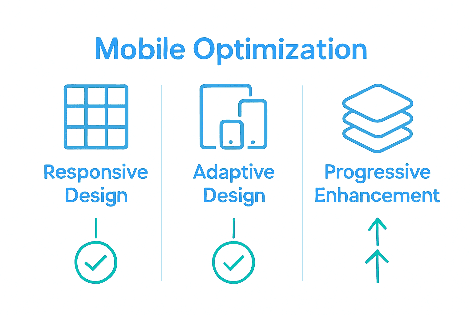
Types of Mobile Optimization Methods
Web developers have several strategic approaches to creating mobile-optimized websites, each with unique strengths and implementation techniques. The primary methods include responsive design, adaptive design, and mobile-specific solutions, which address the diverse needs of modern digital experiences.
In responsive design, websites automatically adjust and reflow content across different screen sizes and device types. This approach uses flexible grid layouts, scalable images, and CSS media queries to create a fluid user experience. By implementing responsive techniques, websites can seamlessly transform from desktop to tablet to smartphone without losing functionality or visual appeal.
Key Mobile Optimization Strategies
The primary mobile optimization methods include:
Here’s a comparison of the main mobile optimisation methods:
| Method | Approach | Key Strengths |
|---|---|---|
| Responsive Design | Fluid layouts adapt to screen size | Broad compatibility Easy scaling |
| Adaptive Design | Distinct layouts served per device | Customised user experience Targeted elements |
| Progressive Enhancement | Core content first, features added progressively | Reliable performance Inclusive access |
| Mobile-First Design | Design begins with mobile as primary environment | Prioritises speed Focus on essentials |
- Responsive Web Design: Fluid layouts that adapt to any screen size
- Adaptive Design: Serving different website versions based on device characteristics
- Progressive Enhancement: Building core content and functionality first, then adding advanced features
- Mobile-First Design: Designing for mobile devices as the primary user experience
Technology plays a crucial role in these optimization strategies. Performance metrics like page load speed, touch-friendly interfaces, and efficient content rendering become paramount. For more insights into optimizing website performance, explore our guide on website speed optimization tips.
Web professionals must carefully select and implement these methods based on specific project requirements, target audience, and technical constraints.
 While each approach offers unique advantages, the ultimate goal remains consistent: delivering an exceptional, seamless mobile user experience that keeps visitors engaged and satisfied.
Core Features of Mobile-Friendly Design
Mobile-friendly design transforms how users interact with websites across different devices, creating seamless digital experiences that adapt to varying screen sizes and user needs. When crafting a mobile-friendly website, developers must focus on several critical features that ensure optimal performance and user satisfaction.
The cornerstone of mobile-friendly design is responsive layout architecture. This means creating flexible grid systems that automatically adjust content placement, image sizes, and navigation elements to provide a consistent and intuitive experience. As our exploration of responsive web design in 2025 demonstrates, modern web development requires intelligent, dynamic design approaches.
Key Technical Features
Essential core features of mobile-friendly design include:
- Touch-Friendly Interface: Large, easily tappable buttons and interactive elements
- Simplified Navigation: Streamlined menus that work efficiently on smaller screens
- Fast Loading Performance: Optimised images and minimal code for quick rendering
- Readable Typography: Legible font sizes and clear text hierarchy
- Adaptive Content Layout: Intelligent content reshaping across device types
Performance optimization remains crucial in mobile design. Websites must load quickly, typically within 3 seconds, to prevent user frustration and potential bounce rates. Elements like compressed images, minimised HTTP requests, and efficient caching strategies become paramount in creating smooth mobile experiences.
Web designers must continuously evolve their mobile-friendly strategies, understanding that user expectations are constantly shifting. By prioritising flexibility, performance, and intuitive design, businesses can create digital experiences that not only meet but exceed modern mobile user requirements.
Impact on User Experience and Conversions
Mobile user experience represents a critical battleground for digital businesses, where every interaction can mean the difference between a loyal customer and a lost opportunity. According to Online WLV, mobile-friendly websites significantly enhance user engagement by “reducing the need for excessive scrolling or zooming, leading to increased user engagement and lower bounce rates.”
The connection between mobile design and conversion rates is profound and multifaceted. Conversion optimization through mobile-friendly design involves creating intuitive, frictionless experiences that guide users seamlessly from initial interest to final action. When websites load quickly, display content clearly, and provide easy navigation, potential customers are more likely to complete purchases, sign up for services, or engage with brand content.
Key Conversion Impact Factors
Primary user experience elements driving conversions include:
- Page Load Speed: Directly impacts user patience and conversion likelihood
- Intuitive Navigation: Reduces user frustration and abandonment rates
- Readable Content: Ensures information is easily consumable on small screens
- Touch-Friendly Interfaces: Enables smooth interaction across devices
- Minimal Form Complexity: Streamlines user registration and purchase processes
Businesses can dramatically improve their digital performance by understanding these nuanced interactions. For deeper insights into maximizing digital potential, explore our guide on understanding user experience for business growth.
Ultimately, mobile-friendly design is not just a technical requirement but a strategic imperative. By prioritizing user experience across all devices, businesses create digital environments that not only attract but actively convert and retain customers, transforming casual browsers into committed brand advocates.
SEO and Search Ranking Implications
Search engine optimization has undergone a radical transformation with the rise of mobile internet usage. According to Wikipedia, Google’s landmark ‘Mobilegeddon’ update fundamentally changed digital marketing strategies by explicitly “prioritizing mobile-friendly websites in search rankings,” emphasizing the critical importance of mobile optimization for online visibility.
Mobile responsiveness is no longer an optional feature but a fundamental ranking factor. Search engines now evaluate websites through a mobile-first lens, meaning the mobile version of your site determines its search performance. This approach recognizes that over 60% of internet traffic now originates from mobile devices, making responsive design a crucial element of competitive digital strategy.
Key SEO Mobile Optimization Factors
Essential mobile SEO considerations include:
- Page Loading Speed: Faster mobile sites receive higher search rankings
- Responsive Design: Consistent user experience across all device types
- Mobile-Friendly Navigation: Clear, tappable menus and intuitive interfaces
- Content Readability: Legible text without requiring zooming
- Minimal Pop-ups: Avoiding intrusive interstitials that disrupt mobile experience
For businesses seeking to understand the intricate relationship between design and search performance, our guide on crucial SEO ranking factors provides comprehensive insights into navigating this complex landscape.
Ultimately, mobile optimization represents a strategic imperative. Websites that fail to adapt risk becoming digitally invisible, losing potential customers and market share to more agile, user-focused competitors. The message is clear: invest in mobile-friendly design, or risk being left behind in the rapidly evolving digital ecosystem.
Risks, Costs, and Common Pitfalls
Mobile optimization is not just a technical upgrade but a critical business survival strategy. According to The Creative Block, “delaying mobile optimization can result in lost business opportunities, as users may abandon sites that are not mobile-friendly” - a stark warning for businesses clinging to outdated digital approaches.
Financial implications of poor mobile design extend far beyond simple website performance. Businesses risk significant revenue loss when potential customers encounter difficult-to-navigate websites. An ineffective mobile experience can lead to abandoned shopping carts, reduced engagement, and ultimately, diminished brand credibility. Small to medium enterprises might find themselves spending substantially more on retrofitting and recovery than they would on proactive mobile optimization.
Common Mobile Design Pitfalls
Critical risks and potential costly mistakes include:
- Inconsistent User Experience: Varying design across different devices
- Slow Page Load Times: Causing immediate user frustration and bounce rates
- Non-Responsive Design: Breaking core functionality on mobile screens
- Complicated Navigation: Complex menus that discourage user interaction
- Unreadable Content: Text too small or difficult to read on mobile devices
For businesses seeking strategic guidance on avoiding these digital traps, our comprehensive guide on crucial SEO ranking factors offers deeper insights into maintaining a robust online presence.
The digital landscape demands continuous adaptation. Businesses that view mobile optimization as an ongoing investment rather than a one-time project will be best positioned to thrive in an increasingly mobile-first world. Proactive strategy, regular audits, and a commitment to user experience are the keys to navigating these complex digital waters.
Transform Your Mobile Experience With Expert Web Design
Struggling with slow loading times, unreadable content, or clunky navigation on your mobile site? You are not alone. The guide highlights how every second lost in page load or confusing menus can drive visitors away and harm your conversions. Mobile-friendly design is no longer optional but vital for keeping customers engaged and ranking well on search engines.
At Cloud Fusion, we understand these challenges deeply. Our tailored web design and development services focus on creating responsive, fast, and intuitive mobile experiences that align perfectly with your business goals. Don’t let poor mobile performance hold back your growth. Act now to future-proof your digital presence with experts who prioritise speed, usability, and SEO impact.
Discover how to convert casual visitors into loyal customers with a seamless mobile site. Take the first step today by getting your personalised web design and development quotation and explore our full range of digital business solutions built to elevate your brand. Your business deserves a mobile website that works as hard as you do—reach out and secure your competitive edge now.
Frequently Asked Questions
What is a mobile-friendly website?
A mobile-friendly website is designed to provide an optimal viewing experience across various mobile devices, allowing users to easily navigate, view, and interact with content without excessive scrolling or zooming.
Why is mobile optimization important for my website?
Mobile optimization is essential as it enhances user experience, reduces bounce rates, and can significantly improve conversion rates. With over 50% of web traffic coming from mobile devices, a mobile-friendly website is crucial for attracting and retaining customers.
What are the key features of mobile-friendly design?
Key features include a responsive layout, touch-friendly navigation, fast loading times, readable typography, and simplified content. These elements work together to create an intuitive and engaging user experience on mobile devices.
How does mobile-friendliness affect SEO?
Mobile-friendliness is a critical factor in SEO, as search engines prioritize mobile-responsive websites in search rankings. A well-optimized mobile site can lead to higher visibility and better performance in search engine results pages.
Recommended


