
Every business website in 2025 faces one massive challenge. People are moving between their phones, tablets, laptops, and even smartwatches all day. Yet despite this tidal wave of devices, a shocking number of companies still have sites that break or look terrible on anything except a big screen. But what if I told you that responsive design explains 74.7% of changes in usability effectiveness? That means nearly three quarters of the way users experience your business online rests on this one crucial detail.
Table of Contents
- Why Responsive Design Matters In 2025
- How Responsive Design Boosts User Experience
- Responsive Design And Business Growth Opportunities
- Key Steps To Implementing Responsive Design Solutions
Quick Summary
| Takeaway | Explanation |
|---|---|
| Responsive design is essential for all devices | Businesses must ensure websites function effectively across desktops, tablets, and smartphones to meet user expectations. |
| User experience directly impacts business performance | Improved site usability leads to enhanced user retention, reduced bounce rates, and increased conversions. |
| Mobile-first design should be prioritized | Designing primarily for mobile devices allows for better user engagement and performance optimization on larger screens. |
| Consistency across platforms builds trust | A unified design and seamless experience enhance brand reliability, reducing cognitive load for users during transitions. |
| Responsive design is a continuous process | Regular testing and refinement are crucial for adapting to user feedback and technological changes over time. |
Why Responsive Design Matters in 2025
Responsive design has transformed from a trendy web development approach to a critical business strategy in 2025. Modern businesses recognise that digital interactions are no longer confined to desktop computers but span multiple devices and screen sizes. Explore our comprehensive guide on web design strategies to understand this crucial digital imperative.
The Multi Device Digital Reality
The proliferation of smartphones, tablets, smartwatches, and other internet-connected devices has fundamentally reshaped how users consume digital content. According to EDUCAUSE research, responsive web design allows a single website to support all device types by dynamically adapting to users’ specific needs and screen capabilities.
Businesses can no longer afford a website that looks perfect on a desktop but becomes unreadable or dysfunctional on mobile devices. The consequences extend far beyond aesthetic concerns:
- User Experience: Inconsistent design reduces user engagement and increases bounce rates
- Search Engine Ranking: Google prioritises mobile-friendly websites in search results
- Brand Perception: A poorly designed site suggests technological incompetence
Technical Performance and User Expectations
Wikipedia defines responsive web design as an approach that renders web pages effectively across diverse devices through fluid grids, flexible images, and strategic CSS media queries. In 2025, this definition represents more than technical jargon - it’s a fundamental business survival strategy.
Modern users expect instantaneous, seamless digital experiences. They transition between devices constantly - checking emails on smartphones, researching products on tablets, and making purchases on laptops. A responsive design ensures consistent functionality and visual appeal across these interactions.
Technical performance metrics now directly correlate with business performance. Websites that load quickly, adapt smoothly, and provide intuitive navigation across devices are more likely to convert visitors into customers. Responsive design is not just about looking good - it’s about creating frictionless digital experiences that align with contemporary user behaviours.
Strategic Digital Transformation
Responsive design in 2025 represents more than a technical implementation - it’s a strategic approach to digital presence. Businesses that embrace this philosophy understand that their digital platforms must be as agile and adaptable as their market strategies.
By investing in responsive design, organisations demonstrate:
- Technological Sophistication: An understanding of modern digital ecosystems
- Customer Centricity: Commitment to providing seamless user experiences
- Future Readiness: Ability to adapt to emerging technological trends
The digital landscape continues to evolve rapidly. Responsive design is no longer optional - it’s a fundamental requirement for businesses seeking to remain competitive and relevant in an increasingly connected world.
How Responsive Design Boosts User Experience
User experience has become the cornerstone of digital success in 2025, with responsive design playing a pivotal role in creating seamless interactions across devices. Discover our advanced user experience strategies to understand how design can transform digital engagement.
Consistency Across Device Ecosystems
In an era of multiple digital touchpoints, users expect uniform experiences regardless of their device. Research published in Jurnal Teknologi examined responsive web design across laptop and smartphone platforms, revealing that well-implemented responsive design ensures consistent user experiences across different screen sizes and device types.
The implications of this consistency are profound:
- Reduced Cognitive Load: Users do not need to relearn navigation or interface elements
- Seamless Interaction: Smooth transitions between devices maintain user engagement
- Brand Reliability: Consistent design reinforces brand perception and trustworthiness
To provide a clearer view of the main implications of responsive design consistency across devices, here’s a summary table:
| Implication | Description |
|---|---|
| Reduced Cognitive Load | Users do not need to relearn navigation or interface elements |
| Seamless Interaction | Maintaining engagement with smooth device-to-device transitions |
| Brand Reliability | Reinforcing brand trust through consistent design across all devices |
Performance and Accessibility Metrics
 EDUCAUSE Review emphasizes that responsive design provides an effective user interface across various device sizes, delivering optimal viewer experiences. This approach goes beyond mere visual adaptation - it fundamentally transforms how users interact with digital platforms.
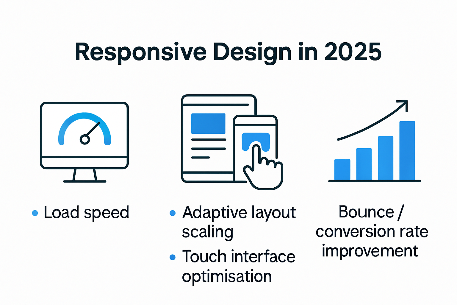
Performance metrics in 2025 are directly tied to user experience. Websites that load quickly, adapt smoothly, and provide intuitive navigation across different devices are more likely to retain user attention. Responsive design addresses critical performance parameters:
- Load Speed: Optimised content delivery across devices
- Adaptive Layout: Intelligent scaling of visual elements
- Touch-Friendly Interfaces: Consideration of different interaction methods
For quick reference, here’s a table summarising the key performance and accessibility factors improved by responsive design:
| Factor | How Responsive Design Addresses It |
|---|---|
| Load Speed | Optimises delivery specific to each device |
| Adaptive Layout | Scales and arranges elements fluidly |
| Touch-Friendly Interface | Designs for various interaction methods (touch, click) |
Psychological Impact of Design
A fascinating PubMed study revealed that responsive design explains 74.7% of changes in usability effectiveness. This statistic underscores that responsive design is not just a technical implementation but a psychological consideration in digital interaction.
Users subconsciously assess a website’s credibility within milliseconds. A responsive design communicates professionalism, technological competence, and user-centricity. It demonstrates that a business understands and anticipates user needs across different contexts and devices.
By prioritising responsive design, organisations create digital experiences that feel intuitive, efficient, and thoughtfully crafted. This approach transforms passive browsing into active, engaging interactions that build long-term user trust and loyalty.
In the complex digital ecosystem of 2025, responsive design is no longer a luxury - it’s a fundamental requirement for creating meaningful, user-centric digital experiences that resonate across diverse technological landscapes.
Responsive Design and Business Growth Opportunities
Responsive design has transcended its technical origins to become a strategic business catalyst in 2025. Learn more about web development strategies for modern businesses to understand how design can drive organisational growth.
Digital Conversion and User Retention
In the competitive digital marketplace, responsive design directly impacts business performance. A January 2025 research study reveals that intuitive navigation, appealing visuals, and performance optimization are essential components driving user retention and conversion rates.
Businesses leveraging responsive design experience significant advantages:
- Enhanced Conversion Rates: Streamlined user experiences encourage immediate action
- Reduced Bounce Rates: Consistent design across devices keeps users engaged
- Improved Customer Satisfaction: Intuitive interfaces build long-term user trust
Market Accessibility and Competitive Edge
Wikipedia defines responsive web design as an adaptable approach ensuring web pages render effectively across diverse devices. This technical capability translates into substantial market opportunities for forward-thinking businesses.
Responsive design enables organisations to:
- Expand Market Reach: Seamlessly serve users across multiple device platforms
- Demonstrate Technological Sophistication: Signal business innovation and adaptability
- Reduce Development Costs: Maintain a single, flexible digital platform
Strategic Digital Transformation
Responsive design is more than a technical implementation - it represents a comprehensive business strategy. By prioritising user-centric design, organisations communicate their commitment to customer experience and technological innovation.
Key strategic benefits include:
- Global Competitiveness: Ability to engage users across different technological ecosystems
- Data-Driven Insights: Better understanding of user interactions and preferences
- Brand Differentiation: Creating memorable digital experiences that stand out
In 2025, responsive design is not merely a web development technique. It is a powerful business growth mechanism that enables organisations to adapt, engage, and succeed in an increasingly digital global marketplace. Businesses that recognise and implement responsive design as a strategic tool will be best positioned to thrive in the dynamic digital landscape.
Key Steps to Implementing Responsive Design Solutions
Implementing responsive design solutions requires a strategic and systematic approach that goes beyond simple visual adjustments. Explore our comprehensive web design best practices to understand the nuanced implementation process for modern digital platforms.
Adopting a Mobile First Methodology
According to the Nielsen Norman Group, a mobile-first approach is crucial for successful responsive design in 2025. This strategy involves designing digital experiences primarily for mobile devices and then progressively enhancing the design for larger screens.
Key considerations in mobile-first implementation include:
- Content Prioritisation: Identifying and highlighting most critical information
- Performance Optimization: Minimising resource-heavy elements
- Touch Interface Design: Ensuring intuitive interaction for smaller screens
To aid in practical adoption, here’s a brief checklist table outlining key mobile-first design considerations:
| Consideration | Addressed in Approach? |
|---|---|
| Content Prioritisation | Yes |
| Performance Optimization | Yes |
| Touch Interface Design | Yes |
Technical Architecture and Flexible Frameworks
 Responsive design demands robust technical foundations. Developers must leverage modern frameworks and technologies that support fluid, adaptive layouts. This involves:
- Fluid Grid Systems: Using percentage-based layouts instead of fixed pixel measurements
- Flexible Image Handling: Implementing techniques that scale images proportionally
- CSS Media Queries: Creating breakpoints that adjust design across different device sizes
Comprehensive Testing and Continuous Refinement
Successful responsive design is an iterative process requiring extensive testing across multiple devices, browsers, and screen sizes. Organisations must develop comprehensive testing protocols that:
- Validate Cross Device Functionality: Ensure consistent performance
- Analyse User Interaction Metrics: Track user experience across platforms
- Implement Continuous Improvement Cycles: Regularly update design based on user feedback
Responsive design is not a one-time implementation but a continuous journey of adaptation and optimization. Businesses that view responsive design as a dynamic, strategic process will create digital experiences that truly resonate with users across diverse technological ecosystems.
By embracing these key steps, organisations can transform responsive design from a technical requirement into a powerful mechanism for digital engagement, user satisfaction, and business growth.
Frequently Asked Questions
What is responsive design and why is it important for businesses in 2025?
Responsive design is an approach to web development where websites are built to adapt seamlessly to various device sizes and screen resolutions. In 2025, it is crucial for businesses as it enhances user experience, meets user expectations, and improves search engine rankings, thereby driving engagement and conversions.
How does responsive design affect user experience?
Responsive design directly impacts user experience by providing consistent and intuitive interactions across devices. It addresses user needs, reduces bounce rates, and increases satisfaction, leading to higher retention and conversion rates.
What are the key benefits of adopting a mobile-first approach in responsive design?
Adopting a mobile-first approach focuses primarily on optimizing websites for mobile devices first, which can lead to better performance, increased engagement, and improved accessibility for users on smaller screens, ultimately enhancing overall user experience across all devices.
How can businesses ensure their website is responsive?
Businesses can ensure their website is responsive by implementing fluid grid systems, flexible images, and CSS media queries. Additionally, regular testing across different devices and user feedback can help in continuously refining the design for optimal functionality.
Give Your Business a Competitive Edge with Responsive Design
Struggling with low engagement and high bounce rates because your website simply does not meet user expectations across all devices? If you recognise the frustration of outdated layouts and inconsistent digital experiences, you are not alone. The article highlighted how a lack of responsive design undermines user trust, lowers conversion, and puts your brand at risk of falling behind in 2025’s fast-paced, multi-device world. Your business deserves more than a site that just works on desktop – it needs to look sharp and perform brilliantly everywhere.
Now is the moment to transform your digital approach. Tap into the expertise of a partner that prioritises seamless user experience, technical agility, and future-ready design. Request a tailored web design and development quotation from Cloud Fusion’s team. Let us help you implement the strategic, user-centred solutions outlined above. Secure your edge in tomorrow’s marketplace – visit our web design and development services now and unlock your business’s potential for lasting online success.
Recommended
- Responsive Web Design in 2025: A Complete Guide for Businesses
- User Experience in Web Design: Best Practices for Businesses 2025
- Mobile App Development Process for Businesses in 2025
- Discover the Top Web Design Trends for 2024 | Cloudfusion
- Master Responsive Web Design: Responsive Web Design 2024
- Responsive Design Bedeutung: Mehr Conversions im Jahr 2025


