Make the name distinctive.
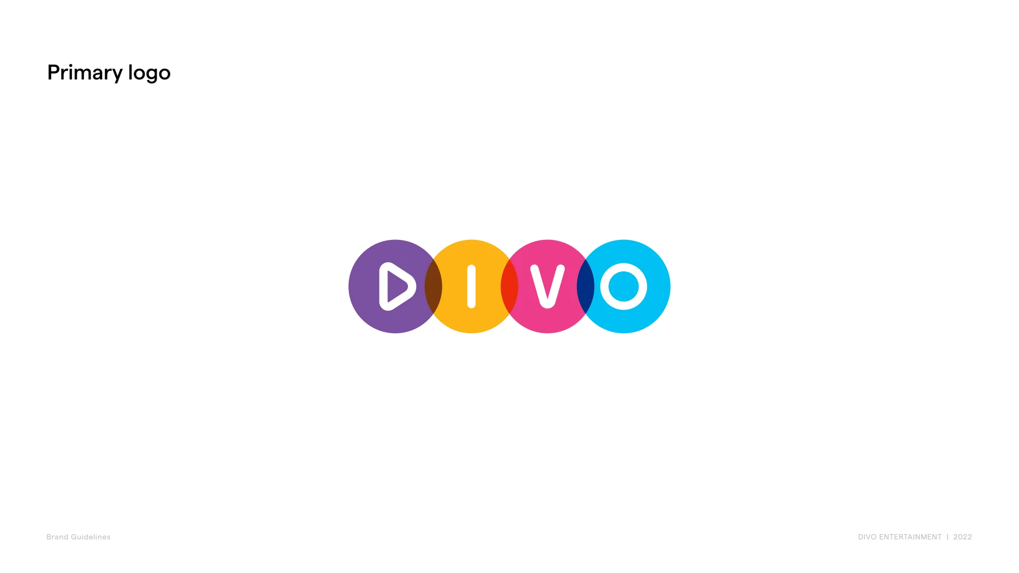
The four-colour wordmark and play symbol give Divo a recognisable visual signature.


Divo Entertainment needed a brand that could bring personality to its business without losing consistency. We developed its logo system and guidelines, then applied the identity to its website and business materials.
Explore the experienceLogo design · Visual identity · Brand guidelines · Business stationery · Presentation design · Custom HTML email signature · Corporate website / 2022–2024
The identity had to feel at home in entertainment and work across very different formats. A website, a presentation and a small piece of stationery all needed to look like Divo, with enough flexibility for the brand to have character.
We designed a wordmark with four colour options and documented its construction, spacing, typography and use in a 16-page guide. That system continued into stationery, presentations and the original website. Later website content updates extended the engagement beyond the initial 2022 brand work.
The team has clear rules for applying its identity to new materials, with enough colour flexibility to suit different entertainment settings.
The colour options give the logo flexibility while keeping its form recognisable.
Guidelines, stationery, presentations and website design use the same underlying brand system.
The original identity balances an expressive entertainment character with clear rules for consistent use.
The four-colour wordmark and play symbol give Divo a recognisable visual signature.
Construction, clear space, logo variations, colours and typography support consistent application.
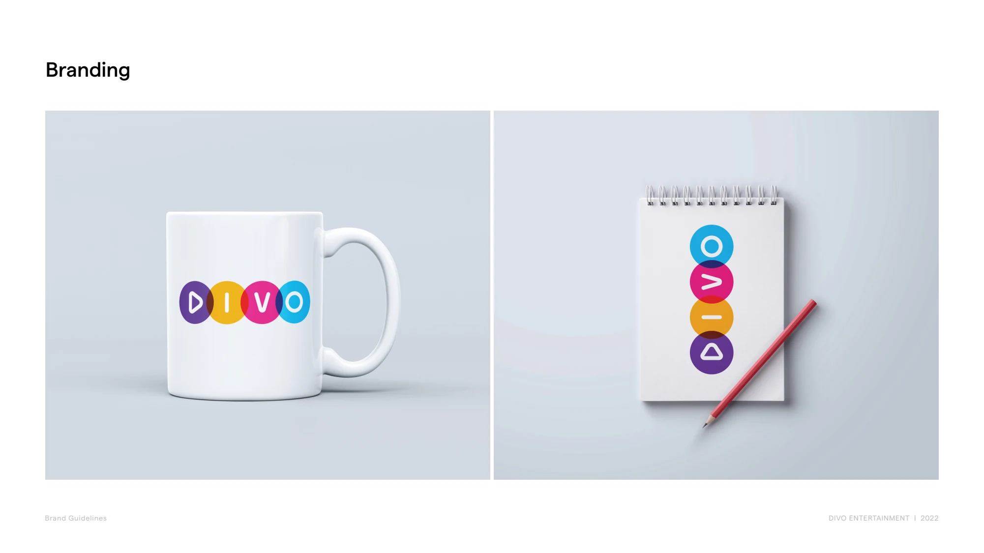
Business materials and presentation design extend the identity into company communications.
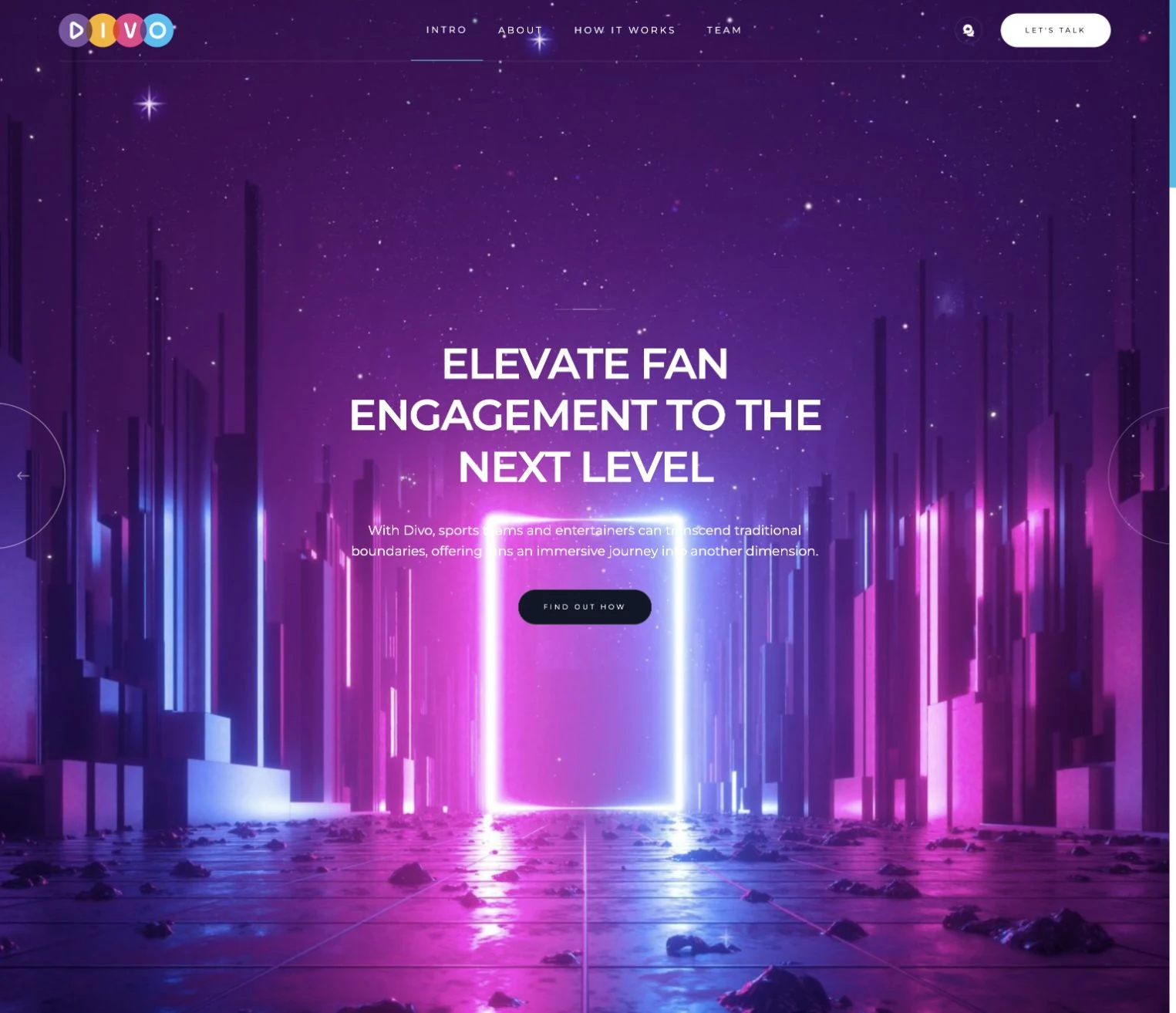
The website uses the identity to present Divo’s entertainment offering, with updates preserved in the May 2024 archive.
Recovered from the original site export, this opening screen shows the brand within Divo’s corporate website. Our work brought the identity, corporate messaging and enquiry journey together.
Primary and secondary logos, the play symbol and a four-colour palette.
A 16-page guide covering construction, clear space, colour, typography and application examples.
Business cards, stationery, branded presentations and a custom HTML email signature for everyday client communication.
Original website design and later content updates, shown through the preserved May 2024 export.
Divo Entertainment needed a brand that could bring personality to its business without losing consistency. We developed its logo system and guidelines, then applied the identity to its website and business materials.
Logo design · Visual identity · Brand guidelines · Business stationery · Presentation design · Custom HTML email signature · Corporate website / 2022–2024
The identity had to feel at home in entertainment and work across very different formats. A website, a presentation and a small piece of stationery all needed to look like Divo, with enough flexibility for the brand to have character.
We designed a wordmark with four colour options and documented its construction, spacing, typography and use in a 16-page guide. That system continued into stationery, presentations and the original website. Later website content updates extended the engagement beyond the initial 2022 brand work.
The team has clear rules for applying its identity to new materials, with enough colour flexibility to suit different entertainment settings.