
TL;DR:
- Responsive web apps significantly increase conversions and reduce bounce rates.
- They utilize fluid layouts, CSS Grid, Flexbox, and real device testing for optimal performance.
- Most businesses need ongoing investment in responsiveness beyond basic mobile-friendly checks.
Businesses that treat mobile responsiveness as an optional feature are quietly losing revenue every single day. Responsive design drives conversions 15 to 20% higher and accelerates revenue growth 2.1 times faster than non-responsive alternatives, while case studies consistently document 35% bounce rate reductions and conversion lifts of up to 60% following responsive redesigns. Yet many organisations still invest in digital platforms without a coherent responsive strategy, assuming their existing site “works well enough” on mobile. This guide cuts through that assumption, explaining exactly how responsive web apps deliver measurable ROI, which methodologies drive the best results, and how your business can act decisively to capture the full opportunity.
Table of Contents
- What is a responsive web app and why does it matter?
- Core methodologies: How responsive web apps are built
- Responsive vs adaptive: Making the right business choice
- Overcoming the challenges of responsive web apps
- Measuring ROI: Performance and business impact of responsive web apps
- Why most businesses underuse responsive web apps (and how to seize the opportunity)
- Take the next step: Responsive web app solutions for your business
- Frequently asked questions
Key Takeaways
| Point | Details |
|---|---|
| Responsive delivers results | Responsive web apps increase conversions, revenue, and customer satisfaction across all devices. |
| Mobile-first is essential | Starting with mobile-first design ensures scalability and success in a multi-device world. |
| Performance impacts ROI | Fast, responsive experiences directly improve business metrics like bounce rate and conversion. |
| Real-world testing matters | Testing on real devices and handling edge cases is critical for delivering reliable, future-proof web apps. |
What is a responsive web app and why does it matter?
Let’s start with a clear foundation: what actually counts as a responsive web app, and why businesses cannot afford to ignore it.
A responsive web app is a browser-based application built so that its layout, content, and functionality automatically adapt to the screen size, resolution, and orientation of any device accessing it. The technical foundation, as defined by fluid grids, flexible images, and CSS media queries, allows a single codebase to serve desktop users, tablet users, and smartphone users equally well, without maintaining separate versions of the application.
From a business perspective, this matters enormously. Consider what your customers actually experience: a user on a commuter train opens your web app on their phone, encounters a layout that requires horizontal scrolling, and abandons the session within seconds. That is not a technical inconvenience. It is a lost sale, a damaged brand impression, and a signal to search engines that your site delivers poor user experience.
The business benefits of responsive web apps extend well beyond aesthetics:
- Broader market reach: A single responsive build serves every device category, meaning you capture mobile, tablet, and desktop users without additional development investment.
- Improved SEO performance: Google’s mobile-first indexing means your search rankings are determined by your mobile experience. A responsive app ensures consistency across the index.
- Lower support and maintenance costs: One codebase is dramatically cheaper to maintain than separate desktop and mobile versions.
- Future-proofing: New device form factors, including foldables and ultra-wide screens, are handled by fluid layouts far more gracefully than fixed designs.
- Higher conversion rates: 78% of top 1000 sites now use responsive web design, and the correlation with stronger commercial performance is well established.
Statistic callout: Mobile Core Web Vitals scores have improved to 48% good scores in 2026, up from 36% in 2023, reflecting industry-wide investment in responsive performance. Businesses that lag behind this trend are increasingly visible to customers as inferior digital experiences.
Understanding responsive web apps as a business growth tool, rather than a purely technical requirement, is the first strategic shift your organisation needs to make. Explore the full web app success guide to see how this foundation connects to broader application strategy, and review proven web app development methods that leading businesses are using right now.
Core methodologies: How responsive web apps are built
Now that you know why responsive web apps matter, let’s break down the core methods that make them work elegantly across all screens.
Building a truly responsive web app is not simply a matter of adding a few CSS rules. It requires a deliberate methodology applied from the earliest stages of planning. The most effective approach follows a structured sequence:
- Adopt mobile-first design as your baseline. Mobile-first means writing your base CSS styles for the smallest screens first, then using media queries to progressively enhance the layout for larger viewports. This discipline forces your team to prioritise essential content and functionality, which produces leaner, faster applications across all devices. Mobile-first design with container queries is now the industry standard for building scalable, maintainable responsive systems.
- Leverage CSS Grid and Flexbox for layout control. CSS Grid handles two-dimensional layout (rows and columns simultaneously), while Flexbox excels at one-dimensional alignment (either rows or columns). Used together, they give your development team precise control over how content reflows across screen sizes without relying on fragile, pixel-based positioning.
- Implement container queries for component-level responsiveness. Traditional media queries respond to the viewport (the overall browser window). Container queries allow individual components to respond to the size of their own parent container, which is critical for reusable design systems where a card component might appear in a narrow sidebar on one page and a wide grid on another.
- Use fluid typography and imagery. The CSS "clamp()
function allows font sizes to scale smoothly between a minimum and maximum value based on viewport width, eliminating jarring text size jumps. Similarly, responsive images usingsrcset` serve appropriately sized image files to each device, reducing data consumption and improving load times. - Test on real devices and cloud testing platforms. Emulators are useful for initial checks, but real-device testing reveals issues that simulators consistently miss, including touch target accuracy, hardware-specific rendering quirks, and actual network performance.
- Conduct structured QA across breakpoints. Define your breakpoints based on content needs rather than specific device models, test at each breakpoint, and validate accessibility at every stage.
Pro Tip: Resist the temptation to define breakpoints around popular device widths like 375px or 768px. Instead, resize your browser gradually and add a breakpoint wherever the layout begins to break. This produces a more resilient design that handles the full spectrum of real-world screen sizes.
Explore the mobile-first web app approach in depth, and review how HTML5 and CSS for responsiveness form the technical backbone of modern web app development.
Responsive vs adaptive: Making the right business choice
As you consider these methods, it is vital to understand how responsive compares with adaptive design, and which direction best fits your long-term strategy.
Both responsive and adaptive design aim to deliver appropriate experiences across devices, but they do so through fundamentally different mechanisms. Understanding the distinction helps you make an informed investment decision.
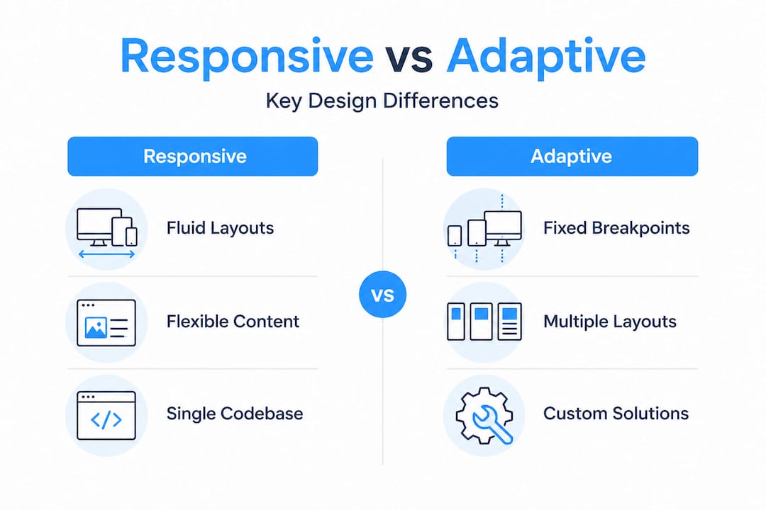
Responsive design uses a fluid, single layout that adjusts continuously using CSS, while adaptive design detects the user’s device server-side and serves one of several fixed layouts designed for specific breakpoints. Adaptive can deliver faster initial loads for targeted devices, but it requires maintaining multiple layout versions and introduces complexity when new device categories emerge.
| Criterion | Responsive design | Adaptive design |
|---|---|---|
| Layout approach | Fluid, single codebase | Fixed, multiple versions |
| Maintenance load | Low (one codebase) | High (multiple layouts) |
| SEO impact | Strong (single URL) | Weaker (URL variations) |
| Initial investment | Moderate | Higher |
| New device support | Automatic | Requires new layout |
| User experience | Consistent across devices | Optimised per device |
| Performance | Dependent on implementation | Potentially faster per device |
“For the vast majority of businesses, responsive design is the strategically sound default. It reduces long-term maintenance costs, preserves SEO equity through a single URL structure, and adapts automatically to new device categories without additional development cycles.”
Adaptive design retains a legitimate role in highly specialised scenarios, such as applications with vastly different feature sets for mobile versus desktop users, or platforms where device-specific performance optimisation is a core product requirement. Outside those specific cases, the maintenance overhead and SEO trade-offs of adaptive design rarely justify the investment.
Review the detailed responsive vs adaptive design comparison for a deeper analysis, understand how to approach solving adaptive and responsive problems in existing applications, and stay current with web development trends shaping this decision in 2026.
Overcoming the challenges of responsive web apps
With your foundational knowledge set, let’s tackle the real-world obstacles that come with executing responsive web apps, and proven tactics to master them.
Responsive web app development is not without its complexities. As device diversity expands, the edge cases multiply. Foldable phones, ultra-wide monitors, landscape orientations with notches, browser-specific quirks in Safari’s Flexbox implementation, and touch targets smaller than 44px all represent real failure points that affect user experience and, ultimately, business outcomes.
| Challenge | Business impact | Technical solution |
|---|---|---|
| Foldable device layouts | Broken UI in tent/open modes | CSS fold media features, container queries |
| Ultra-wide monitors | Unreadable line lengths | Max-width containers, multi-column layouts |
| Notch and safe-area insets | Content obscured by hardware | safe-area-inset CSS environment variables |
| Browser rendering quirks | Inconsistent experience | Cross-browser testing, targeted CSS fixes |
| Accessibility at 400% zoom | Exclusion of users with visual impairments | Reflow-compliant layouts, WCAG 2.2 compliance |
| Performance on slow networks | High bounce rates | srcset, lazy loading, resource prioritisation |
Performance is inseparable from responsiveness. Core Web Vitals benchmarks set clear targets: Largest Contentful Paint under 2.5 seconds, Interaction to Next Paint under 200 milliseconds, and Cumulative Layout Shift below 0.1. Fluid typography using clamp(), responsive images with srcset, and lazy loading collectively reduce layout shifts and data consumption by up to 35%, directly improving these scores.

Pro Tip: Do not rely solely on Lighthouse scores in a controlled environment. Run Core Web Vitals monitoring on real user traffic using tools like Google Search Console’s Core Web Vitals report or a real user monitoring platform. Lab data and field data frequently diverge, and field data is what Google actually uses for ranking signals.
Accessibility is another dimension that businesses frequently underestimate. A responsive app that works visually across screen sizes but fails keyboard navigation or screen reader compatibility excludes a significant user segment and creates legal exposure in many jurisdictions. Build accessibility into your responsive design process from day one, not as an afterthought. Explore the full responsive design for business guide for a structured approach to these challenges.
Measuring ROI: Performance and business impact of responsive web apps
Once you have addressed the challenges, the logical question is: what is the measurable business impact? Here is what the numbers reveal.
The return on investment from responsive web app development is not theoretical. It is documented across industries and business sizes, and the data is compelling enough to reframe how organisations should think about their digital investment priorities.
Key business KPIs that respond directly to responsive web app quality include:
- Conversion rate: Responsive design lifts conversions 15 to 20% on average, with documented cases showing 60% improvement and mobile conversion rates 2.8 times higher following a responsive redesign.
- Bounce rate: Businesses report 35% reductions in bounce rate after implementing properly executed responsive design, because users who can navigate comfortably stay longer and engage more deeply.
- Revenue growth velocity: Companies with strong responsive implementations grow revenue 2.1 times faster than those with poor mobile experiences, a gap that compounds over time.
- SEO and organic traffic: Google’s mobile-first index rewards responsive, fast-loading applications with stronger rankings, translating directly into lower customer acquisition costs.
- Support cost reduction: A single responsive codebase eliminates the duplication of effort required to maintain separate desktop and mobile applications, reducing both development and QA costs substantially.
- Customer retention: Seamless cross-device experiences build brand trust. Users who encounter a polished, consistent experience on every device are more likely to return and to recommend your platform.
Statistic callout: ROI from UX and responsive investments ranges from 245% to 9,900% depending on the baseline and implementation quality. Even conservative estimates place responsive web app investment among the highest-return digital expenditures available to a business.
The implication for decision-makers is straightforward: delaying or under-investing in responsive web app quality is not a neutral choice. It is an active decision to accept lower conversions, higher bounce rates, weaker SEO, and slower revenue growth. Review the full responsive design business guide to understand how these metrics translate into your specific industry context.
Why most businesses underuse responsive web apps (and how to seize the opportunity)
Having seen the data, let’s examine why so many businesses still miss the full opportunity behind truly responsive web apps.
Here is an uncomfortable observation: most businesses that believe they have a responsive web app actually have a web app that passes a basic mobile-friendly test. That is not the same thing. Passing Google’s mobile-friendly check means your text is readable and buttons are tappable. It says nothing about whether your application performs well under real network conditions, whether it handles foldable devices gracefully, whether it meets WCAG accessibility standards, or whether your Core Web Vitals scores are competitive enough to drive organic traffic.
The gap between “mobile-friendly” and “genuinely responsive” is where significant business value is being left unrealised. Organisations that invest in surface-level responsiveness and then consider the job done are, in effect, accepting a permanently degraded competitive position. Meanwhile, businesses that treat responsive design as an ongoing, evolving practice, continuously testing on new devices, monitoring real user performance data, and iterating on component-level responsiveness, are compounding their advantage every quarter.
The strategic insight here is that responsiveness is not a project with a completion date. It is a capability that requires sustained investment and attention, much like your security posture or your content strategy. The businesses that understand this are building design systems with container queries and intrinsic responsiveness baked in, so that new features automatically inherit responsive behaviour rather than requiring retroactive fixes.
Our perspective, grounded in working with businesses across multiple sectors, is that the most cost-effective moment to invest in true responsiveness is before your next major feature release, not after you have accumulated technical debt across a fragmented device experience. The web app planning insights we share with clients consistently show that proactive responsive architecture reduces long-term development costs while delivering superior user outcomes from day one.
Take the next step: Responsive web app solutions for your business
Ready to turn insights into action? Here is how to upgrade your web presence and capture more customers.
At Cloudfusion, we build custom web development solutions that are responsive by design, not as an afterthought. Our development teams apply mobile-first methodology, container queries, fluid typography, and rigorous real-device testing to every project, ensuring your web app performs at the highest level across every screen size your customers use. Whether you are launching a new platform or modernising an existing application, we handle the full technical complexity so your team can focus on business outcomes. We also extend responsive principles into mobile app development, creating cohesive digital ecosystems that serve your customers wherever they are. Contact Cloudfusion today to discuss your responsive web app requirements and see measurable results.
Frequently asked questions
What makes a web app responsive?
A responsive web app automatically adjusts its layout and functionality to provide an optimal experience on any device or screen size, achieved through fluid grids, flexible images, and CSS media queries operating from a single codebase.
How do responsive web apps improve business results?
They directly improve conversion rates, reduce bounce rates, strengthen SEO rankings, and increase customer satisfaction by delivering a seamless experience on every device, with documented lifts of 60% in conversions and 2.8 times higher mobile conversion rates following responsive redesigns.
Is responsive design better than adaptive design for most businesses?
Yes, for most businesses responsive design delivers greater flexibility, lower maintenance overhead, and stronger SEO through a single URL structure, while adaptive design requires more maintenance and is only justified when highly device-specific performance optimisation is a core requirement.
What are the biggest technical challenges with responsive web apps?
The most demanding challenges involve foldable phones, ultra-wide monitors, browser-specific rendering quirks, and accessibility compliance, all of which require advanced CSS techniques, real-device testing, and continuous monitoring to resolve effectively.
What KPIs should I track for a responsive web app?
Prioritise conversion rate, bounce rate, session duration, and Core Web Vitals scores, specifically LCP under 2.5 seconds, INP under 200 milliseconds, and CLS below 0.1, as these metrics directly reflect both user experience quality and search ranking potential.
Recommended


