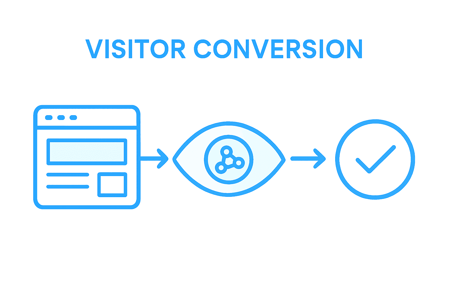
Bold, high-converting landing pages are shaping the future of digital marketing, and South-African businesses are seeing remarkable results. With more than 55 percent of visitors leaving a poorly designed page within seconds, the need for a focused, modern structure has never been clearer. This guide reveals the essential elements, content placement tactics, and common mistakes to help South-African brands turn ordinary landing pages into powerful conversion tools.
Table of Contents
- Defining The Modern Landing Page Structure
- Essential Sections Every Page Needs
- Conversion-Focused Content Placement Tactics
- Visual Hierarchy And User Flow Principles
- Common Landing Page Mistakes To Avoid
Key Takeaways
| Point | Details |
|---|---|
| Effective Structure is Key | A modern landing page must integrate essential elements like a compelling headline, a clear call-to-action, and social proof to drive user engagement and conversions. |
| Visual Hierarchy Enhances Interaction | Strategic placement and design techniques significantly influence user behaviour, guiding them towards desired actions while minimising cognitive load. |
| Avoid Common Mistakes | Clutter, weak calls-to-action, and slow loading times can severely impact conversion rates; regularly auditing landing pages can help mitigate these issues. |
| Focus on a Single Objective | Ensure that every element on the landing page serves the primary conversion goal, eliminating distractions to enhance user focus and effectiveness. |
Defining the Modern Landing Page Structure
The modern landing page represents far more than a simple web entry point. It is a strategically designed digital interface engineered to transform casual website visitors into engaged potential customers. Understanding complex webpage generation techniques reveals how sophisticated these digital environments have become.
A well-structured landing page integrates several critical components that work synergistically to guide user attention and motivate action. These elements include:
- Compelling Headline: Immediately communicates unique value proposition
- Clear Call-to-Action (CTA): Prominently displayed and visually distinct
- Engaging Visuals: High-quality images or graphics that support messaging
- Social Proof: Testimonials, client logos, or performance metrics
- Minimal Navigation: Focused design reducing potential user distraction
Advanced page segmentation approaches demonstrate how strategic visual analysis can enhance landing page effectiveness by improving user experience and information hierarchy. These techniques help designers create more intuitive and conversion-oriented digital interfaces.
Pro Tip - Conversion Focus: Design your landing page with a singular, crystal-clear objective and remove any elements that might dilute or complicate that primary goal.
By understanding these structural principles, businesses can transform their landing pages from static web pages into powerful conversion engines.
Essential Sections Every Page Needs
Every high-performing landing page requires a strategic combination of essential sections designed to capture user attention and drive conversions. Structured page template design reveals critical components that transform a static webpage into a dynamic marketing tool.
The key sections that form the backbone of an effective landing page include:
- Hero Section: Featuring a bold headline, compelling subheadline, and primary call-to-action
- Value Proposition: Clearly articulating unique benefits and solving visitor’s core problems
- Social Proof: Incorporating testimonials, case studies, client logos, or performance metrics
- Feature Breakdown: Explaining product or service capabilities with concise, impactful descriptions
- Trust Signals: Displaying security badges, certifications, awards, or industry recognitions
Each section serves a specific psychological purpose in guiding potential customers through their decision-making journey. The hero section creates initial intrigue, the value proposition addresses specific pain points, and social proof builds credibility and trust.

Here’s how key landing page sections support conversion goals:
| Section | Primary Purpose | Psychological Impact |
|---|---|---|
| Hero Section | Grabs attention and sets expectations | Creates strong first impression |
| Value Proposition | Communicates unique benefits | Resolves visitor uncertainties |
| Social Proof | Adds credibility and peer validation | Builds trust and reduces doubt |
| Feature Breakdown | Explains product capabilities | Increases perceived value |
| Trust Signals | Displays security and reliability cues | Lowers anxiety and risk |
A well-designed landing page navigation should also remain minimal and focused, Footers 101: Leave a lasting good impression can provide additional insights into creating effective page endings that reinforce your primary message.
Pro Tip - Strategic Simplification: Ruthlessly eliminate any section or element that does not directly contribute to your primary conversion goal, keeping user attention laser-focused on taking the desired action.
By meticulously crafting each landing page section with purpose and clarity, businesses can create powerful digital experiences that transform casual visitors into committed customers.
Conversion-Focused Content Placement Tactics
Content placement represents a critical strategy for driving user engagement and conversion rates. Efficient multivariate optimization algorithms demonstrate how strategic positioning of page elements can dramatically influence user behaviour and decision-making processes.
Successful landing pages leverage several key placement tactics:
- Visual Hierarchy: Arranging content from most to least important
- Focal Point Positioning: Placing critical information where users’ eyes naturally gravitate
- Logical Flow: Creating a narrative progression that guides users towards conversion
- Minimal Cognitive Load: Reducing complexity and decision fatigue
- Strategic White Space: Using spacing to direct attention and improve readability
Multivariate landing page optimization provides a data-driven approach to testing different content configurations, allowing businesses to make precise adjustments that incrementally improve conversion potential. This method enables systematic evaluation of visual elements, ensuring that each pixel serves a strategic purpose.
Creating an effective content placement strategy requires understanding user psychology and implementing website content planning principles that align with user expectations and business objectives.
Pro Tip - Strategic Content Mapping: Always visualise your landing page as a user journey, placing content in a sequence that naturally leads visitors from initial curiosity to confident action.
By thoughtfully positioning content and continuously testing placement strategies, businesses can transform their landing pages into powerful conversion machines that speak directly to user needs and motivations.
Visual Hierarchy and User Flow Principles
Visual hierarchy transforms landing pages from static interfaces into strategic communication tools that guide users through a deliberate psychological journey. Landing page design principles reveal how strategic composition and spatial relationships profoundly influence user perception and interaction.
Effective visual hierarchy relies on several fundamental design techniques:
- Size Variation: Larger elements attract more attention
- Colour Contrast: Using colour to differentiate and emphasise key information
- Strategic Spacing: Creating breathing room between elements
- Typography Hierarchy: Using font sizes and weights to establish importance
- Directional Cues: Implementing visual arrows, lines, or implied movement
The goal of these techniques is to create an intuitive user journey that feels natural and effortless. By carefully orchestrating visual elements, designers can subtly guide users’ attention, reducing cognitive load and increasing the likelihood of conversion. This approach transforms landing pages from mere information repositories into persuasive storytelling platforms.
Understanding user psychology becomes crucial in this process. Elements must be arranged not just aesthetically, but with a deep comprehension of how human attention naturally flows across a page, creating a narrative that leads seamlessly towards the desired action.
Pro Tip - Attention Mapping: Conduct a 3-second squint test on your landing page design, ensuring that the most critical information remains visible and compelling even in a blurred state.
By mastering visual hierarchy, businesses can create landing pages that communicate more effectively, engage users more deeply, and ultimately drive higher conversion rates.
Common Landing Page Mistakes to Avoid
Landing pages represent critical conversion touchpoints where small errors can significantly diminish business performance. Critical analytics tracking mistakes reveal how seemingly minor design oversights can undermine entire digital marketing strategies.
The most prevalent landing page mistakes include:
- Cluttered Design: Overwhelming visitors with too much information
- Weak Call-to-Action: Unclear or poorly positioned conversion buttons
- Slow Loading Times: Pages that take more than three seconds to load
- Mobile Unresponsiveness: Designs that break on smaller screens
- Lack of Social Proof: Missing testimonials or credibility indicators
Poorly structured content fundamentally undermines user engagement and conversion potential. Businesses must recognise that each page element should serve a specific strategic purpose, guiding visitors seamlessly towards taking desired actions.
To avoid critical landing page errors, keep these prevention strategies in mind:
| Common Mistake | Impact on Conversions | Prevention Strategy |
|---|---|---|
| Cluttered Design | Overwhelms and confuses users | Use focused visuals and clear layout |
| Weak Call-to-Action | Reduces user engagement | Make CTA bold and action-oriented |
| Slow Loading Times | Increases bounce rate | Optimise images and code |
| Mobile Unresponsiveness | Limits reach and usability | Employ responsive, flexible design |
| Lack of Social Proof | Lowers trust and credibility | Showcase testimonials and logos |
Understanding these common pitfalls requires a holistic approach to landing page design. Landing page optimisation strategies demonstrate that successful pages balance aesthetic appeal with strategic functionality, ensuring every visual and textual element contributes to a cohesive user experience.
Pro Tip - Error Elimination: Conduct monthly landing page audits, systematically reviewing each element’s performance and ruthlessly removing anything that does not directly contribute to your conversion objectives.
By proactively identifying and addressing these common mistakes, businesses can transform their landing pages from potential conversion barriers into powerful marketing instruments that consistently deliver measurable results.
Elevate Your Landing Page to Drive Real Business Results
Are you struggling with landing pages that clutter visitor attention or fail to convert? This article highlights critical challenges like weak calls-to-action, poor visual hierarchy, and lack of social proof that diminish your site’s impact and business growth. Your goal is a focused, conversion-driven landing page structure with clear value propositions and seamless user flow that builds visitor trust and guides them naturally toward action.
At Cloud Fusion, we specialise in crafting custom, scalable digital solutions that address these exact pain points. Our expert team integrates strategic content placement, persuasive design principles, and user-centric navigation to transform your landing pages into powerful conversion engines. Through our web design and development quotation service you gain a partner dedicated to eliminating clutter, optimising calls-to-action, and enhancing trust signals tailored to your business needs.
Take control of your digital presence now Let us help you build a landing page that not only attracts but engages and converts your ideal customers. Visit https://cloudfusion.co.za today to request your personalised web design and development quotation and start driving measurable business results with a landing page crafted to succeed.
Frequently Asked Questions
What are the essential components of an effective landing page?
An effective landing page typically includes a compelling headline, a clear call-to-action (CTA), engaging visuals, social proof, and minimal navigation to avoid user distraction.
How can social proof enhance my landing page’s performance?
Social proof, such as testimonials, case studies, and performance metrics, builds credibility and trust, reassuring potential customers about the quality of your offering and increasing the likelihood of conversions.
Why is visual hierarchy important in landing page design?
Visual hierarchy guides users’ attention and enhances readability by arranging elements from most to least important, thereby improving user flow and increasing conversion rates.
What common mistakes should I avoid when designing a landing page?
Common mistakes include cluttered design, weak call-to-action buttons, slow loading times, mobile unresponsiveness, and lack of social proof. Avoiding these can significantly enhance user engagement and conversion potential.
Recommended