
TL;DR:
- Over 60% of global web traffic is mobile, making responsive design essential for SMEs.
- Responsive web pages adapt to any device using fluid layouts, media queries, and flexible images.
- Embracing modern, mobile-first responsive techniques improves SEO, user experience, and future-proofing.
Mobile web traffic now accounts for more than 60% of all global web visits, yet a surprising number of small and medium-sized enterprises (SMEs) still treat mobile optimisation as an afterthought. If your website forces users to pinch, zoom, or scroll sideways, you are not just creating a poor experience, you are actively pushing potential customers toward competitors. Responsive web design is no longer a luxury feature reserved for large corporations. It is the baseline expectation every visitor brings to your site, and getting it right is one of the most direct levers available to SMEs seeking measurable growth online.
Table of Contents
- What is a responsive web page?
- Core mechanics: How responsive web pages work
- Mobile-first and modern methodologies
- Going beyond basics: Testing, best practices, and pitfalls
- Our perspective: Why most SMEs are still missing out on responsive web design
- Let us help you build a responsive website that grows your business
- Frequently asked questions
Key Takeaways
| Point | Details |
|---|---|
| One site, every device | Responsive web pages adapt automatically, saving SMEs money and time. |
| Modern tools simplify design | CSS Grid, Flexbox, and container queries enable fluid, future-proof layouts for any screen. |
| Mobile-first mindset wins | Prioritizing mobile ensures your site is ready for most users and improves SEO. |
| Test on real devices | Checking your responsive design on actual phones and laptops guarantees a consistent user experience. |
What is a responsive web page?
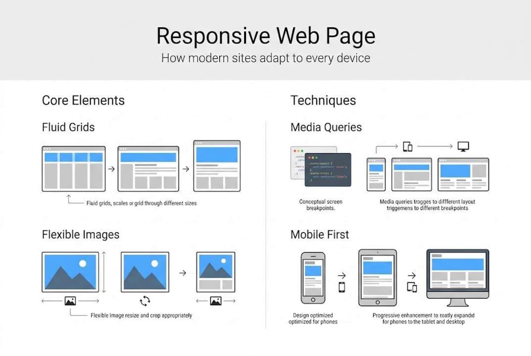
At its core, a responsive web page is one that automatically adjusts its layout, content, and visual elements to suit the screen size and device being used, whether that is a smartphone, tablet, laptop, or widescreen monitor. The goal is a seamless, consistent experience regardless of how someone accesses your site.
According to MDN’s explanation, responsive web design uses fluid grids, flexible images, and media queries to adapt layouts to any device screen size. This approach, often abbreviated as RWD, was formally introduced by web designer Ethan Marcotte in 2010 and has since become the global standard for professional web development.
Many SME owners still operate under an outdated belief: that having a “mobile version” of their site is enough. It is not. Separate mobile sites create duplicated content, split maintenance effort, and deliver inconsistent brand experiences. A well-built responsive site, by contrast, uses a single codebase that serves every device efficiently. For a detailed breakdown of current best practices, our responsive web design guide covers the full landscape.
To understand how these approaches differ in practice, the table below provides a direct comparison:
| Design approach | Layout behaviour | Codebase | Recommended for |
|---|---|---|---|
| Responsive | Fluid, adapts to any width | Single | All SMEs and modern sites |
| Adaptive | Fixed layouts per device | Multiple | Legacy systems only |
| Fixed | Rigid, no adaptation | Single | Internal tools only |
The key advantages of adopting a responsive approach for your SME include:
- Cost efficiency: One site to build, maintain, and update across all devices.
- Consistent branding: Your messaging and visuals remain intact on every screen.
- Better discoverability: Search engines favour single-URL responsive sites over fragmented mobile versions.
- Future-proofing: New screen sizes and device types are handled automatically by fluid layouts.
“Responsive web design is not about making your site fit a phone. It is about ensuring your business is accessible, credible, and competitive on every device your customers use.”
This single shift in perspective can transform how your SME approaches its entire digital presence.
Core mechanics: How responsive web pages work
Understanding the technical building blocks of responsive design equips you to make informed decisions when briefing a developer or evaluating an existing site. You do not need to write the code yourself, but knowing what drives responsiveness helps you ask the right questions.

CSS media queries are the engine of responsive design. They allow stylesheets to apply different rules depending on the device’s screen width, orientation, or resolution. Paired with using Flexbox and Grid, these CSS layout systems handle most structural responsiveness without requiring complex workarounds.
Here is how the core mechanics fit together:
- Viewport meta tag: Placed in the HTML head, this tag tells the browser to scale the page correctly on mobile devices. Without it, a responsive layout simply will not function as intended.
- Fluid grids: Columns and rows are defined using percentage-based widths rather than fixed pixel values, so they stretch and compress proportionally.
- Flexible images: Images scale within their containers using CSS rules like "max-width: 100%`, preventing overflow on smaller screens.
- Media queries with breakpoints: Common breakpoints at 480px, 768px, and 1024px trigger layout changes at the most critical screen-size thresholds.
- Relative units: Using rem, %, and vw instead of fixed pixels ensures spacing and typography scale smoothly across devices.
A vital strategic consideration here is the choice between a mobile-first approach and a desktop-first approach. Mobile-first means you design and code for the smallest screen initially, then use min-width media queries to progressively enhance the layout for larger screens. This approach is now considered the professional standard because it forces clarity and prioritisation of content.
Pro Tip: Always add the viewport meta tag <meta name="viewport" content="width=device-width, initial-scale=1"> to every page. Omitting it is one of the most common reasons a technically responsive site still breaks on mobile.
Breakpoints are guidelines, not rigid rules. Your content should dictate where layouts need to shift, not the dimensions of a specific popular device model. A site built around content flow, rather than device specifications, ages far more gracefully.
Mobile-first and modern methodologies
Moving beyond the foundational mechanics, modern responsive design has evolved significantly. The tools and techniques available today allow for far more sophisticated, nuanced layouts than were possible even three years ago. For SMEs building or rebuilding sites in 2026, these methodologies are not optional extras but essential components of a competitive digital strategy.
As noted in Scrimba best practices, mobile-first progressive enhancement is the preferred approach, combined with relative units, clamp() for fluid typography, and container queries for component-level responsiveness.
Here is a comparison of legacy versus modern responsive techniques:
| Technique | Legacy approach | Modern approach |
|---|---|---|
| Typography scaling | Fixed px values | clamp(min, preferred, max) |
| Layout system | Float-based grids | CSS Grid and Flexbox |
| Component responsiveness | Page-level only | Container queries |
| Unit preference | Pixels | rem, %, vw, vh |
For SMEs, the most actionable techniques to prioritise are:
- Container queries: Unlike media queries that respond to the browser viewport, container queries allow individual components (like a product card or pricing widget) to adapt based on the space available to them. This makes your UI modular and far more reusable.
- Fluid typography with
clamp(): Instead of jumping between font sizes at breakpoints,clamp()smoothly scales text between a minimum and maximum value. Your headings look intentional on every screen. - Logical properties: CSS logical properties (like
margin-inline) improve layouts across different writing directions, which matters if your audience includes multiple language groups.
The mobile-first website approach also carries significant SEO weight. Google uses mobile-first indexing, meaning it predominantly crawls and ranks the mobile version of your site. If your mobile experience is degraded, your search rankings reflect that, regardless of how polished your desktop version looks. Ensuring your site incorporates mobile-friendly website features is therefore a direct SEO investment.
Pro Tip: Use clamp() for your primary heading font size. A simple rule like clamp(1.5rem, 4vw, 3rem) eliminates the need for multiple media query overrides and produces cleaner, more consistent typography across every screen.
Going beyond basics: Testing, best practices, and pitfalls
Building a responsive site is only half the work. Ensuring it performs correctly across the real, fragmented world of devices and network conditions is where many SMEs fall short. The gap between a site that looks responsive in a browser emulator and one that genuinely works on a mid-range Android device or an older iPhone can be significant.
Responsive best practices in 2026 centre on content-driven breakpoints, avoiding hidden content on mobile, testing on physical devices, and meeting Core Web Vitals thresholds: LCP under 2.5 seconds, CLS under 0.1, and INP under 200 milliseconds.
These metrics directly influence both user experience and SEO, making them a business concern, not just a technical one. A slow-loading page on mobile costs you conversions. An unstable layout that shifts as the page loads damages trust and elevates bounce rates.
The most common pitfalls SMEs encounter include:
- Hiding content on mobile: Some developers collapse or entirely hide sections to simplify the mobile layout. Search engines still index hidden content, but users miss critical information. Always restructure rather than hide.
- Using only emulators for testing: Browser DevTools emulation is useful but not exhaustive. Physical devices reveal touch target issues, font rendering differences, and performance bottlenecks that emulators miss.
- Ignoring content-driven breakpoints: Building layouts around specific device sizes rather than where your content naturally breaks leads to awkward layouts on non-standard screens.
- Neglecting touch interaction: Buttons and links must meet a minimum tap target size. Tiny clickable elements frustrate mobile users and increase error rates.
- Overlooking page speed: Responsive layout alone does not guarantee speed. Unoptimised images, render-blocking scripts, and excessive third-party tools all degrade performance on mobile networks.
Pro Tip: Set up a simple testing protocol. After any major update, check your site on at least two physical mobile devices and run a Google PageSpeed Insights report. This takes under ten minutes and catches the majority of real-world issues before they affect visitors.
“The best responsive design is invisible. Users should never notice the layout is adapting. They should only notice that the site works perfectly, wherever they are.”
For technical implementation support, our guide on HTML5 and CSS for responsive web design provides structured, actionable guidance for development teams and business owners overseeing site builds.
Our perspective: Why most SMEs are still missing out on responsive web design
After working with businesses across multiple industries, we consistently observe the same pattern: SMEs acknowledge that responsive design matters, then deprioritise it when budgets or timelines tighten. The justification is usually that it is too expensive or too complex. Both assumptions are increasingly false.
Modern CSS frameworks, design systems, and development tools have made building a responsive site faster and more cost-effective than at any previous point. The real cost sits elsewhere. Every month an SME operates a non-responsive or poorly responsive site, it is losing customers who bounce from a broken mobile experience, losing search ranking because Google penalises poor mobile usability, and losing competitive ground to businesses that invested early.
The businesses we see gaining the most traction online are not always the ones with the biggest budgets. They are the ones that made responsiveness a non-negotiable requirement from day one and built iteratively from there. Even incremental improvements, fixing font sizes, improving touch targets, compressing images, can yield measurable gains in engagement and lead generation. Our responsive design service guide outlines how to approach this strategically without overextending resources.
Let us help you build a responsive website that grows your business
If this article has clarified what responsive web design requires and why it matters, the natural next step is ensuring your SME’s site actually delivers on those standards. Our team at CloudFusion specialises in custom web development built specifically around your business goals, audience behaviour, and growth targets. We do not apply generic templates. We build scalable, performance-driven sites that convert visitors into customers across every device. Whether you need a full site rebuild or a structured audit of your current responsiveness gaps, we are ready to engage. Request your web design quotation today and take the first concrete step toward a website that actively supports your business growth.
Frequently asked questions
What is the main difference between responsive and adaptive web design?
Responsive design adapts content fluidly for any screen size using flexible layouts, while adaptive design uses a set of fixed layouts triggered at specific, predefined breakpoints. Responsive is the preferred standard for modern SME websites due to its broader device compatibility.
How does responsive design impact SEO for SMEs?
Responsive web design enhances UX and SEO simultaneously because search engines like Google reward sites that deliver strong mobile experiences with better rankings. A single responsive URL also consolidates your SEO authority rather than splitting it across mobile and desktop versions.
Do I need a separate mobile site if I have a responsive web page?
No. A well-built responsive site serves all devices from a single codebase, which eliminates the cost and complexity of maintaining separate mobile versions while delivering a consistent brand experience to every user.
What are Core Web Vitals, and why are they important for responsiveness?
Core Web Vitals are Google’s benchmarks for real-world page performance, measuring loading speed (LCP), visual stability (CLS), and interaction responsiveness (INP). Meeting these performance thresholds directly affects both search rankings and conversion rates for SME sites.
How can I test if my SME website is truly responsive?
The most reliable method is testing on real devices across different screen sizes, combined with running Google PageSpeed Insights and checking your Core Web Vitals scores. Browser emulators are a useful starting point but should never be your only testing method.
Recommended


