
TL;DR:
- Choosing a mobile-first design agency is crucial because it prioritizes performance, usability, and content hierarchy from the start, unlike responsive design. Genuine mobile-first design improves load times, user engagement, and search rankings, which directly impact revenue and growth. Selecting an agency that uses documented systems, prioritizes accessibility, and measures outcomes ensures long-term digital success.
Choosing a mobile first design agency is one of the most consequential digital decisions your business will make, yet most organisations approach it with a fundamental misconception: that mobile-friendly and mobile-first are the same thing. They are not. Mobile-first design is a disciplined methodology that begins with the smallest viewport and builds upward, producing leaner interfaces, faster load times, and measurably better user engagement. This article breaks down what genuine mobile-first design entails, why it directly impacts your revenue, and how to evaluate an agency that truly delivers it.
Table of Contents
- What is mobile-first design and why it matters
- The business impact of mobile-first design: speed and conversions
- Designing for mobile usability: thumb reach, touch targets, and accessibility
- Ensuring mobile-first success: systematised design and SEO considerations
- Why most businesses misunderstand mobile-first design — and how to avoid the pitfalls
- Partner with Cloudfusion for expert mobile-first design solutions
- Frequently asked questions
What is mobile-first design and why it matters
True mobile-first design is not a desktop site squeezed into a smaller frame. The distinction matters enormously for your users and your business outcomes. A mobile-first design approach begins with the constraints of a small screen, limited bandwidth, and touch interaction, then progressively enhances the experience for tablets and desktops. As Framer’s design dictionary notes, a mobile-first design starts with the smallest mobile viewport and progressively enhances the layout for larger screens, ensuring mobile is not an afterthought.
This progressive enhancement philosophy produces a fundamentally different result from responsive design. Responsive design retrofits a desktop layout to shrink on smaller screens. Mobile-first design forces your team to make hard prioritisation decisions upfront: what content is truly essential, what interactions must feel effortless with a thumb, and what visual weight serves the user at this scale. Those decisions produce cleaner, faster, more focused interfaces that perform better across every device.
Here is what genuine mobile-first design prioritises:
- Content hierarchy: Only the most critical content and actions occupy prime mobile real estate, eliminating unnecessary clutter.
- Progressive enhancement: Layout, typography, and functionality expand as screen size increases, not the reverse.
- Performance by default: Images, assets, and code are optimised for mobile constraints from the start, not patched afterwards.
- Touch-first interactions: Navigation, buttons, and form elements are designed for fingers before cursors.
“Mobile-first is not a design trend. It is a structural decision that determines whether your digital product serves the majority of your users well or merely tolerates them.”
For businesses targeting South African consumers, this is especially relevant. Mobile internet usage in South Africa is the primary means of digital access for a significant portion of the population, making a disciplined mobile-first strategy not optional but essential. Coupling this with solid content optimization practices ensures your mobile audience receives relevant, fast-loading content every time.
The business impact of mobile-first design: speed and conversions
Understanding the concept is one thing. Seeing the numbers is another. Speed is the single most direct line between your mobile design decisions and your revenue. Research shows that mobile conversions drop 9.4% for every one-second delay in page load time, a figure that compounds quickly when your site takes three or four seconds to load on a mobile network.
Desktop users tolerate slow experiences more readily because they are typically on faster connections and in less time-pressured contexts. Mobile users are frequently on the move, comparing options, and making quick decisions. A half-second advantage over a competitor’s site is enough to shift purchase intent. Mobile-first design builds speed into the architecture, not as a retrofit.
| Design approach | Average load time | Typical conversion impact |
|---|---|---|
| Desktop-first, responsively adapted | 4.2 seconds on mobile | Baseline |
| Mobile-first, progressively enhanced | 2.1 seconds on mobile | Up to 20% higher conversions |
| Unoptimised mobile site | 6+ seconds on mobile | Significant drop in revenue |
These figures are directional rather than universal, but the pattern holds across industries. The benefits of a faster website extend beyond conversions to include lower bounce rates, higher session duration, and better SEO rankings, all of which compound into meaningful business growth.
Practical guidance on website speed optimisation can help you benchmark your current performance, while a clear understanding of how to improve conversions with digital solutions gives you the framework to evaluate what improvements will have the highest return.
Pro Tip: Ask any agency you are evaluating to show you Google PageSpeed Insights or Core Web Vitals scores for their recent mobile-first projects. A score above 90 on mobile is a meaningful indicator of disciplined performance work, not just aesthetic design.
Designing for mobile usability: thumb reach, touch targets, and accessibility
Speed gets users to your page. Usability determines whether they stay and act. Mobile UI/UX design for mobile is not simply a smaller version of desktop UX. It requires a specific ergonomic understanding of how people actually hold and use their phones.

Research from UXPin confirms that most users operate one-handed, meaning key interface elements should sit within the natural arc of thumb movement, and touch targets should be no smaller than 48×48 dp (density-independent pixels) to prevent accidental taps and input errors. When your primary call-to-action button sits at the top of a screen or is 20px wide, you are designing for a mouse, not a thumb.
A well-structured approach to mobile app UI design addresses these ergonomic factors as a foundation, not an afterthought. The practical implications for your business include:
- Thumb zone mapping: Primary navigation, CTAs, and key inputs placed in the lower two-thirds of the screen where thumbs naturally rest.
- Touch target sizing: All interactive elements meet the 48×48 dp minimum, with sufficient spacing between adjacent elements to prevent mis-taps.
- Gesture support: Swipe, pinch, and long-press interactions designed intentionally, not accidentally triggered.
- Form optimisation: Input fields trigger the correct keyboard type (numeric, email, text), reducing friction in checkout and contact flows.
Accessibility is the other pillar of mobile usability that separates serious agencies from those delivering surface-level mockups. The WCAG 2.2 standard addresses mobile accessibility comprehensively, covering visual, motor, auditory, and cognitive disabilities, with Level AA compliance recommended as the enterprise baseline. This is not a compliance checkbox. It is a business decision: approximately 15% of the global population lives with some form of disability, and an inaccessible mobile experience excludes them entirely.
Ensuring your digital product meets mobile-friendly website standards covers both the ergonomic and accessibility requirements your agency should deliver as standard practice.
Pro Tip: Request an accessibility audit report for any agency’s existing mobile work. WCAG 2.2 Level AA compliance should be documented, not claimed verbally. Tools like Axe or Lighthouse can produce these reports in minutes, so there is no excuse for an agency not to provide them.
Ensuring mobile-first success: systematised design and SEO considerations
Many businesses engage a mobile responsive design agency, receive attractive designs, and launch their site, only to discover inconsistent UI patterns across pages, accessibility regressions introduced during development, and unexpected drops in search rankings. These problems share a common root: the agency delivered designs without a governing system.
Top mobile design companies build and deliver design systems, which are documented libraries of components, spacing rules, typography scales, colour tokens, and interaction patterns. As UXPin’s research on enterprise mobile projects highlights, enterprise teams must use mobile-first design systems with documented components and spacing to maintain consistent UX and accessibility in development. Without this, each new page or feature becomes a gamble.
The SEO dimension is equally consequential. Google’s mobile-first indexing means the mobile version of your site is the primary version it crawls and ranks. If your mobile design strips out content, removes structured data, or omits internal links present on the desktop version, you will face ranking penalties. As Clarigital’s analysis of mobile-first indexing risks makes clear, content parity between mobile and desktop, including links and structured data, is essential for maintaining rankings.
Your agency’s mobile-first process should address the following systematically:
Design system requirements:
- Documented component library with mobile-first spacing and sizing
- Typography scale tested across small viewport sizes
- Colour contrast ratios meeting WCAG 2.2 Level AA across all states
SEO and content parity checklist:
- Confirm all desktop content exists on the mobile version in full.
- Verify structured data (schema markup) is present and correct on mobile pages.
- Ensure all internal links appear on the mobile version, not only desktop.
- Test canonical tags to confirm no mobile URL conflicts.
- Audit Core Web Vitals on mobile independently from desktop scores.
| Consideration | Desktop-first approach | Mobile-first approach |
|---|---|---|
| SEO indexing priority | Desktop version indexed first | Mobile version is primary index |
| Content parity risk | Lower risk historically | High risk if stripped-down mobile version |
| Design system consistency | Often desktop-centric | Mobile components govern all breakpoints |
| Accessibility testing | Often desktop-focused | Mobile gesture and screen reader testing included |
Understanding how to implement mobile design at a systems level is what separates agencies that produce short-term wins from those that deliver durable digital assets. Reviewing your overall mobile-first website strategy alongside landing page optimisation principles will give you a complete picture of what disciplined mobile-first execution looks like in practice.
Why most businesses misunderstand mobile-first design — and how to avoid the pitfalls
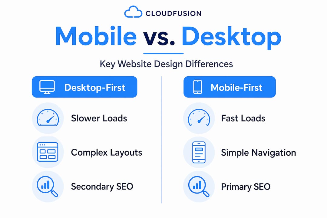
Here is an uncomfortable truth: the majority of agencies describing themselves as mobile-first are delivering responsive adaptations of desktop thinking. The distinction is not semantic. It has direct consequences for your users, your search rankings, and your conversion rates.
The misconception runs deep. As Framer’s definition confirms, mobile-first is commonly mistaken for simple responsive design, but true mobile-first demands prioritising mobile user experience as a foundation, something many agencies overlook. What you get instead is a desktop design with a CSS media query that collapses the layout at 768 pixels. It looks fine on a phone. It is not mobile-first.
The practical gap shows up in three places. First, performance: desktop-first sites adapted for mobile carry asset weights and code that mobile-first builds would never have included. Second, usability: navigation patterns designed for hover states do not translate well to touch, and agencies that did not start from a mobile-first position rarely catch these issues until after launch. Third, SEO: if the agency does not treat content parity as a non-negotiable, your mobile version becomes a liability in Google’s index.
What genuinely distinguishes a top mobile design agency is its ability to act as a strategic partner rather than a production vendor. The best agencies push back on your instincts when they conflict with mobile usability evidence. They present design systems rather than static mockups. They document accessibility compliance. They measure outcomes in conversion rates and Core Web Vitals, not just visual approval.
Businesses that recognise this distinction, and hire accordingly, consistently outperform competitors who treat mobile design as a visual exercise. The mobile-first website approach is ultimately a business strategy, and the agency you choose should be equipped to lead it.
Partner with Cloudfusion for expert mobile-first design solutions
With a clear understanding of what genuine mobile-first design demands, the next step is working with a partner who delivers it with discipline. Cloudfusion provides custom web development built on mobile-first principles, with design systems, accessibility compliance, and SEO-ready architecture as standard. Our mobile app development services are purpose-built for South African businesses seeking measurable digital growth, not just polished interfaces. We work transparently, document our processes, and measure outcomes against the metrics that matter to your business. If you are ready to move beyond responsive approximations and into a true mobile-first digital strategy, request a web design quotation and let us map out your mobile-first transformation.
Frequently asked questions
What is the main difference between mobile-first and responsive design?
Mobile-first design starts with the smallest screen as the primary design target and progressively enhances for larger viewports, whereas responsive design adapts an existing layout across screen sizes without that foundational mobile priority. The starting point determines the performance and usability outcomes, as mobile-first design builds up from mobile rather than scaling down from desktop.
Why is page load speed more critical for mobile conversions?
Mobile users are typically on variable network connections and make faster decisions, meaning even small delays have outsized consequences. Mobile conversions drop 9.4% per one-second delay in load time, a penalty that accumulates rapidly when sites are not optimised from the ground up for mobile performance.
How does WCAG 2.2 impact mobile-first design?
WCAG 2.2 establishes accessibility requirements that apply directly to mobile interactions, including touch target sizing, gesture alternatives, and screen reader compatibility. WCAG 2.2 guidelines recommend Level AA conformance as the standard for enterprise projects, making it a baseline expectation rather than an optional enhancement.
What should businesses look for when selecting a mobile-first design agency?
Prioritise agencies that deliver documented design systems, demonstrate WCAG 2.2 compliance, and can show measurable business outcomes from past mobile projects. Agencies that build systems ensuring thumb zone usability, accessibility testing, and SEO content parity consistently produce superior results compared to those delivering static visual mockups alone.
Recommended


