
TL;DR:
- Over 60% of web traffic is mobile, and responsive design boosts conversions and SEO.
- Responsive design uses flexible grids, media queries, and fluid images to adapt to any device.
- Prioritize mobile-first development for better user experience, higher ROI, and lower support costs.
Over 60% of web traffic is now mobile, yet a staggering 72% of users abandon sites that fail to adapt to their screen. Most business owners assume that simply having a website is enough to capture this audience. It is not. A site that looks polished on a desktop but breaks on a smartphone is actively costing you conversions, trust, and search engine rankings. Mobile responsive design is no longer a feature you add later — it is the foundation upon which effective digital engagement is built. This guide will demystify the concept, present the data, and give you actionable strategies to make responsiveness work as a genuine business asset.
Table of Contents
- What is mobile responsive design?
- The business case for responsive web design
- Core principles and strategies for mobile responsiveness
- Performance optimization and testing best practices
- Our perspective: why mobile responsive design is business-critical (and most get it wrong)
- How cloudfusion can help you achieve seamless mobile responsiveness
- frequently asked questions
Key Takeaways
| Point | Details |
|---|---|
| Mobile-first is essential | Prioritizing mobile design ensures your most critical content and customer journeys are optimized for the devices most people use. |
| Business ROI is powerful | Responsive redesigns lead to measurable gains in conversions, revenue, support savings, and SEO. |
| Performance drives results | Testing and optimizing for speed and usability on mobile is just as important as visual appeal. |
| Strategic approach wins | Businesses that treat responsiveness as a strategic, ongoing investment get lasting advantages over those who simply retrofit. |
What is mobile responsive design?
Now that you understand why mobile matters, let’s pinpoint what mobile responsive design truly means and why it’s often misunderstood.
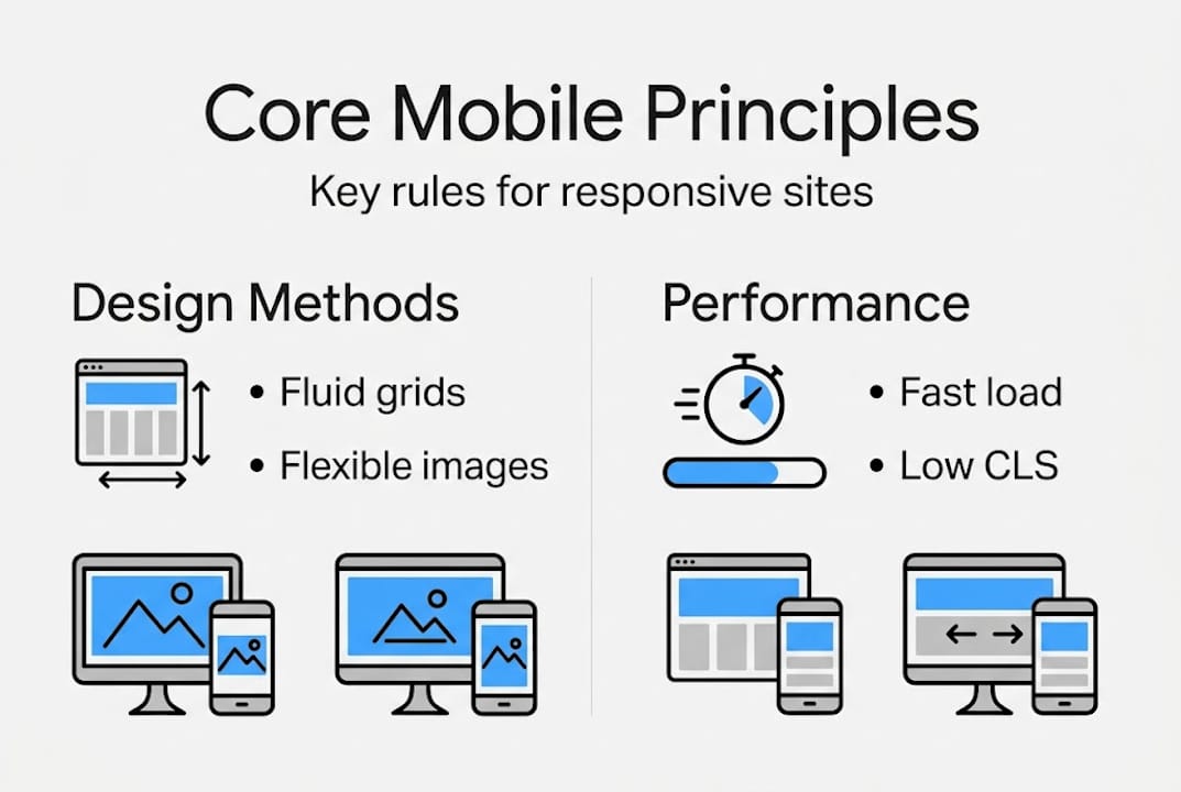
Mobile responsive design is an approach where a website’s layout, images, and content automatically adapt to fit any screen size, whether that’s a 4-inch smartphone, a tablet, or a 27-inch monitor. The goal is a seamless experience across every device without requiring separate codebases or manual adjustments. Many businesses confuse it with “mobile-friendly” design, which often just means text is readable on a phone. True responsiveness goes much further.
At its technical core, responsive design uses flexible grids, fluid images, and media queries to adapt layouts for any device. CSS Grid and CSS allow elements to stretch and compress proportionally, while media queries (rules that trigger layout changes at specific screen widths) ensure your content is always presented optimally. The viewport meta tag tells browsers how to scale your page, and fluid images scale within their containers rather than overflowing them.
Understanding responsive vs adaptive layouts is critical for your technology decisions. Here is a direct comparison:
| Feature | responsive design | adaptive design |
|---|---|---|
| Layout approach | fluidly scales layouts for any device | Fixed layouts per specific screen ranges](url) |
| Device targeting | Any screen size automatically | Pre-defined breakpoints only |
| Development effort | Single codebase | Multiple fixed layouts |
| SEO benefit | Higher, single URL | Lower, fragmented URLs |
| User experience | More consistent | Can feel abrupt between sizes |
For most businesses, responsive design is the preferred path because it scales effortlessly and consolidates your SEO authority into one URL.
Here are the core building blocks you need to understand:
- CSS Grid and CSS for fluid, multi-column layouts that reflow content automatically
- Media queries to apply different styles at defined screen width thresholds
- The viewport meta tag to control how mobile browsers render your page
- srcset on images to serve appropriately sized images per device
- Mobile-first CSS writing styles for small screens first, then scaling up
“A device” is a moving target. With thousands of device sizes in the market, responsive design is the only scalable, future-proof approach to ensure your brand experience stays consistent.
To see how to create a responsive web page that drives real business growth, the technical principles above must be applied with a strategic mindset, not just as a development checkbox.
The business case for responsive web design
With a foundation in what responsive design is, let’s see why enterprises and SMBs alike can’t afford to ignore it.
The commercial argument for responsive design is no longer theoretical. Over 60% of site visits are mobile, meaning the majority of your potential customers are already on their phones when they find you. A site that fails them on mobile is failing your core market.

The financial returns are equally compelling. Consider the following data:
| Business metric | Impact of responsive design |
|---|---|
| Return on investment | Up to 245% ROI on redesigns |
| Development cost savings | 35% lower vs separate mobile sites |
| Revenue growth | 2.1x faster than non-responsive peers |
| Support tickets | 40% reduction after responsive launch |
Beyond direct revenue, responsive design delivers compounding SEO gains. Google’s mobile-first indexing means it crawls and ranks your site based on its mobile version. A single, responsive URL consolidates your link equity and signals, rather than splitting authority across a mobile subdomain and a desktop site. When paired with improved Core Web CLS (cumulative layout shift) and LCP (largest contentful paint) scores, responsive design for business success becomes a measurable competitive advantage in search rankings.
For SMBs, the cost reduction angle is equally persuasive. Building and maintaining a separate mobile site doubles your development, hosting, and content management effort. A single responsive site eliminates that duplication, freeing budget for higher-impact marketing investments.
Here’s the practical breakdown for decision-makers:
- Higher conversions: responsive sites boost conversions 15 to 20% compared to their non-responsive counterparts
- Revenue acceleration: revenue grows 2.1x faster for businesses with fully responsive digital properties
- Lower support overhead: support tickets drop 40% because users encounter fewer layout errors and broken interactions
- SEO consolidation: a single canonical URL structure improves crawlability, link equity, and ranking signals
Pro tip: Before budgeting your next web project, calculate your current mobile bounce rate in Google Analytics. If it exceeds 60%, you are haemorrhaging qualified traffic that a responsive redesign could recover.
When evaluating enterprise web design elements, responsiveness should sit at the top of any requirements list, not as a nice-to-have but as a revenue protection measure.
Core principles and strategies for mobile responsiveness
Understanding the benefits, let’s get tactical — here are the proven principles and techniques that achieve true mobile responsiveness.
The most effective methodology starts with mobile-first design, which means beginning your design and CSS for the smallest screens first, then progressively enhancing layouts for larger displays. This forces prioritisation of essential content and performance, because you cannot rely on screen real estate to hide poor decisions. Many teams still design desktop-first and try to shrink down afterward, which consistently produces cramped, slow mobile experiences.
Breakpoints are the screen width thresholds at which your layout changes. A common mistake is setting them to match specific popular devices like iPhone or iPad screen sizes. Instead, breakpoints should be content-driven; open your design in a browser, shrink the window until the content looks awkward, and set a breakpoint there. This approach is device-agnostic and far more resilient over time.
Mobile-first is not a design trend. It is a business decision that ensures your highest-traffic audience segment receives the best possible experience from the start.
Here is a prioritised implementation checklist:
- Set the viewport meta tag ("`) in your HTML head
- Write CSS mobile-first, using
min-widthmedia queries to scale up, notmax-widthto scale down - Use CSS Grid or CSS for layouts that reflow naturally without breakpoint overrides
- Apply srcset on all images so browsers download only the resolution appropriate for the device
- Test touch targets: buttons and links must be at least 48x48 pixels to be comfortably tappable
- Set font sizes in relative units (rem or em) rather than fixed pixels so text scales with user preferences
For teams looking to adopt a mobile-first website approach systematically, the shift in mindset from “shrink desktop” to “expand mobile” is where the real quality improvement happens.
Pro tip: Use Chrome DevTools’ device toolbar to simulate dozens of screen sizes simultaneously during development. It catches layout breakage before users do.
When thinking about optimising for all devices, image handling and layout fluidity are the two highest-impact areas. Address those first before fine-tuning typography and spacing.
Performance optimization and testing best practices
Once your site is built responsively, ongoing performance and real-world testing make all the difference. Here is how to ensure lasting quality.
Performance and responsiveness are inseparable. A layout that adjusts beautifully but loads slowly will still drive users away. Google’s Core Web CLS are the three metrics that define a quality mobile experience:
- LCP (largest contentful paint): measures load speed of the largest visible element. Target: 2.5 seconds or under
- INP (interaction to next paint): measures responsiveness to user interactions. Target: 200 milliseconds or under
- CLS (cumulative layout shift): measures visual stability as the page loads. Target: 0.1 or under
CWV thresholds of LCP under 2.5s, INP under 200ms, and CLS under 0.1 directly influence both user retention and Google search rankings. Meeting these thresholds on mobile is harder than on desktop because of slower networks and less processing power.
On the technical side, responsive images cut bandwidth by up to 50%, directly improving LCP scores on mobile networks. Use the <picture> element and srcset attributes to serve WebP or similarly efficient formats at the appropriate resolution. CSS fluid layouts also reduce layout recalculation, which improves CLS scores naturally.
Pro tip: Run a Google meet Core Web CLS audit on your live site today. The “Mobile” tab in PageSpeed CLS will show exactly which elements are dragging your scores below the thresholds.
Your testing workflow should follow this sequence:
- Browser emulation first: use Chrome or Firefox DevTools to test common screen sizes and check for layout breakage
- Google CLS reports: generates scored reports on LCP, INP, CLS, and accessibility, with actionable fix recommendations
- Real device checks: emulators do not replicate actual touch behaviour, network conditions, or browser quirks, so always validate on physical devices
- Cross-browser testing: check Safari on iOS, Chrome on Android, and Samsung Internet as minimum baselines
When resolving mobile responsiveness issues, prioritise fixes that affect Core Web CLS first, because those have the highest combined impact on SEO and user satisfaction.
A structured testing strategy using DevTools, real devices, and CLS for Core Web CLS should be a recurring process, not a one-time launch activity. Schedule monthly audits and treat mobile performance as a living business metric.
Our perspective: why mobile responsive design is business-critical (and most get it wrong)
With technical foundations covered, let’s step back and look at responsive design through a business lens — a perspective most organisations miss.
Here is the hard truth: most organisations treat mobile responsiveness as a technical retrofit. They build a desktop site, then ask the development team to “make it mobile.” The result is a site that technically adapts but strategically fails, because the content hierarchy, conversion paths, and performance budgets were never designed with mobile users in mind.
Only 48% of mobile sites meet all Core Web CLS thresholds as of 2025. That figure is not a technical failure; it is a strategic one. Teams that prioritise visual design over performance, or desktop layout over mobile content flow, will always fall short of those benchmarks.
The organisations that see genuine ROI from responsive investments treat mobile as the primary channel, not a secondary concern. Every content decision, every image choice, and every conversion funnel is evaluated through the mobile lens first. That mindset shift, not any single technical technique, is what separates high-performing digital properties from average ones. You can read more about this in our responsive design service guide for 2026, which outlines how to align responsive strategy with measurable business outcomes.
How cloudfusion can help you achieve seamless mobile responsiveness
If you are ready to turn mobile responsiveness into real business growth, here is where cloudfusion can move you forward.
At cloudfusion, our approach to custom web development solutions goes beyond visual adaptation. We architect responsive sites that are engineered for performance, SEO, and conversion from the first wireframe. Every project is aligned to your specific business goals, whether that means meeting Core Web CLS thresholds, consolidating your mobile and desktop SEO authority, or building responsive interfaces into your mobile app development services. Our teams understand both the technical depth and the strategic implications of mobile-first design, which means your investment produces measurable outcomes. Ready to start? Request a web design quote and let us show you what a strategically responsive digital property can do for your business.

frequently asked questions
What is the difference between responsive and adaptive design?
responsive design fluidly scales layouts for any device, while adaptive design uses fixed layouts tailored to specific screen sizes, making responsive the preferred choice for consistent user experience across all screen widths.
Why is mobile responsive design important for business in 2026?
60% of web traffic is mobile, and responsive sites see 15 to 20% higher conversions, faster revenue growth, and improved SEO performance compared to non-responsive alternatives.
How do I test if my website is mobile responsive?
You can test using browser DevTools emulation, real physical devices, and Google CLS to measure performance scores and mobile usability across Core Web CLS metrics.
What are Core Web CLS and why do they matter for mobile sites?
Core Web CLS thresholds measure key user experience signals including load speed (LCP), interaction responsiveness (INP), and visual stability (CLS), all of which directly affect your Google search rankings and how long users stay on your site.
Recommended


