
TL;DR:
- Proper user flows and information architecture lay a strong foundation, reducing redesign costs later.
- Following platform-specific navigation patterns enhances usability and meets user expectations.
- Designing adaptive layouts and considering accessibility from the start ensures consistency and inclusivity across devices.
A poorly structured mobile app UI is one of the most expensive mistakes an SME can make. Users form opinions within seconds, and when navigation is confusing or content feels scattered, they abandon the app entirely, taking their business elsewhere. For product managers and designers working within resource constraints, getting the UI structure right from the start is not optional — it is the difference between a product that drives measurable retention and one that burns through development budgets on constant rework. This guide walks you through a practical, step-by-step approach to structuring your mobile app UI with confidence and strategic precision.
Table of Contents
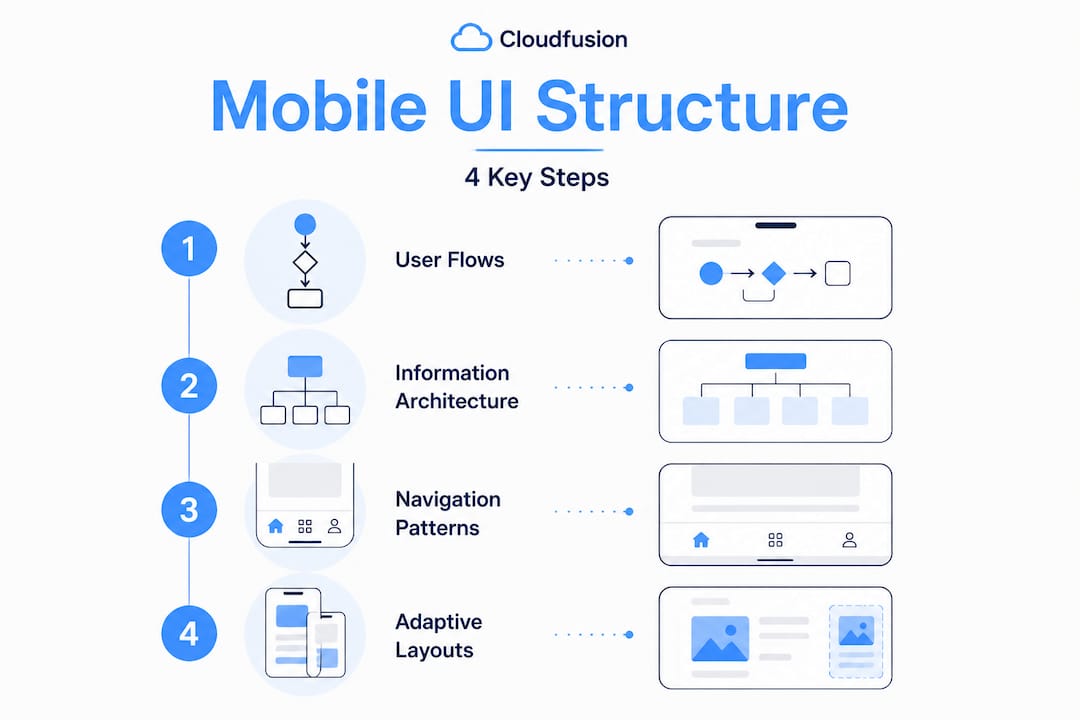
- Understand user flows and information architecture
- Select the right navigation patterns by platform
- Design adaptive layouts for devices and screens
- Plan for edge cases and accessibility up front
- Our perspective: Why native patterns are your SME superpower
- Accelerate your mobile success with expert partners
- Frequently asked questions
Key Takeaways
| Point | Details |
|---|---|
| Start with user flows | Mapping journeys and information architecture sets the backbone for effective UI. |
| Choose platform-native navigation | Aligning with iOS and Android conventions speeds development and meets user expectations. |
| Design for every screen | Adaptive layouts ensure your app works across all devices, from phones to foldables. |
| Plan accessibility early | Addressing edge cases and accessibility at the start prevents major rework later. |
| Leverage expert help | Professional UI structuring accelerates app delivery and improves results for SMEs. |
Understand user flows and information architecture
Now that you understand why a scattered UI results in user frustration, let us start with the invisible foundation of successful apps: user flows and information architecture.
Many product teams make the mistake of jumping straight into visual design, choosing colour palettes and icon styles before anyone has clearly defined how a user moves from point A to point B. This approach produces beautiful screens that fail to connect into a coherent experience. Starting with user flows and information architecture before visual screens is precisely what ensures that the app makes sense as a whole, not just screen by screen.
User flows describe the sequence of steps a user takes to complete a specific goal, such as purchasing a product or resetting a password. Information architecture (IA) is the broader discipline of organising, labelling, and structuring the content and features within your app so users can navigate it intuitively.
Skipping this phase produces predictable problems: orphaned screens that users cannot find, conflicting navigation paths, and features buried so deeply that adoption rates plummet. These are not hypothetical risks — they represent the most common reasons apps fail to retain users past the first week.
Core IA deliverables you should produce before any visual work begins:
- Site map: A hierarchical diagram showing every screen and how they relate to one another
- Flowcharts: Step-by-step diagrams illustrating decision points and user paths for key tasks
- Wireframes: Low-fidelity layouts that establish structure and content placement without visual styling
- Content inventory: A catalogue of all content types and how they will be grouped or categorised
“The most effective mobile application design processes treat information architecture as the structural engineering of the app — invisible when done well, catastrophic when ignored.”
Investing two to three days in solid IA work routinely saves weeks of redesign later in the project. For SMEs where every development sprint carries real cost, this upfront discipline is particularly high-leverage.
Select the right navigation patterns by platform
With user flows established, you are ready to give shape to navigation. But platform conventions matter — let us dive in.
Navigation is arguably the single most important structural decision in mobile UI design. Users arrive at your app with deeply ingrained expectations shaped by every other app on their device. When your navigation breaks those expectations, users experience friction immediately, even if they cannot articulate why.
Both iOS and Android have mature, research-backed navigation paradigms. Following mobile UI navigation basics for each platform is not a creative limitation — it is a strategic advantage that reduces cognitive load for users and development complexity for your team.
Navigation pattern comparison
| Navigation pattern | Platform fit | Best use case | Key limitation |
|---|---|---|---|
| Bottom navigation bar | iOS and Android | 3 to 5 top-level destinations | Limited to 5 items maximum |
| Tab bar | iOS (native) | Content-heavy apps with clear sections | Not ideal for task-oriented workflows |
| Navigation drawer | Android primarily | Apps with many secondary sections | Hidden by default; reduces discoverability |
| Nav rail | Android tablets | Medium to large screens | Not suited for compact phone displays |
| Modal sheets | Both platforms | Contextual actions and confirmations | Overuse creates a disorienting experience |
Android architecture guidelines specify bottom navigation accommodating up to 5 destinations, nav rails for tablets, Material 3 components, 48x48dp touch targets, and an 8dp grid system. These are not arbitrary numbers — they reflect years of usability research across millions of devices.

For iOS, Apple’s Human Interface Guidelines (HIG) prescribe tab bars with no more than five items, using clear iconography paired with labels. On Android, Material Design governs component behaviour, spacing, and interaction states. Familiarising yourself with both sets of guidelines is essential if you are building for both platforms.
Pros and cons by navigation pattern:
- Bottom navigation: Highly discoverable, thumb-friendly, supports quick switching. Cons: consumes vertical screen space, limits destination count
- Navigation drawer: Supports large numbers of sections without visual clutter. Cons: hidden by default, requires user awareness of the gesture or icon
- Nav rail: Ideal for landscape and tablet contexts, keeps destinations visible. Cons: unfamiliar to users accustomed to phone-only interactions
- Tab bar (iOS): Persistent and immediately scannable. Cons: can feel rigid if sections are not clearly distinct
Pro Tip: Limit your top-level navigation to three or four destinations wherever possible. Users can always access secondary features through progressive disclosure — but forcing them to scan six or seven navigation items immediately adds cognitive burden that directly reduces task completion rates. Explore UI/UX tips to understand how navigation density affects usability metrics across different user segments.
Design adaptive layouts for devices and screens
Once navigation choices are clear, structuring layouts to adapt fluidly across devices is your next priority.
The mobile landscape in 2026 is no longer just smartphones. Tablets, foldables, and large-screen Android devices are part of everyday business use, particularly in enterprise and SME contexts where employees might access the same app on multiple form factors throughout a single workday. Designing exclusively for a 390px-wide phone screen and then patching it for tablets is an approach that consistently produces poor results.
Adaptive and canonical layouts, such as the list-detail pattern, are the recommended approach for large screens, tablets, and foldables, paired with a single-activity architecture on Android to manage navigation state cleanly across screen sizes.
The list-detail layout is one of the most practical adaptive patterns available. On a compact phone screen, the list and detail views appear sequentially. On a tablet or foldable, they appear side by side, giving users immediate context without navigation overhead.
Common device sizes and recommended UI patterns
| Device type | Typical screen width | Recommended layout pattern |
|---|---|---|
| Compact smartphone | 320px to 480px | Single-column, stacked navigation |
| Standard smartphone | 360px to 430px | Bottom navigation, single-pane layouts |
| Large smartphone | 430px to 600px | Expanded bottom nav or nav rail |
| Small tablet | 600px to 840px | List-detail, two-column layouts |
| Large tablet or foldable | 840px and above | Multi-pane, nav rail, canonical layouts |
Step-by-step process for designing adaptive layouts:
- Define your layout breakpoints based on the Material 3 or HIG grid specifications before creating any screens
- Design for compact screens first, then progressively enhance the layout for larger screen sizes
- Use flexible grid systems (8dp baseline grid on Android, 8pt on iOS) to ensure all elements scale proportionally
- Test the list-detail transition on both compact and expanded viewports to verify state management behaves predictably
- Validate touch targets across all device sizes, ensuring interactive elements never fall below the 48x48dp minimum
- Document layout decisions per breakpoint so developers and QA teams share a single source of truth during implementation
A key reference for this work is wireframing adaptive layouts, which establishes structural intent clearly before any high-fidelity visual design begins. This sequential approach ensures your mobile app development team receives specifications that are actionable and unambiguous.
Plan for edge cases and accessibility up front
Great layouts can still fail if edge cases and accessibility are not built in from day one. Let us address these before visual polish.
Here is what most UI guides omit: the screens you design are not the only states your users will encounter. Every app has a range of edge cases — situations where the normal flow breaks down due to device constraints, user behaviour, or environmental conditions. Discovering these late in development is expensive. Addressing them in the design phase costs almost nothing.
Critical edge cases include safe area handling, particularly on iOS where the home indicator requires 34px of protected space at the bottom, gesture conflicts with system-level swipe-back navigation, network loss states, orientation changes between portrait and landscape, and empty states where no data exists to display.
Edge case and accessibility planning checklist:
- Design explicit empty states for every list or data screen
- Define error states for network failure, authentication expiry, and form validation failures
- Account for iOS safe areas and Android gesture navigation zones in all full-screen layouts
- Specify loading skeletons (placeholder UI) rather than spinners for data-heavy screens
- Ensure all text meets WCAG 2.1 AA contrast ratios (minimum 4.5:1 for normal text)
- Set minimum font sizes at 16px for body text to support readability without system scaling
- Label every interactive element with accessible names for screen reader compatibility
- Test orientation changes to confirm layouts reflow without data loss or broken states
“Accessibility built into the design phase costs roughly 30 times less to implement than accessibility retrofitted after launch. For SMEs with limited QA budgets, early planning is not just ethical — it is fiscally responsible.”
Pro Tip: Before your first usability test, run your wireframes or prototypes through platform-native accessibility tools. On iOS, use the Accessibility Inspector in Xcode. On Android, use the Accessibility Scanner app. Both tools flag contrast failures, missing labels, and touch target violations in minutes, long before any code is written. Reviewing mobile accessibility tips alongside these tools gives your team a practical framework for systematically improving inclusivity at every design stage.
Accessibility is not a checkbox to tick at the end of a project. It is a quality signal that directly reflects the maturity of your design process and the care your business extends to all users, regardless of ability.
Our perspective: Why native patterns are your SME superpower
Having seen the technical steps, here is what most guides gloss over — a strategic view tailored specifically for SMEs that are making real build-vs-buy decisions under real constraints.
Many SMEs fall into a specific trap: they want a unique brand identity in their app, and they interpret that to mean custom UI components everywhere. Custom navigation, custom sliders, custom tab behaviours. The result is an app that looks distinctive but behaves unpredictably, requires extensive developer documentation, increases QA time, and frustrates users who expect standard interactions to work the way they always have.
Platform-native patterns, specifically HIG for iOS and Material for Android, reduce development time and align with user expectations without requiring the compromises that cross-platform custom solutions typically impose. This is not about limiting creativity — it is about directing creative energy towards product differentiation that actually matters, such as content, workflow, and value delivery.
Here is an analogy that resonates with most product managers: the steering wheel in every car works the same way, regardless of the brand. No car manufacturer redesigns the steering wheel to express their identity, because doing so would make the car dangerous and disorienting. The identity lives in the dashboard design, the material quality, the driving feel. Your app’s identity should live in its content strategy, its tone of voice, its workflows — not in reinventing how a bottom navigation tab works.
From a maintenance standpoint, native components receive automatic updates when operating systems evolve. Custom components require your team to manually reconcile changes with each major OS release, which compounds over time into significant technical debt.
Practically speaking, the highest-return approach for most SMEs is to launch with fully native components, conduct rigorous user testing, gather real behavioural data, and then invest in selective customisation only where it demonstrably improves outcomes. This strategy accelerates time to market, reduces initial investment, and grounds every subsequent design decision in evidence rather than assumption.
For teams exploring business mobile app growth, the consistent finding is that apps built on native conventions outperform heavily customised alternatives in early retention metrics, simply because users spend less cognitive effort learning how to use them and more time experiencing the value they deliver.
Accelerate your mobile success with expert partners
Ready to move from planning to building? Impactful structure comes easier with the right partners behind you.
At Cloudfusion, our mobile app development experts work with SMEs to translate strategic UI planning into production-ready applications that perform across platforms and device sizes. Whether you need end-to-end development support or a structured design review of your existing app, our team brings the technical depth and product thinking required to execute efficiently. We also offer custom web development services for businesses building integrated digital ecosystems. Visit Cloudfusion to explore our full portfolio and connect with a specialist who understands the specific pressures and opportunities facing growing businesses in the digital landscape.
Frequently asked questions
What is the first step in structuring a mobile app UI?
Begin with mapping user flows and establishing solid information architecture before moving to visual design, ensuring the app’s navigation and content structure are coherent from the outset.
How do I choose the right navigation for my mobile app?
Follow platform guidelines — use tab bars or bottom navigation on iOS and Material 3 components like bottom nav or nav rail on Android, keeping top-level destinations to five or fewer.
Why are adaptive layouts important in mobile UI?
Adaptive canonical layouts let your app function correctly on phones, tablets, and foldables by adjusting UI patterns to match available screen real estate.
How can I ensure my app is accessible and robust?
Plan for accessibility and edge cases such as gestures, safe areas, and network loss from the design phase, and validate contrast ratios and touch targets before development begins.
Is it better to use native UI elements or custom designs?
For SMEs, native UI components are the preferred starting point because they reduce development time, lower maintenance overhead, and immediately align with the interaction expectations your users already carry.
Recommended


