TL;DR:
- Effective B2B SaaS website design focuses on conversion optimization through clear messaging, social proof, and fast post-form scheduling. Prioritizing speed, mobile usability, and targeted content reduces friction and significantly increases demo and trial signups. Targeted fixes often outperform costly redesigns, giving local South African businesses a competitive edge in digital growth.
B2B SaaS website design is the strategic process of building marketing websites that convert visitors into demo requests, free trials, and booked meetings through focused messaging, clear calls to action, and structure tailored to SaaS buyer journeys. Unlike general corporate or e-commerce sites, these marketing websites must accommodate longer sales cycles, multiple decision-makers, and a high degree of buyer scepticism. The difference between a SaaS site that generates pipeline and one that simply looks good comes down to conversion rate optimisation (CRO) discipline, not visual polish. This guide covers the design elements, messaging tactics, and CRO benchmarks that matter most for South African businesses building or refining their SaaS marketing presence in 2026.
What are the essential design elements for B2B SaaS websites?
Effective b2b saas website design starts above the fold. Your value proposition must be specific, not aspirational. “Automate your accounts payable in 48 hours” outperforms “The future of finance is here” every time, because it tells a buyer exactly what they get and how fast. Pair that headline with a single primary call to action, and you have the foundation of a high-converting SaaS homepage.

Social proof placement is where most teams get this wrong. Logos, testimonials, and review badges from platforms like G2 or Capterra must appear near decision points, not buried at the bottom of the page. Pages with credible social proof convert 12 to 34% higher than those without. That gap is too significant to treat proof as an afterthought.
Mobile optimisation is non-negotiable. Mobile-optimised SaaS pages with tap targets of at least 44 pixels, responsive forms, and fast load times convert at roughly double the rate of unoptimised pages. For South African businesses targeting decision-makers who frequently browse on mobile, this is a direct revenue consideration.
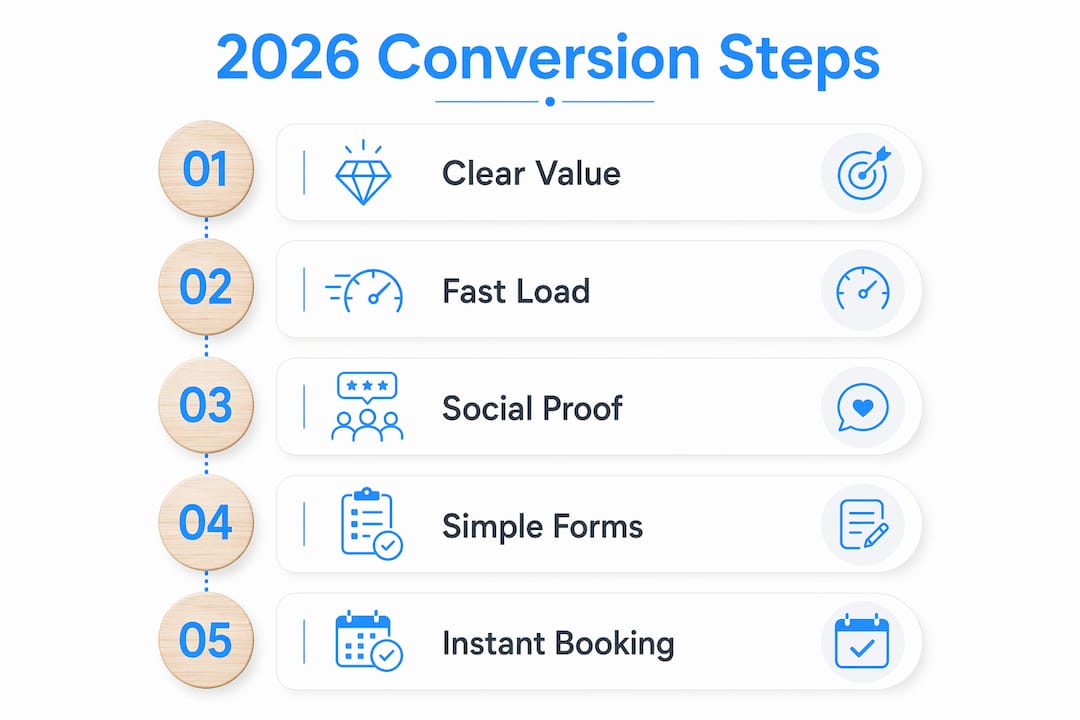
Key design elements that separate high-performing SaaS sites from average ones:
- Single primary CTA with benefit-driven copy (“Book a demo” beats “Request a demo” because it implies commitment and outcome)
- Above-the-fold clarity with a specific value proposition and supporting subheadline
- Social proof near conversion points, not just on a dedicated testimonials page
- Responsive forms with minimal required fields to reduce abandonment
- Page speed under 3 seconds, since load time directly affects bounce rate and conversion
Pro Tip: Strip competing CTAs from your demo and pricing pages. Every additional link or button you add reduces the probability that a visitor takes the one action you actually want.
Good UX design strategies for SaaS sites also account for the post-click experience. A fast-loading, well-structured page that leads to a confusing form or a dead-end thank-you page wastes every rand you spent on traffic.
How to optimise conversion through content and messaging
Messaging alignment is the highest-leverage activity in SaaS website optimisation, and it is consistently underestimated. When a visitor clicks an ad about “automated payroll for SMEs” and lands on a generic homepage, the disconnect kills intent. Message-to-traffic mismatch and overly complex forms are the top conversion killers across demo and trial signup flows.
Here is a structured approach to aligning your content with buyer intent:
- Match your headline to your traffic source. If your Google Ads campaign targets “HR software for manufacturing,” your landing page headline should reflect that exact context, not a generic product tagline.
- Write outcome-driven subheadings. Specify concrete benefits: “Reduce payroll errors by 90%” is more persuasive than “Powerful payroll tools.”
- Segment CTAs by visitor intent. A first-time blog reader needs a different prompt than someone who has visited your pricing page three times. Use tools like HubSpot or Segment to serve contextual CTAs based on behaviour.
- Embed CTAs within blog content. Contextual CTAs in blog content matched to the visitor’s journey stage increase demo and trial signups meaningfully. A post about “how to reduce churn” should link to a demo of your retention analytics feature, not your generic homepage.
- Reduce form friction progressively. Ask for only an email address at first contact, then use enrichment tools like Clearbit or OrbiSearch to fill in company data automatically. This approach, called progressive profiling, reduces abandonment without sacrificing lead quality.
- Use account-based messaging for high-value segments. If you are targeting enterprise accounts in financial services, your messaging, case studies, and CTAs should reflect that vertical specifically.
Pro Tip: Place a short product video (under 90 seconds) above the fold on your demo page. Video demonstrations of the actual product interface reduce buyer uncertainty and increase form submissions, particularly for complex SaaS products where the value is not immediately obvious from text alone.
The goal of content optimisation is not to be clever. It is to remove every reason a qualified buyer might hesitate.
What CRO tactics specifically benefit B2B SaaS sites in 2026?
Conversion rate benchmarks give you a target to aim at. Pricing page conversions for high-intent traffic typically run 6 to 12%. Self-serve signup pages average 5 to 8%. Enterprise demo request pages average 1.5 to 3%. Knowing where you sit relative to these benchmarks tells you whether you have a traffic problem or a conversion problem.
The single biggest CRO lever in 2026 is speed-to-lead. Instant post-form scheduling correlates with median qualified-to-booked rates of 62%, with top performers reaching 78% or higher. The mechanism is straightforward: when a prospect submits a demo request and immediately sees a calendar to book a meeting, they book. When they receive an email saying “someone will be in touch,” they move on. Integrating tools like Calendly or Chili Piper directly into your post-submit flow eliminates this drop-off entirely.
| CRO tactic | Expected impact | Priority |
|---|---|---|
| Instant post-form calendar booking | Qualified-to-booked rate up to 78% | High |
| Single CTA on demo pages | Significantly higher qualified lead rate | High |
| Social proof near conversion points | 12 to 34% conversion lift | High |
| Mobile optimisation (44px tap targets) | Up to 2x conversion rate | Medium |
| Message-to-traffic match on landing pages | Reduces bounce, increases form starts | High |
| Page load under 3 seconds | Reduces abandonment before form view | Medium |
Demo pages with one primary action and clear above-the-fold explanation perform significantly better than those with competing CTAs. Analysis of 50 high-converting demo pages with 70% or higher qualified-to-booked rates confirms this pattern consistently.
A practical CRO audit checklist for your SaaS site should cover:
- Message match: Does your page headline reflect the ad or link that brought the visitor here?
- Proof density: Are logos, testimonials, and review badges visible without scrolling?
- Mobile usability: Do forms work cleanly on a smartphone? Are buttons large enough to tap?
- Form friction: Are you asking for more than three fields before the visitor has seen value?
- Lead routing: Does your CRM automatically assign new demo requests to the right sales rep based on company size, industry, or geography?
Pro Tip: Treat the post-submit step as part of your design, not an afterthought. Eliminate thank-you page delays by integrating instant calendar scheduling directly into the same flow for maximum conversions.
How does B2B SaaS website design differ from other site types?
B2B SaaS websites require a distinct design focus compared to e-commerce or general corporate sites because of longer sales cycles, multiple decision-makers, and higher trust requirements. A retail site needs to convert in seconds. A SaaS marketing site needs to build enough credibility that a procurement committee will approve a six-figure annual contract.
This distinction matters when choosing a development partner. Many agencies are skilled at branding or visual design but lack experience with SaaS-specific conversion architecture. The right b2b web design firm understands the difference between a marketing website (which drives demos and trials) and in-app product UI (which drives feature adoption). Conflating the two leads to beautiful sites that generate no pipeline.
| Website type | Primary goal | Key design priority |
|---|---|---|
| B2B SaaS marketing site | Demo requests, trial signups | Conversion clarity, trust signals, speed |
| E-commerce site | Immediate purchase | Product discovery, checkout flow |
| Corporate branding site | Brand awareness | Visual identity, content depth |
| In-app product UI | Feature adoption | Usability, onboarding flow |
Platforms like Webflow have become the preferred choice for SaaS marketing sites because they allow marketing teams to iterate quickly without developer dependency. This matters because SaaS websites are not one-off projects. They are living assets that require ongoing testing, messaging updates, and CRO experiments. A site built on a rigid custom CMS becomes a bottleneck; a site on Webflow or a similarly flexible platform supports continuous growth.
For South African businesses, choosing a b2b website development company with relevant local digital expertise adds another layer of value. Understanding local buyer behaviour, payment infrastructure, and connectivity constraints shapes design decisions that a purely offshore agency might miss. Cloudfusion’s enterprise web design work reflects this local market awareness directly.
Most B2B teams see the biggest conversion lifts by fixing message mismatch, slow load times, form friction, weak social proof, and unclear CTAs rather than committing to full redesigns. This is a critical insight for businesses managing tight budgets: targeted improvements to existing pages often outperform expensive rebuilds.
What I have learned about SaaS websites that most teams overlook
The conversation about B2B SaaS website design almost always starts with visuals and ends there. Teams spend months debating colour palettes and hero image styles, then launch a site that looks polished but converts at 0.8% on the demo page. The visual layer is the last thing that needs fixing in most cases.
What I consistently see underinvested is the post-submit experience. A prospect fills in your demo request form, hits submit, and sees a generic “Thanks, we’ll be in touch” message. That moment is where pipeline dies. The prospect was at peak intent. They had just committed to raising their hand. And the site responded with a delay. Integrating real-time scheduling at that exact point, the way tools like Chili Piper enable, is the single change I would make first on almost any SaaS marketing site.
South African SaaS businesses have a genuine opportunity here. Digital adoption among local enterprises is accelerating, and the bar for SaaS website quality in many verticals is still relatively low. A site that applies even half the CRO principles in this guide will stand out clearly against local competitors who are still treating their website as a digital brochure rather than a conversion asset.
The other thing I would flag is the danger of form overengineering. I have reviewed lead forms asking for job title, company size, industry, phone number, and LinkedIn profile before a prospect has seen a single product screenshot. Pair that with web lead forms that are not mobile-friendly, and you have built a filter that removes your best leads, not your worst. Start with email only. Enrich the rest automatically.
The future of SaaS website design is personalisation at scale: dynamic content that adapts to the visitor’s industry, company size, or traffic source without requiring manual page duplication. That capability is becoming accessible to mid-market teams, not just enterprise players. The businesses that build this infrastructure now will have a compounding advantage over the next three years.
— Anton
How Cloudfusion builds conversion-driven SaaS marketing websites
Cloudfusion specialises in custom web development for businesses that need more than a good-looking site. If you are building or rebuilding a SaaS marketing website, the team at Cloudfusion brings the technical depth and conversion-focused thinking to design pages that actually generate demo requests and trial signups. From integrating real-time booking flows to building on scalable platforms suited for ongoing iteration, Cloudfusion delivers b2b website development services tailored to your product and your market. For SaaS businesses operating in South Africa, having a local partner who understands both the technical requirements and the buyer context makes a measurable difference. Give us a shout and let’s chat about your project.
FAQ
What is B2B SaaS website design?
B2B SaaS website design is the practice of building marketing websites specifically for software-as-a-service businesses, with a focus on converting visitors into demo requests, free trials, or booked meetings through clear messaging, trust signals, and minimal friction.
What conversion rates should a SaaS demo page target?
Enterprise demo request pages average 1.5 to 3% conversion, while self-serve signup pages average 5 to 8%. Top-performing demo pages with instant post-form scheduling reach qualified-to-booked rates of 78% or higher.
How does mobile optimisation affect SaaS website conversions?
Mobile-optimised SaaS pages with tap targets of at least 44 pixels and responsive forms convert at roughly double the rate of unoptimised pages, making mobile performance a direct revenue factor for any SaaS marketing site.
What makes a good B2B SaaS website different from a corporate site?
A B2B SaaS marketing site is built to drive pipeline through demo and trial conversions, while a corporate site prioritises brand awareness. SaaS sites require conversion architecture, social proof near decision points, and fast post-form booking flows that corporate branding sites do not need.
Should I redesign my SaaS site or optimise what I have?
Most B2B teams achieve the biggest conversion lifts by fixing message mismatch, form friction, weak social proof, and slow load times rather than committing to a full redesign. A targeted CRO audit typically delivers faster results than starting from scratch.
Key takeaways
Effective B2B SaaS website design requires conversion-focused structure, message alignment, and real-time booking flows, not visual redesigns.
| Point | Details |
|---|---|
| Conversion clarity above the fold | A specific value proposition and single CTA outperform generic headlines every time. |
| Social proof drives conversions | Pages with logos, testimonials, and review badges convert 12 to 34% higher than those without. |
| Instant scheduling eliminates drop-off | Post-form calendar booking lifts qualified-to-booked rates to 62% median and 78% at top performance. |
| Mobile optimisation doubles conversion | Responsive forms and 44px tap targets are non-negotiable for SaaS sites targeting mobile buyers. |
| Fix before you rebuild | Message mismatch, form friction, and slow load times deliver bigger lifts than full site redesigns. |
Recommended