
Most websites lose users not because of poor content, but because visitors cannot find what they need. Research reveals that global navigation visibility remains the single most critical factor for usability, yet many modern designs hide or minimize it in pursuit of minimalist aesthetics. This guide equips you with proven principles, strategic frameworks, and advanced methodologies to create navigation systems that enhance discoverability, boost engagement, and deliver measurable improvements in user experience. You will learn how to balance simplicity with comprehensive access, optimize for mobile contexts, and apply data-driven techniques to refine navigation architecture.
Table of Contents
- Key takeaways
- Foundations of effective website navigation design
- Design strategies for mobile and complex navigation scenarios
- Structuring navigation hierarchies: flat versus deep approaches
- Leveraging advanced methodologies to optimize navigation design
- Enhance your website navigation with expert web development solutions
- Frequently asked questions
Key Takeaways
| Point | Details |
|---|---|
| Global navigation visibility | Visible persistent global navigation significantly improves usability by helping users form accurate mental models of the site structure. |
| Balance simplicity and access | Expose enough options to support discovery without overwhelming users, tailored to site complexity and goals. |
| Mobile navigation alternatives | Mobile designs should combine approaches like bottom tab bars and hybrid visible elements rather than relying solely on hamburger menus. |
| Edge case management | Handle edge cases with clear canonical paths and filters to maintain navigation clarity. |
| Cognitive maps in navigation | Advanced techniques such as cognitive maps can optimize navigation by revealing relationships between content and user goals. |
Foundations of effective website navigation design
Effective navigation design rests on three interconnected principles: discoverability, consistency, and cognitive efficiency. Discoverability ensures users can locate content without extensive searching or guesswork. Consistency creates predictable patterns that reduce cognitive load across pages. Cognitive efficiency minimizes the mental effort required to understand and use navigation systems.
The most critical element is global navigation visibility. Despite trends toward hidden or minimalist navigation, research consistently shows that visible, persistent global navigation significantly improves usability. When users cannot see their options, they struggle to build accurate mental models of site structure. This uncertainty leads to hesitation, increased bounce rates, and abandoned tasks.
Consider these foundational requirements for robust navigation:
- Clear visual hierarchy distinguishing primary, secondary, and tertiary navigation levels
- Descriptive labels using familiar terminology from your target audience
- Logical grouping that reflects user mental models rather than internal organizational structures
- Consistent placement and behavior across all pages to build user confidence
- Adequate visual weight ensuring navigation elements stand out from content
Balancing simplicity with comprehensive access presents the core challenge. You need to expose enough options for users to understand available content without overwhelming them with choices. This balance depends heavily on your site’s complexity, content volume, and user goals.
Pro Tip: Test navigation labels with actual users before launch. Terms that seem obvious to internal teams often confuse real visitors who lack organizational context.
The relationship between navigation design and overall user experience through effective website design cannot be overstated. Navigation serves as the primary interface between users and content, making it the foundation upon which all other UX improvements build. Poor navigation undermines even the most compelling content and sophisticated functionality.
Modern web usability standards demand navigation systems that accommodate diverse user needs, including accessibility requirements, varied device contexts, and different levels of familiarity with your site. Universal design principles ensure navigation works for novice and expert users alike. Implementing elements of a user friendly website design requires treating navigation as a strategic asset rather than a cosmetic afterthought.
Design strategies for mobile and complex navigation scenarios
Mobile navigation presents unique constraints that demand specialized strategies. Screen real estate limitations force difficult trade-offs between visibility and content space. The hamburger menu has become recognizable, yet it still sacrifices discoverability by hiding options behind an icon. Users must remember to check the menu and expend extra effort to access navigation.
Smart mobile navigation combines multiple approaches rather than relying solely on hamburger menus. Bottom tab bars provide persistent access to primary destinations without consuming vertical space. Hybrid approaches use visible tabs for top tasks while tucking secondary options into a menu. Priority-based systems expose the most critical navigation items while progressively disclosing less frequent options.
Consider these mobile-specific strategies:
- Place primary navigation within easy thumb reach on larger devices
- Use recognizable icons paired with labels to improve comprehension
- Implement swipe gestures for horizontal navigation between related content
- Ensure touch targets meet minimum size requirements of 44x44 pixels
- Test navigation performance on actual devices, not just emulators
Complex content architectures introduce additional challenges. Multi-parent content, where items logically belong in multiple categories, creates ambiguity about canonical locations. Faceted navigation with multiple filter dimensions can overwhelm users with combinations. Cross-cutting taxonomies complicate mental model formation.
Handling these edge cases requires deliberate design decisions. Establish canonical paths for multi-parent content, designating one primary location while providing contextual links from secondary locations. Separate filters from navigation, treating them as refinement tools rather than structural elements. Use breadcrumbs to clarify the current path within complex hierarchies.
Pro Tip: Map out edge cases during the design phase rather than discovering them after launch. Document how your navigation system handles ambiguous content placement, seasonal variations, and unusual user paths.
The principles behind essential principles to enhance user experience apply with particular force to navigation design. Every navigation decision should prioritize user goals over organizational convenience. When internal structure conflicts with user expectations, redesign the structure.
For enterprise website features scalable cloud solutions, navigation complexity often reflects genuine business complexity. The solution is not simplification that hides important options, but intelligent information architecture that organizes complexity into comprehensible patterns. Progressive disclosure, contextual navigation, and smart defaults help users navigate sophisticated systems without feeling overwhelmed.
Structuring navigation hierarchies: flat versus deep approaches
Navigation hierarchy depth fundamentally affects user efficiency and satisfaction. Flat hierarchies minimize levels, typically keeping content within two or three clicks of the homepage. Deep hierarchies organize content into multiple nested levels, creating tree structures that can extend five or more levels deep.

Flat structures work best for sites with limited content volume or when users need rapid access to all options. E-commerce sites with narrow product ranges, portfolio sites, and small business websites often benefit from flat navigation. Users can scan available options quickly and reach any page with minimal clicking.
Deep hierarchies suit content-rich platforms where flat structures would create overwhelming menus. News sites, large e-commerce catalogs, knowledge bases, and corporate intranets typically require deeper navigation. The key is supporting deep navigation with breadcrumbs and clear wayfinding cues.
| Hierarchy type | Best for | User speed | Cognitive load |
|---|---|---|---|
| Flat (2-3 levels) | Simple sites, limited content | Faster for small sites | Lower initial load |
| Deep (4+ levels) | Content-rich platforms | Slower without breadcrumbs | Higher without wayfinding aids |
| Hybrid | Complex sites with clear sections | Balanced with good design | Manageable with clear structure |
Breadcrumbs transform deep navigation from a liability into an asset. They provide constant orientation, showing users their current location within the hierarchy. Users can jump back to any previous level without retracing steps. This reduces the cognitive burden of remembering paths through complex structures.
Consider these hierarchy design guidelines:
- Limit top-level categories to seven or fewer items to respect working memory constraints
- Ensure each level adds meaningful differentiation rather than arbitrary subdivision
- Balance breadth and depth based on content relationships, not arbitrary rules
- Use mega menus to preview deep structure at top levels
- Implement search as a complementary wayfinding tool for deep sites
Pro Tip: Analyze your analytics data to identify common entry points and user paths. Design your hierarchy to support actual user behavior rather than theoretical ideal paths.
Staying current with top web design trends for 2024 helps inform hierarchy decisions, but prioritize timeless usability principles over trendy approaches. Navigation structures should reflect content organization and user needs, not fleeting aesthetic preferences.
When planning website redesign considerations 2025, hierarchy restructuring often delivers the highest impact improvements. Moving from an organization-centric to a user-centric hierarchy can dramatically improve findability without changing visual design. The investment in proper information architecture pays dividends across the entire user experience.
Mastering master user experience web development requires understanding that hierarchy decisions cascade through every aspect of implementation, from URL structures to template design to content management workflows.
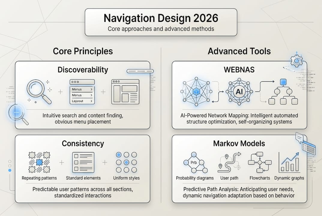
Leveraging advanced methodologies to optimize navigation design
Beyond foundational principles, advanced analytical methodologies provide empirical tools for navigation optimization. These approaches move beyond intuition and best practices to data-driven design informed by actual user behavior and cognitive patterns.
Cognitive mapping visualizes how users mentally organize information and expect to find content. By studying user-generated maps of site structure, designers identify mismatches between intended and perceived organization. This reveals where navigation labels confuse users, where expected categories are missing, and where logical groupings differ from designer assumptions.
The cognitive mapping process follows these steps:
- Recruit representative users from your target audience
- Ask participants to organize content cards into groups that make sense to them
- Have users label the groups using their own terminology
- Analyze patterns across participants to identify consensus and variation
- Design navigation structure reflecting dominant mental models
- Validate the new structure through usability testing
WEBNAS (Website Navigation Analysis System) provides quantitative metrics for navigation effectiveness. It measures path efficiency, navigation load, and structural complexity. These metrics enable objective comparison of design alternatives and identification of problematic areas requiring refinement.
Markov models predict navigation paths by analyzing sequences of page visits. By understanding probable next steps from any given page, designers can optimize navigation placement and predict where users might get stuck. This probabilistic approach reveals navigation patterns invisible in aggregate analytics.
| Methodology | Primary benefit | Data required | Complexity |
|---|---|---|---|
| Cognitive mapping | Reveals user mental models | Card sorting sessions | Medium |
| WEBNAS | Quantifies navigation efficiency | Site structure data | High |
| Markov modeling | Predicts navigation paths | Sequential clickstream data | High |
| Heat mapping | Shows interaction patterns | User session recordings | Low |
These advanced methods complement rather than replace traditional usability testing. Cognitive maps inform initial structure, analytics identify problem areas, and usability testing validates solutions with real users attempting real tasks.
Pro Tip: Start with simpler methods like card sorting and heat mapping before investing in complex modeling. Build analytical sophistication as your navigation design practice matures.
Integrating these methodologies into website development processes ensures navigation decisions rest on evidence rather than assumptions. The upfront investment in proper analysis prevents costly redesigns and delivers measurable improvements in user success rates.
Staying informed about web design best practices includes understanding emerging analytical tools that make sophisticated navigation analysis accessible to more teams. Cloud-based analytics platforms increasingly incorporate navigation-specific metrics and visualizations that were previously available only through custom development.
Enhance your website navigation with expert web development solutions
Implementing the navigation strategies outlined in this guide requires both design expertise and technical capability. Custom web development services provide the foundation for sophisticated navigation systems that adapt to user context, device capabilities, and content complexity. Professional developers ensure navigation performs flawlessly across browsers and devices while maintaining accessibility standards.
Reliable infrastructure supports seamless navigation experiences. Web hosting packages optimized for performance ensure navigation elements load instantly, preventing the frustration of delayed interactions. Fast response times are essential for mobile navigation where users expect immediate feedback.
For businesses extending their digital presence beyond websites, mobile application development brings navigation design principles into native app contexts. Consistent navigation patterns across web and mobile platforms create cohesive experiences that build user confidence and reduce learning curves.
Frequently asked questions
What is effective website navigation design?
Effective website navigation design enables users to find content quickly and confidently through clear structure, consistent patterns, and appropriate hierarchy. It balances comprehensive access with simplicity, avoiding both overwhelming choice and hidden options. Good navigation feels invisible because users focus on content rather than struggling with the interface.
What are common navigation design challenges?
Designers frequently struggle with balancing breadth versus depth in hierarchies, accommodating mobile constraints, and handling edge cases like multi-parent content. Maintaining consistency across diverse page types while supporting different user goals creates additional complexity. Organizational politics often pressure designers to prioritize internal structure over user mental models.
Why is mobile-friendly navigation important?
Mobile devices account for the majority of web traffic, making mobile navigation critical for reaching users. Touch interfaces, smaller screens, and varied contexts demand navigation approaches optimized for mobile constraints. Poor mobile navigation directly impacts conversion rates, engagement metrics, and overall user satisfaction.
How can I improve mobile navigation discoverability?
Avoid relying exclusively on hamburger menus, which hide options and reduce discoverability despite widespread recognition. Combine hamburger menus with visible bottom tab bars that expose primary destinations. Use hybrid approaches placing top tasks in persistent navigation while tucking secondary options into expandable menus. Test navigation with actual users on real devices to identify discoverability issues.
What factors determine using flat versus deep navigation hierarchies?
Site size and content volume are primary factors, with flat hierarchies faster for sites with limited content and deep structures better for content-rich platforms. Content relationships and user task patterns also influence optimal depth. Breadcrumbs significantly improve deep navigation usability by providing constant orientation and quick backtracking. Balance hierarchy depth against menu complexity to avoid overwhelming users at any single level.
How do cognitive maps improve website navigation design?
Cognitive maps reveal how users mentally organize information, showing where designer assumptions diverge from user expectations. This visualization guides intuitive menu creation using terminology and groupings that match user mental models. Data-driven design based on cognitive mapping reduces confusion and improves findability by aligning navigation structure with natural user thinking patterns.
Recommended


