
TL;DR:
- Building fully responsive websites requires understanding flexible layouts, media queries, and accessibility.
- Container queries and modular design enhance adaptability beyond simple viewport-based breakpoints.
- Thorough testing on real devices and browsers ensures accessibility, performance, and layout integrity.
Designing for seamless experiences across every screen size remains one of the most persistent challenges in modern web development. Conflicting advice, outdated techniques, and the sheer variety of devices make it easy to build layouts that look polished on a desktop but fall apart on a mid-range Android phone. The freeCodeCamp Responsive Web Design v9 certification addresses this directly, offering hundreds of hours of interactive lessons, five certification projects, and a 50-question exam that tests real implementation skills. This guide walks you through preparation, execution, accessibility, troubleshooting, and verification so you can build responsive sites with confidence.
Table of Contents
- What you need to start: Tools, prerequisites and freeCodeCamp curriculum overview
- Step-by-step guide: Building a responsive layout with Flexbox and Grid
- Accessibility and edge cases: Making designs truly responsive
- Troubleshooting and verification: Testing your responsive design
- Why modular responsive design is the new standard
- Next steps: Bring your responsive design to reality with custom web development
- Frequently asked questions
Key Takeaways
| Point | Details |
|---|---|
| Modern curriculum matters | freeCodeCamp’s Responsive Web Design v9 certification delivers hands-on, relevant training for today’s devices. |
| Flexbox and Grid mastery | Combining Flexbox and Grid enables scalable layouts that adapt to all screen sizes with minimal code. |
| Accessibility is essential | Responsive design must include keyboard navigation, touch targets, and clear focus management for all users. |
| Test and verify | Thorough testing across devices, including accessibility checks, ensures designs work properly everywhere. |
| Container queries unlock modularity | Using container queries, designers can build flexible, context-aware components for future-proof responsiveness. |
What you need to start: Tools, prerequisites and freeCodeCamp curriculum overview
Before writing a single line of CSS, it pays to understand what the curriculum demands and what tools will support your workflow. The freeCodeCamp curriculum is structured around modules that build progressively, moving from foundational HTML and CSS concepts through to fully responsive certification projects. You do not need prior framework experience, but a working knowledge of HTML structure and basic CSS properties will accelerate your progress significantly.
Here is what you need to get started:
- A code editor: Visual Studio Code is the industry standard, with extensions for live preview and CSS linting.
- A modern browser: Chrome or Firefox, both of which include robust developer tools for device emulation.
- Multiple test devices: Even a secondary smartphone reveals layout issues that emulators miss.
- Basic understanding of the box model: Margin, padding, and border behaviour underpins every responsive layout decision.
- Familiarity with HTML semantics: Understanding how to structure content with semantic HTML improves both accessibility and maintainability.
The curriculum covers semantic HTML, CSS Flexbox, CSS Grid, responsive design principles, forms, and accessibility in a structured sequence. Understanding the distinction between responsive vs adaptive design is also worth clarifying early, as it shapes how you approach breakpoints and layout logic throughout the course.
| Prerequisite | Importance | Where to strengthen it |
|---|---|---|
| Semantic HTML | Critical | freeCodeCamp HTML module |
| CSS box model | High | MDN Web Docs |
| Basic accessibility principles | High | freeCodeCamp accessibility module |
| Browser dev tools | Medium | Chrome DevTools documentation |
| Version control (Git) | Useful | GitHub Learning Lab |
For a broader technical foundation before starting, the HTML5 and CSS responsive guide provides practical context on how these technologies interact in real projects.
Pro Tip: Start with the Survey Form certification project early in your learning. It forces you to apply form layout, label association, and basic responsiveness simultaneously, giving you a fast, practical feedback loop that accelerates understanding of the core concepts.
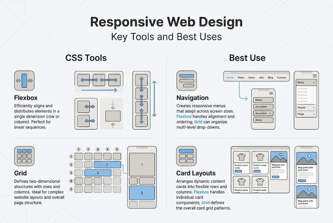
Step-by-step guide: Building a responsive layout with Flexbox and Grid
Once your tools are in place and the curriculum structure is clear, the real work begins: building layouts that adapt intelligently across screen sizes. The most effective approach starts with a mobile-first mindset, where you design for the smallest viewport first and layer complexity upward.
- Set your viewport meta tag. Add "` to every HTML document. Without it, mobile browsers render pages at desktop width and scale down, breaking your layout entirely.
- Build the base layout with Flexbox. Use Flexbox for one-dimensional layouts: navigation bars, card rows, and form fields. Set
display: flexon the container and useflex-wrap: wrapto allow items to reflow naturally as the viewport narrows. - Layer CSS Grid for two-dimensional structures. Grid excels at page-level layouts where both rows and columns need precise control. Define your grid with
grid-template-columnsand usefrunits to create proportional, fluid columns. - Apply media queries at logical breakpoints. Rather than targeting specific devices, set breakpoints where your content visually breaks. Common starting points are 480px, 768px, and 1024px, but your content should dictate these values.
- Introduce container queries for modular components. Container queries enable component-level responsiveness that responds to the parent container’s size rather than the viewport, making components truly portable across different layout contexts.
- Test at every stage. Resize your browser continuously as you build, not only at the end.
| Layout tool | Best use case | Key property |
|---|---|---|
| Flexbox | Navigation, card rows, form fields | flex-wrap, justify-content |
| CSS Grid | Page structure, image galleries | grid-template-columns, fr |
| Container queries | Reusable components | @container, cqi units |
| Media queries | Global breakpoints | @media (min-width) |
For a deeper look at how responsive design decisions affect business outcomes, the business importance of responsive design provides strategic context that complements the technical implementation. You can also explore advanced responsive techniques for going beyond standard media queries.
Pro Tip: Use grid-template-columns: repeat(auto-fit, minmax(250px, 1fr)) for card grids. This single line creates a fully adaptive, query-less grid that reflows from one column to many without a single media query, saving significant code and maintenance overhead.
Accessibility and edge cases: Making designs truly responsive
Building a layout that reflows correctly is only half the task. A truly responsive design must also be usable by everyone, on every device, under real-world conditions. This is where many developers stop short, and where the most impactful improvements are still available.

Over 60% of global web traffic now originates from mobile devices, which means accessibility failures on small screens affect the majority of your users, not an edge case minority. Addressing these issues is not optional; it is a core deliverable.
Key edge cases and accessibility requirements to address:
- Navigation menus: Hamburger menus must be keyboard accessible and announce their open or closed state to screen readers using ARIA attributes.
- Touch targets: Touch targets must be at least 44px in both width and height to meet usability standards for users with motor impairments.
- Horizontal scrolling: Avoid it entirely on mobile. A single element with a fixed width wider than the viewport will trigger horizontal scroll and break the user experience.
- Keyboard navigation: Every interactive element must be reachable and operable via keyboard alone. Test using Tab, Enter, and arrow keys without a mouse.
- Focus management: When modals or off-canvas menus open, trap focus within them. When they close, return focus to the triggering element.
- Alt text and semantic structure: Images must have descriptive alt attributes, and headings must follow a logical hierarchy (H1, H2, H3) to support screen reader navigation.
For practical guidance on resolving layout failures on small screens, solving mobile responsiveness problems covers the most common issues with actionable fixes. You should also review website accessibility guidelines to ensure your implementation meets recognised standards.
Responsive design without accessibility is an incomplete solution. A layout that reflows beautifully but excludes keyboard users or screen reader users has failed a significant portion of its audience.
Pro Tip: Run your site through Google’s Core Web Vitals assessment and target a Cumulative Layout Shift (CLS) score below 0.1 and a Largest Contentful Paint (LCP) under 2.5 seconds. These metrics directly reflect how stable and fast your responsive layout feels to real users, and they influence search rankings.
Troubleshooting and verification: Testing your responsive design
Accessibility and layout work must be validated under realistic conditions. A site that looks correct in your editor can still fail in production due to image sizing, font loading, or third-party scripts that alter layout dimensions. Systematic testing eliminates these surprises before they reach users.
Follow this verification checklist before any deployment:
- Emulate devices in browser dev tools. Chrome DevTools and Firefox Responsive Design Mode allow you to simulate dozens of screen sizes and pixel densities. Test at 320px (small mobile), 375px (standard mobile), 768px (tablet), and 1280px (desktop) as a minimum.
- Test on physical devices. Emulators do not replicate touch behaviour, font rendering, or performance constraints accurately. Test on at least one real Android and one iOS device.
- Check images and media. Ensure images use
max-width: 100%and that video embeds are wrapped in a responsive container. Oversized images are the most common cause of horizontal overflow. - Validate HTML and CSS. Use the W3C Markup Validation Service and the W3C CSS Validator to catch structural errors that may cause inconsistent rendering across browsers.
- Test form usability on mobile. Verify that input fields trigger the correct keyboard type (numeric, email, tel) and that labels remain visible when the keyboard opens.
- Review Core Web Vitals in Search Console. Google Search Console’s Core Web Vitals report identifies real-world performance issues grouped by device type.
| Common mistake | Symptom | Fix |
|---|---|---|
| Missing viewport meta tag | Mobile renders at desktop width | Add viewport meta to <head> |
| Fixed-width elements | Horizontal scroll on mobile | Replace px widths with % or max-width |
| Non-accessible touch targets | Users miss buttons on mobile | Set minimum 44px height and width |
| Unoptimised images | Slow LCP, layout shift | Use srcset, loading="lazy", explicit dimensions |
| Missing focus styles | Keyboard users lose their place | Restore :focus-visible styles in CSS |
The freeCodeCamp certification projects are structured to give you hands-on experience building real responsive sites using Flexbox, Grid, and media queries, making them an ideal practical reference when troubleshooting your own implementations. For a broader strategic view, the complete responsive design guide and the business benefits of accessibility are worth reviewing alongside your testing process.
Pro Tip: Use Chrome DevTools’ network throttling combined with device emulation to simulate a mid-range device on a 3G connection. This single test reveals performance issues that would never appear on a fast desktop machine, and it closely mirrors the real conditions many mobile users experience.
Why modular responsive design is the new standard
Most developers still think of responsive design as a system of media queries tied to viewport breakpoints. That model made sense when the device landscape was predictable. It no longer is. Foldable phones, ultrawide monitors, and embedded browser contexts have made viewport-based breakpoints an unreliable foundation for complex component libraries.
Layering container queries atop media queries creates truly modular, context-aware components that respond to where they are placed, not just how wide the screen is. A card component inside a narrow sidebar should behave differently from the same card in a full-width grid, and container queries make that distinction possible without duplicating code.
The shift toward modular responsiveness also changes how you should think about breakpoints. Rather than asking “at what screen width does this break?”, the better question is “in what context will this component be rendered?” That reframe, combined with the contrast between responsive and adaptive approaches, positions your codebase to handle device variability that does not yet exist. Future-proofing is not about predicting every device; it is about building components that adapt to their context by design.
Next steps: Bring your responsive design to reality with custom web development
Mastering responsive design principles through structured learning is a significant step forward, but translating that knowledge into production-ready, business-grade websites requires more than a certification. At Cloudfusion, we build custom web development solutions that are architected for performance, accessibility, and scalability from the ground up. Whether you need a fully responsive marketing site or a complex web application, our team applies the same principles covered in this guide at an enterprise level. Pair your development with reliable domain registration and managed hosting to ensure your responsive site reaches users with speed and consistency. Ready to move from learning to launching? Request a web design quote and let us help you build it right.
Frequently asked questions
What is the difference between responsive and adaptive design?
Responsive design adapts fluidly using flexible layouts and fluid grids, while adaptive design uses fixed layouts that switch at predefined breakpoints. Responsive design is generally preferred for SEO and long-term maintenance.
How hard is the freeCodeCamp Responsive Web Design v9 certification exam?
The 50-question certification exam tests practical knowledge gained through interactive lessons, labs, and five real projects. It is designed to evaluate applied understanding rather than theoretical recall, making consistent project work the best preparation.
What are container queries and why are they important for responsive web design?
Container queries allow CSS rules to respond to a parent container’s dimensions rather than the viewport, enabling components to adapt based on their placement context. This makes design systems far more modular and portable across different layout environments.
How do I test my responsive site for accessibility?
Verify touch targets meet 44px minimums, test keyboard navigation thoroughly, and check focus management for modals and menus. Combine automated tools like Lighthouse with manual keyboard and screen reader testing for reliable coverage.
Recommended


