
TL;DR:
- A responsive branding workflow uses tiered logo systems and fluid layouts to ensure brand consistency across all devices. It emphasizes designing four logo variants for different pixel ranges, adopting a fluid canvas over fixed breakpoints, and incorporating user-centric testing and accessibility standards. Proper asset organization, naming conventions, and continuous evaluation are essential for maintaining a cohesive and effective digital brand presence.
A responsive branding design workflow is a structured process that keeps your brand legible, consistent, and effective across every device size by combining tiered logo systems, fluid canvas layouts, and user-focused design principles. Most business owners treat branding as a single deliverable. The reality is that a logo designed for a desktop header will often appear blurred or illegible at 32px on a mobile screen. The industry term for solving this is adaptive visual identity design, and the responsive branding design workflow is the practical framework that makes it happen. Tools like Adobe Illustrator, Etch, and frameworks such as Aaker’s Brand Identity Model are central to getting this right.
What does a responsive branding design workflow require?
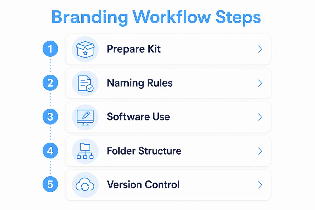
Before you build anything, you need the right foundation. The prerequisites fall into three categories: software, file formats, and brand asset variants.
Software you need:
- Adobe Illustrator for creating vector logos in multiple configurations
- SVG editors (such as Inkscape or Figma) for web-ready, resolution-independent files
- Etch for generating auto-responsive media and container queries in your layouts
- Figma or Sketch for building and sharing brand kits across teams
File formats to maintain:
- SVG for all web-facing logo use (scales without quality loss)
- PNG at multiple resolutions (1x, 2x, 3x) for raster contexts
- PDF for print and partner distribution
- AI or PSD source files for internal editing and version control
Your brand kit must include at minimum a primary logo, a simplified mark, and a favicon. High-contrast logo versions and clear size minimums are non-negotiable parts of any professional brand kit, particularly to meet WCAG accessibility standards. This matters for South African businesses targeting diverse audiences across varying device quality levels.
Naming conventions are often overlooked but critically important. A file named logo-v3-FINAL2.svg is a liability. Use descriptive, searchable names like brand-primary-logo-dark-bg-v1.svg so any team member or partner can locate the right asset without asking.

| Tool or Format | Primary Use | Why It Matters |
|---|---|---|
| Adobe Illustrator | Logo creation and editing | Produces scalable vector artwork |
| SVG | Web logo delivery | Resolution-independent at all sizes |
| Etch | Responsive layout queries | Automates fluid canvas breakpoints |
| PNG (multi-res) | Raster contexts and social media | Ensures clarity on high-density screens |
| Print and partner distribution | Preserves colour and layout fidelity |
Pro Tip: Create a shared brand folder structure with subfolders for logos, colours, typography, and UI elements. Label each subfolder by platform context, such as “web,” “print,” and “social,” to eliminate version confusion across teams.
How does the multi-tier responsive logo system work?
The four-tier logo system is the single most important structural concept in responsive branding. It transforms one logo into a full system that covers every digital scale. Each tier is designed for a specific pixel range, not as an aesthetic choice, but as a response to legibility physics.
| Tier | Pixel Range | Design Guidelines |
|---|---|---|
| Favicon | 16px | Single icon or initial only; no text |
| Simplified Mark | 32px | Drop taglines and fine detail; bold shapes only |
| Primary Mark | 64px | Retain icon and abbreviated wordmark |
| Full Lockup | 80px and above | Complete logo with tagline and all elements |
The design rules at each tier are specific. At 16px and 32px, you must drop hairlines and increase spacing to prevent logos from appearing blurry or illegible on small mobile devices. Thin strokes that look elegant at full size become visual noise at small scales. Curves must be simplified. Counter-spaces (the open areas inside letters like “O” or “B”) must be widened. The principle is to prefer mass over outline.
Here is something many designers miss: the decision to simplify at smaller sizes is not a creative compromise. It is a technical requirement driven by how screens render pixels. A logo that ignores this will actively damage brand perception on mobile, where most South African users now access digital content.
Audit your existing logo at 16px, 32px, and 64px before building your tiers. Open your current SVG in a browser, resize the window, and observe where the design breaks down. Those breakdown points define exactly where each tier needs to take over.
Pro Tip: When designing your simplified mark, remove every element that is not essential to recognition. If your brand is still identifiable with just the icon and no text, your simplified mark is working correctly.
What is the fluid canvas workflow for responsive brand layouts?
The fluid canvas approach replaces fixed breakpoints by adapting design to continuous device width ranges. This produces genuinely responsive brand layouts rather than designs that only look correct at three or four preset screen sizes.
The recommended workflow follows these steps:
- Set mobile-first base styles. Write your core brand styles for the smallest screen first. This includes typography scale, logo size, colour application, and spacing.
- Apply progressive enhancement. Add complexity as screen size increases, not the other way around. This ensures your brand looks correct on every device, not just the ones you tested.
- Monitor layout behaviour across all widths. Drag your browser window from its narrowest point to its widest. Watch where the layout breaks or where brand elements lose proportion.
- Add queries only where breaks occur. Use mobile-first styling and add container or media queries at the exact widths where your design needs adjustment, not at arbitrary device sizes.
- Use Etch to automate query generation. Etch identifies layout break points and generates the appropriate media and container queries, reducing manual effort and human error.
- Test across real devices. Use BrowserStack or physical devices to confirm brand element rendering on Android and iOS at various screen densities.
The advantage over traditional fixed breakpoint models is significant. Fixed breakpoints assume users access your brand on a phone, a tablet, or a desktop. The reality is that screen widths vary enormously across device models. A fluid canvas approach means your brand identity holds at every width, not just the three you planned for.
Understanding responsive design importance for your business is the strategic foundation that makes this workflow worth implementing properly.
Pro Tip: Never define breakpoints based on popular device sizes. Define them based on where your specific design breaks. This produces a truly content-driven responsive system rather than a device-driven one.
How to integrate user-centric design thinking into your branding workflow
User-centric branding design is defined as the practice of aligning every visual and messaging decision with the verified needs, expectations, and behaviours of your audience. Aaker’s Brand Identity Model and the Brand Ikigai framework are the two most widely applied structures for achieving this alignment.
Aaker’s model defines brand identity across four dimensions: brand as product, brand as organisation, brand as person, and brand as symbol. Applying this model to your responsive workflow means every design decision, from logo simplification to colour palette selection, is tested against these dimensions. A simplified mark at 32px must still communicate the brand’s personality, not just its shape.
Practical integration looks like this:
- Conduct customer interviews before finalising any brand tier. Ask users to identify your simplified mark without context. If they cannot, the mark needs more work.
- Prototype across devices and gather feedback on legibility and emotional response at each size tier.
- Apply consistent brand elements across all digital touchpoints. Logos, typography, colours, and tone of voice presented uniformly on websites and social media build trust and recognition over time.
- Test for accessibility. Run colour contrast checks using tools like the WebAIM Contrast Checker. Confirm that your brand palette meets WCAG AA standards at minimum.
- Align messaging with visual identity. Your brand voice on a mobile push notification must feel like the same brand as your desktop homepage. Consistency across scale is the goal.
The Brand Ikigai framework adds a useful layer by asking where your brand’s purpose, audience needs, and market opportunity intersect. Answering this question informs which brand elements deserve the most prominence at each responsive tier.
How to organise and maintain your responsive branding assets
Organising brand assets with consistent naming and version control directly improves team efficiency and brand consistency over time. This is not an administrative task. It is a strategic one.
Logical asset categorisation follows this structure: logos, colour palettes, typography files, UI elements, and brand guidelines documents. Each category gets its own folder. Each folder uses a consistent naming convention that includes the asset type, variant, background context, and version number.
Asset maintenance dos and don’ts:
- Do archive old asset versions in a clearly labelled “Archive” subfolder rather than deleting them
- Do update assets whenever a platform changes its display specifications (social media platforms update image dimensions regularly)
- Do share a read-only brand guidelines document with all internal teams and external partners
- Don’t allow multiple versions of the same asset to exist in the same folder without clear version labels
- Don’t use generic file names like
logo-final.svgornew-logo.png - Don’t store master source files in the same location as exported delivery files
Version control tools like Git (for development teams) or cloud-based platforms like Google Drive with version history enabled provide an audit trail for every asset change. For South African businesses working with distributed teams or external agencies, this audit trail prevents costly errors when assets are updated mid-campaign.
Reviewing your mobile-first design approach alongside your asset organisation strategy ensures that your brand files are structured to support the devices your audience actually uses.
Key takeaways
A responsive branding design workflow succeeds when it combines a four-tier logo system, fluid canvas layouts, user-centric design thinking, and disciplined asset management into one cohesive process.
| Point | Details |
|---|---|
| Four-tier logo system | Design separate logo variants for 16px, 32px, 64px, and full lockup to maintain legibility at every scale. |
| Fluid canvas over fixed breakpoints | Add media queries only where your design breaks, not at arbitrary device sizes, for true responsiveness. |
| User-centric design alignment | Apply Aaker’s Brand Identity Model and conduct user testing to confirm brand recognition at each tier. |
| Accessibility is non-negotiable | Include high-contrast variants and meet WCAG standards as core parts of your brand kit. |
| Asset organisation drives consistency | Use descriptive naming conventions and version control to keep teams aligned and brand assets current. |
Why most brands get responsive design wrong
Here is what I have observed working across digital branding projects: most businesses treat responsive branding as a technical afterthought rather than a design discipline. They hand a single logo file to a developer and expect it to work at every size. It does not. The result is a blurred favicon, a cramped mobile header, and a brand that looks unprofessional precisely where most users encounter it first.
The four-tier logo system is not complicated, but it requires a mindset shift. You are not adapting one logo. You are building a system. That distinction changes how you approach every design decision, from stroke weight to counter-space to the choice of what to drop at small scales.
The fluid canvas workflow is similarly misunderstood. Designers who set breakpoints at 768px and 1024px are designing for assumptions, not for actual user behaviour. The moment you start watching your layout break across a continuous width range, you see where your brand actually needs support.
The human-centred layer is where I see the most value left on the table. Businesses invest in visual identity but skip the customer interviews and accessibility audits. A brand that looks good but fails a WCAG contrast check is excluding a portion of your audience by default.
My honest recommendation: run a size audit on your current logo today. Open it in a browser at 16px, 32px, and 64px. What you see will tell you exactly how much work your responsive branding workflow needs.
— Anton
How Cloudfusion can build your responsive brand system
Cloudfusion works with South African businesses to design and implement brand systems that hold up across every digital platform and device size. From multi-tier logo design to fully responsive web builds, the team brings technical depth and brand strategy together in one place. If you are starting from scratch or refining an existing identity, Cloudfusion’s custom web development and branding services are built to deliver brand consistency at scale. Give us a shout and let’s chat about what your brand needs to perform across every screen your customers use.
FAQ
What is a responsive branding design workflow?
A responsive branding design workflow is a structured process for creating brand assets that remain legible and consistent across all device sizes. It combines tiered logo systems, fluid layout principles, and user-centric design methods.
How many logo variants does a responsive brand need?
The industry standard is four tiers: a favicon at 16px, a simplified mark at 32px, a primary mark at 64px, and a full lockup for larger displays. Each tier is optimised for its specific pixel range.
What is the difference between fixed breakpoints and fluid canvas design?
Fixed breakpoints target specific device sizes, while the fluid canvas approach adds queries only where the layout actually breaks. Fluid canvas produces more accurate responsiveness across the full range of device widths.
Why does accessibility matter in responsive branding?
Accessibility ensures your brand is usable by people with visual impairments and meets legal and ethical standards. High-contrast logo versions and WCAG-compliant colour palettes are required components of a professional brand kit.
How often should you update your responsive brand assets?
Update assets whenever a platform changes its display specifications, when your brand identity evolves, or when user feedback reveals legibility or recognition issues. Regular audits, at least twice a year, keep your brand performing correctly across all touchpoints.
Recommended


