TL;DR:
- Step by step website prototyping involves creating an interactive model by mapping user flows and testing with real users before coding begins.
- Focusing on one core user journey and validating structure through low-fidelity wireframes reduces redesign costs and accelerates development.
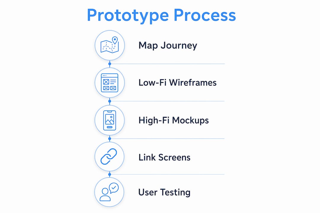
Step by step website prototyping is the process of creating an interactive model of your site by mapping user flows, sketching wireframes, building clickable screens, and testing with real users before a single line of code is written. The industry term for this discipline is interaction design prototyping, but most product teams simply call it prototyping. Done correctly, it prevents costly redesigns, aligns stakeholders early, and produces a validated blueprint that developers can build from with confidence. Tools like Figma, Adobe XD, and AI-driven platforms like floow.design have made this process accessible to entrepreneurs and product managers who have no formal design background.
What are the essential prerequisites and tools for website prototyping?
Effective prototyping starts with preparation, not pixels. Before you open any design tool, you need a clear inventory of the pages your site requires, the content that will populate them, and the user goals each page must serve.
Choosing the right prototyping tool
Prototyping tools for websites fall into two broad categories: traditional design software and AI-driven platforms. Each suits a different team profile.
| Tool | Best for | Key strength | Limitation |
|---|---|---|---|
| Figma | Collaborative teams | Real-time co-editing, component libraries | Steeper learning curve |
| Adobe XD | Adobe ecosystem users | Interactive mockups, voice prototyping | Less active development post-2023 |
| floow.design | Rapid AI-generated screens | Generates screens from text prompts | Less granular design control |
| Marvel | Non-designers | Simple drag-and-drop linking | Limited hi-fi design capability |
Choosing a tool depends on your team’s design skill, collaboration needs, and speed requirements. A solo entrepreneur validating an idea quickly will get more value from floow.design than from Figma’s full feature set.
Planning for responsive design from the start
Responsive design planning must address at least two breakpoints: desktop at 1,200px and above, and mobile below 768px. Ignoring these breakpoints during prototyping leads to structural problems that are expensive to fix during development. Build your wireframes with both screen sizes in mind from day one.
Pro Tip: Create a simple content inventory spreadsheet listing every page, its primary purpose, and the key content blocks it needs. This takes 30 minutes and prevents scope creep throughout the entire prototyping process.
For a broader view of the modern web development tools available in 2026, Cloudfusion’s blog covers the full ecosystem in detail.
How to map the core user journey for effective prototype scope
The single most common mistake in website prototyping is trying to prototype everything at once. The correct approach is the one-core-journey method: identify the single most important task your user needs to complete, and prototype only that path first.
The one-core-journey approach saves 50–70% of prototyping time compared to building full-site mockups. That time saving is significant because it means you can test and validate your core assumptions within days rather than weeks.
How to define your core journey in four steps
- Identify the primary user goal. Ask: what is the one action that, if completed, makes your site successful? For an e-commerce site, that is a purchase. For a SaaS product, it is a sign-up or trial activation.
- List the screens required. Map out every screen the user touches from arrival to goal completion. Most core journeys produce 3–6 essential screens, which is the ideal scope for a first prototype.
- Remove anything that is not on the critical path. If a screen does not directly move the user toward the goal, exclude it from this prototype iteration. You can add secondary flows later.
- Document the flow logic. Write a simple flow diagram showing which screen leads to which, including error states and back-navigation paths.
Pro Tip: Use sticky notes or a free tool like FigJam to map your user journey physically before opening a design tool. The act of arranging and rearranging screens by hand surfaces gaps in your flow that digital tools often hide.
Cloudfusion’s guide on user experience in web development expands on user-centred design principles that directly inform how you define and prioritise these journeys.
Step by step process to create and link prototype screens
With your core journey mapped, you are ready to build. The standard prototyping workflow moves through defined stages: lo-fi wireframes first, then hi-fi mockups, then interactive linking.

Stage 1: Low-fidelity wireframes
Low-fidelity wireframes are rough, unstyled layouts that show structure without distraction. Use boxes for images, lines for text, and simple labels for buttons. The goal is to validate layout and information hierarchy, not aesthetics.
Skipping lo-fi and jumping to hi-fi is one of the most common prototyping mistakes. Rushing into colours and fonts before the UX structure is confirmed causes inefficiency and forces expensive rework. Lo-fi must validate structure before hi-fi visual elements are applied.
A good wireframe tutorial approach: spend no more than 10–15 minutes per screen at this stage. Speed matters more than polish. Cloudfusion’s resource on creating wireframes for UI design covers fidelity levels and practical wireframing techniques in depth.
Stage 2: High-fidelity mockups
Once your lo-fi structure is validated, progress to hi-fi mockups by applying your brand colours, typography, imagery, and real content. At this stage, Figma’s component libraries and design systems become genuinely valuable. They allow you to update a button style once and have it propagate across all screens instantly.
Stage 3: Linking screens into a clickable flow
- Define hotspots. In Figma or Adobe XD, select a button or navigation element and link it to the destination screen.
- Add forward and back navigation. Every screen must have a clear path forward and a way to return. Users who feel trapped abandon flows.
- Test the flow yourself first. Click through the entire prototype as if you are a first-time user. Note any moment where you hesitate or feel confused.
- Add transition animations sparingly. Simple fade or slide transitions improve realism without adding significant build time.
- Share the prototype link. Both Figma and Adobe XD generate shareable prototype links that work on any device without requiring the recipient to have an account.
Pro Tip: An initial clickable MVP prototype focusing on one core user journey can be built in 30–60 minutes using AI-driven tools like floow.design. Use this approach to produce a testable prototype on day one, then refine it based on real user feedback rather than assumptions.
Some advanced teams, particularly SaaS founders, bypass design software entirely by coding interactive prototypes directly in component-based frameworks. This approach improves responsiveness and reduces handoff errors, though it requires developer involvement from the start.
How to test your website prototype with users and iterate effectively
Building a prototype without testing it is the equivalent of writing a business plan and never showing it to a customer. User testing is where prototyping delivers its real return on investment.
Testing with 3–5 real users uncovers around 85% of common usability issues. That figure is well established in UX research and means you do not need a large sample to get statistically meaningful feedback.
How to run an effective prototype test session
- Write a simple test script. Give users a scenario, not instructions. Say “You want to buy a pair of running shoes. Show me how you would do that.” Do not say “Click the shop button.”
- Observe behaviour, not just answers. Watch where users hesitate, where they click incorrectly, and where they stop. These moments reveal more than any post-session survey.
- Record the session with permission. Screen recordings allow you to review moments you missed during the live session.
- Focus on the core journey. Do not ask users to explore the whole site. Keep the test focused on the flow you prototyped.
- Debrief immediately after each session. Write down your key observations while they are fresh. Patterns across 3–5 sessions will become clear quickly.
Pro Tip: Remote testing tools like Maze or Lookback allow you to run unmoderated tests where users complete tasks independently. This is particularly useful for South African entrepreneurs testing with participants across different cities without travel costs.
After each round of testing, fix the issues identified and retest. Two to three iterations of this cycle typically produce a prototype that is ready for development handoff.
Common challenges and mistakes in website prototyping and how to avoid them
Most prototyping projects stall or produce poor results for predictable reasons. Recognising these pitfalls early saves significant time and budget.
- Jumping to hi-fi before validating structure. Applying branding and visuals to an unvalidated layout locks in bad decisions. Always confirm the lo-fi structure works before investing in aesthetics.
- Prototyping the entire site at once. This creates an unmanageable scope and delays testing. Start with the core journey and expand only after it is validated.
- Ignoring mobile breakpoints. A prototype that only shows the desktop layout will produce a development build that breaks on mobile. Plan for both breakpoints from the start. Cloudfusion’s article on responsive web design explains exactly how to approach this during the design phase.
- Testing with colleagues instead of real users. Internal testers know too much about the product to behave like genuine first-time users. Recruit people who match your actual user profile.
- Overloading the prototype with features. Every additional screen or interaction adds complexity and slows testing. Discipline in scope is a competitive advantage.
- Treating the prototype as the final product. A prototype is a learning tool, not a deliverable. Its purpose is to generate insight, not to impress stakeholders with polish.
“The prototype is not the product. It is the question you ask before you build the product.” This distinction separates teams that ship successful digital products from those that rebuild the same site three times.
Key takeaways
Effective website prototyping requires a disciplined sequence: map one core user journey, validate structure with lo-fi wireframes, apply hi-fi visuals, link screens into a clickable flow, and test with 3–5 real users to surface 85% of usability issues before development begins.
| Point | Details |
|---|---|
| Start with one core journey | Focus on a single user goal to reduce scope and save 50–70% of prototyping time. |
| Lo-fi before hi-fi | Validate layout and structure before applying branding to avoid costly rework. |
| Plan responsive breakpoints early | Design for desktop (1,200px+) and mobile (below 768px) from the first wireframe. |
| Test with 3–5 real users | A small test group uncovers around 85% of common usability issues efficiently. |
| Iterate in short cycles | Test, fix, and retest until the core journey is intuitive before handing off to developers. |
Why I think most teams prototype in the wrong order
After working with many entrepreneurs and product teams, the pattern I see most often is this: teams spend weeks perfecting a hi-fi prototype that looks beautiful but has never been tested with a real user. They present it to stakeholders, get approval, hand it to developers, and then discover during user acceptance testing that the navigation makes no sense to anyone outside the building.
The fix is not a better tool or a bigger budget. It is a mindset shift. Prototyping is a research activity, not a design activity. Your prototype’s job is to generate questions and surface assumptions, not to demonstrate your brand identity. The teams that internalise this ship faster and build products that users actually want to use.
I have also seen South African entrepreneurs hesitate to test with users because they worry about exposing an unfinished product. That hesitation is understandable but costly. A rough lo-fi wireframe shown to five real users on a Tuesday will teach you more than a polished hi-fi prototype that only your team has seen. Get comfortable with imperfection early. It is the fastest path to a product worth being proud of.
— Anton
How Cloudfusion can take your prototype to production
Once your prototype is validated and your core user journey is confirmed, the next challenge is turning that blueprint into a production-ready website. Cloudfusion specialises in exactly this transition. Our team works directly from validated prototypes, reducing handoff errors and keeping development aligned with the user experience you have already tested. Whether you are building a marketing site, an e-commerce platform, or a web application, our custom web development service is built to take your prototype from concept to live product efficiently. Give us a shout and let’s chat about your project.
FAQ
What is step by step website prototyping?
Step by step website prototyping is the structured process of mapping user flows, creating lo-fi wireframes, building hi-fi mockups, linking screens into clickable flows, and testing with real users before development begins. It validates design assumptions and reduces costly rework.
How many screens does a website prototype need?
A focused prototype covering one core user journey typically requires 3–6 screens. This scope is sufficient to test the primary workflow without creating unnecessary complexity.
Which tools are best for website prototyping?
Figma is the leading choice for collaborative teams, Adobe XD suits users already in the Adobe ecosystem, and floow.design accelerates screen generation using AI prompts. The right tool depends on your team’s skill level and speed requirements.
How many users do I need to test a prototype?
Testing with 5 users is statistically sufficient to uncover approximately 85% of major usability issues. Focus on the quality of your test script and observation rather than recruiting large numbers of participants.
What is the difference between lo-fi and hi-fi prototypes?
Lo-fi prototypes are rough, unstyled layouts used to validate structure and user flow. Hi-fi prototypes apply real branding, typography, and imagery to create a realistic representation of the final product. Lo-fi must always precede hi-fi to prevent structural rework.
Recommended