TL;DR:
- Ecommerce UX design focuses on optimizing every customer touchpoint to reduce friction, enhance confidence, and boost conversions. Systematic user data analysis, streamlined navigation, effective product pages, simplified checkout, and continuous testing are essential for sustained success. Prioritizing speed, mobile usability, and user-centered improvements significantly increases revenue and reduces abandoned carts.
Ecommerce UX design is defined as the deliberate structuring of every touchpoint in an online shopping journey to reduce friction, build purchase confidence, and drive conversions. The industry term is “ecommerce user experience,” and it covers far more than visual aesthetics. Research from Contentsquare outlines a 7-step framework spanning user needs analysis, navigation, product pages, checkout, speed, mobile, and ongoing testing. The business case is direct: 88% of users will not return to a site after a single poor experience. For South African ecommerce entrepreneurs and UX designers, this guide translates that research into practical steps you can act on today.
What does a UX design guide for ecommerce actually cover?
Ecommerce UX is the sum of all shopping journey touchpoints that shape how a customer perceives and interacts with your store. It is not limited to colour palettes or button styles. It includes how quickly your pages load, how easy your filters are to use, and whether your checkout form asks for information your customer finds intrusive or unnecessary.
Understanding this scope matters because it changes where you invest your design effort. Most online retailers over-invest in homepage aesthetics and under-invest in product page clarity and checkout flow. The sections below address each layer of the user experience in the order that delivers the highest return.
How do you understand and analyse your ecommerce users’ needs?
Effective UX decisions begin with data, not assumptions. Before redesigning a single page, you need a clear picture of who your users are, what they want, and where they struggle.

Start with quantitative tools. Google Analytics and Contentsquare both surface behavioural patterns: which pages users exit from, how far they scroll, and which elements they click. These numbers tell you what is happening. Qualitative methods tell you why.
Here is a practical approach to building that picture:
- Run on-site surveys using tools like Hotjar or Typeform to ask users directly what stopped them from completing a purchase.
- Conduct user interviews with five to eight customers per segment. Even brief 20-minute sessions reveal friction points that analytics cannot surface.
- Use session recordings to watch real users navigate your store. Patterns of rage-clicking or repeated back-navigation signal broken flows.
- Segment by intent. Site searchers represent 24% of visitors but generate 44% of revenue, converting at 2.5 times the rate of non-searchers. This means your search experience deserves disproportionate attention and investment.
- Track micro-conversions such as add-to-cart rate, wishlist additions, and filter usage to identify where high-intent users drop off before reaching checkout.
Pro Tip: Set up a dedicated feedback widget on your highest-traffic product category pages. Ask one question only: “What stopped you from adding this to your cart?” The specificity of the answers will surprise you.
Combining quantitative and qualitative data gives you a user needs map that informs every subsequent design decision with confidence rather than guesswork.
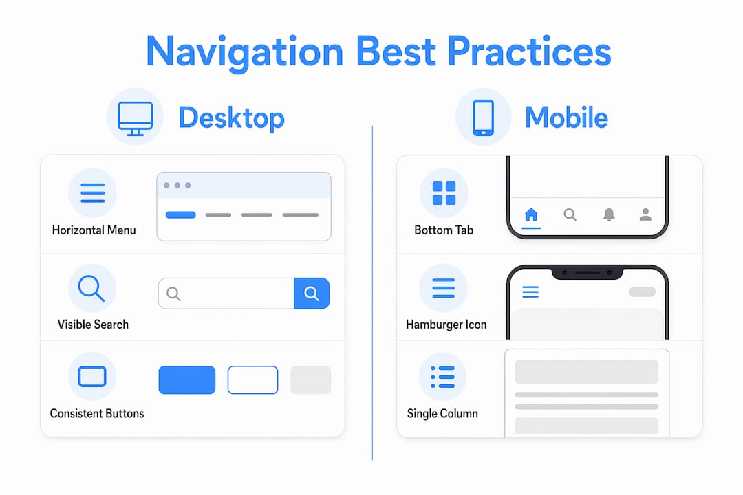
What are the best navigation practices for ecommerce sites?
Navigation is the architecture of your store. Poor navigation means customers cannot find products, and products that cannot be found cannot be sold. The goal is to reduce the number of steps between landing and product discovery.
Consider these four navigation principles ranked by impact:
- Use mega menus for large catalogues. A mega menu displays multiple category levels simultaneously, reducing the number of clicks required to reach a specific product type. This works particularly well for fashion, electronics, and home goods retailers with deep inventories.
- Implement bottom tab navigation on mobile. Thumb-friendly navigation placed at the bottom of the screen reduces drop-off on mobile devices, where top-of-screen menus are harder to reach and often ignored.
- Make your search bar prominent and intelligent. Attractive search results tailored to user preferences double click-through rates compared to simple keyword matching. Invest in a search engine that learns from user behaviour rather than one that returns exact-match results only.
- Provide robust filtering and sorting. For catalogues exceeding 50 products, filtering by price, size, colour, rating, and availability is not optional. It is the primary way high-intent users narrow their choices.
Desktop vs. mobile navigation comparison
| Navigation element | Desktop best practice | Mobile best practice |
|---|---|---|
| Primary menu | Horizontal mega menu with hover states | Bottom tab bar with 4 to 5 core categories |
| Search | Persistent search bar in header | Full-width search bar at top, auto-focus on tap |
| Filters | Left-side panel, always visible | Collapsible drawer, triggered by filter button |
| Category pages | Grid layout with 24 to 48 products per page | Single-column grid, infinite scroll or pagination |
Consistent UI elements like uniform “add to cart” buttons across every product listing reduce cognitive load and build user confidence. When the same action always looks the same, users stop thinking about the interface and start thinking about the product.
How should you optimise product page layouts for purchase confidence?
A product page has one job: give the customer enough information and confidence to click “add to cart.” Every design decision on that page either supports or undermines that goal.
The most effective product page layouts share these characteristics:
- Multiple high-resolution images showing the product from at least three angles, with a zoom function and, where relevant, a lifestyle shot showing the product in use.
- Clear pricing and availability displayed above the fold, without requiring the user to scroll. Uncertainty about stock or price is a conversion killer.
- Customer reviews presented near the product title, not buried at the bottom. Social proof at the point of decision reduces purchase anxiety significantly.
- Scannable descriptions structured with short paragraphs, bullet points for key specifications, and expandable sections for detailed information. Most users scan before they read.
- Heatmap analysis of your existing product pages using tools like Microsoft Clarity or Contentsquare to identify which elements users engage with and which they ignore entirely.
Pro Tip: Place your most persuasive review, ideally one that addresses the most common purchase objection, directly below the product title. This single change consistently improves add-to-cart rates without any structural redesign.
You can find a detailed ecommerce usability checklist that covers product page structure alongside every other critical UX element for online stores.
How do you reduce cart abandonment through better checkout UX?
Cart abandonment is the most measurable symptom of poor checkout UX. Baymard’s checkout research identified over 1,350 distinct UX issues across ecommerce checkout flows, producing 110 guidelines for improvement. That scale of research confirms one thing clearly: checkout usability requires systematic evaluation, not intuition.
Follow these steps to build a checkout flow that converts:
- Offer guest checkout as the default. Forcing account creation before purchase is one of the leading causes of abandonment. Let users buy first and register later.
- Reduce form fields to the minimum required. Every additional field is a reason to leave. If you do not need a phone number to process the order, do not ask for it.
- Display a progress indicator. A simple three-step indicator (cart, details, payment) tells users exactly where they are and how close they are to completing the purchase.
- Show shipping costs early. Unexpected shipping fees at the final step are the single most cited reason for abandonment. Display estimated shipping on the cart page.
- Offer multiple payment methods. In South Africa, this means supporting credit and debit cards, PayFast, Ozow, and where your audience warrants it, buy-now-pay-later options like PayJustNow or Payflex.
“Checkout flows are complex usability systems that require rigorous heuristic evaluation and usability testing rather than guess-based design.” — Baymard Institute
A minimalist checkout design with no distracting navigation links, no promotional banners, and no upsell pop-ups keeps the user focused on completing the transaction.
What technical UX improvements have the biggest impact on ecommerce performance?
Page speed and mobile optimisation are not back-end concerns. They are UX decisions with direct revenue consequences.
Page speed targets and tools
| Performance factor | Target | Tools to achieve it |
|---|---|---|
| Page load time | Under 2 seconds | Image compression, CDN, optimised hosting |
| Core Web Vitals (LCP) | Under 2.5 seconds | Lazy loading, server-side rendering |
| Mobile page weight | Under 1.5 MB | WebP images, minified CSS and JavaScript |
| Time to interactive | Under 3.5 seconds | Code splitting, deferred scripts |
Page load times under 2 seconds improve both SEO rankings and user retention. Every additional second of load time increases bounce rate, particularly on mobile networks. South African mobile data costs make this especially relevant: users on capped data plans are less tolerant of heavy pages than users in markets with unlimited data.
For mobile UX specifically, simplify aggressively. Fewer images per page, shorter product descriptions on listing pages, and a single-column layout reduce cognitive load and load time simultaneously.
Progressive Web Apps represent the most advanced option for mobile performance. Shopify recommends defining measurable UX and performance goals before building a PWA, with real-user testing on installability and offline support. A PWA delivers app-like speed and engagement without requiring users to visit an app store.
Pro Tip: Upgrade your hosting before investing in a PWA. A well-configured web hosting package with a content delivery network will resolve the majority of speed issues at a fraction of the development cost.
How does ongoing testing keep your ecommerce UX effective?
UX design is not a project with a completion date. User expectations shift, product catalogues grow, and new device types emerge. Treating UX as a continuous process rather than a one-time fix is what separates stores that grow from those that plateau.
Build these practices into your regular operations:
- Run A/B tests on high-traffic pages. Test one variable at a time: button colour, headline copy, image placement, or call-to-action text. Tools like Google Optimize or VWO make this accessible without developer involvement for most changes.
- Review heatmaps monthly. Regular heatmap and session replay analysis surfaces new friction points as your catalogue and traffic patterns evolve.
- Send post-purchase surveys. Ask customers what nearly stopped them from buying. This captures friction that analytics cannot measure because the user completed the journey despite the obstacle.
- Monitor your ecommerce analytics dashboard weekly. Track cart abandonment rate, search-to-purchase conversion, and mobile vs. desktop conversion gaps as your primary UX health indicators.
- Iterate in small cycles. Monthly or quarterly UX reviews with defined hypotheses and measurable outcomes produce more reliable improvements than annual redesigns.
The goal is a feedback loop where data informs design, design changes behaviour, and behaviour generates new data.
Key takeaways
Effective ecommerce UX design requires systematic attention to user needs, navigation clarity, product page confidence, checkout simplicity, technical performance, and continuous testing across every stage of the shopping journey.
| Point | Details |
|---|---|
| Prioritise search UX | Searchers generate 44% of revenue despite being 24% of visitors. Invest in intelligent search first. |
| Simplify checkout ruthlessly | Offer guest checkout, reduce form fields, and show shipping costs before the final step. |
| Target sub-2-second load times | Use image compression, CDN, and optimised hosting to meet speed thresholds that protect SEO and retention. |
| Test continuously, not annually | Monthly A/B tests and heatmap reviews outperform periodic redesigns for sustained conversion growth. |
| Mobile UX requires its own design logic | Bottom tab navigation, single-column layouts, and simplified checkout flows are non-negotiable for mobile conversion. |
Why UX is the most undervalued investment in ecommerce
Working with ecommerce clients across various industries, I have noticed a consistent pattern: business owners invest heavily in paid advertising to drive traffic, then lose a significant portion of that traffic to avoidable UX failures. A R50,000 monthly ad spend directed at a site with a broken mobile checkout or a confusing navigation structure is money that largely goes to waste.
The uncomfortable truth is that most ecommerce UX problems are not complex to fix once you know where to look. A guest checkout option, a visible search bar, and a product page that loads in under two seconds will outperform a beautifully designed site that is slow and confusing. Aesthetics matter, but they matter far less than clarity and speed.
What I have found most valuable for clients is shifting the conversation from “how does this look?” to “what does this make the user do?” That reframe changes every design decision. It moves the focus from the brand’s preferences to the customer’s behaviour, which is where revenue actually lives.
The UX design strategies that deliver the most consistent results are rarely the most visually dramatic. They are the ones grounded in user data, tested against real behaviour, and iterated over time. A user-first mindset is not a design philosophy. It is a business strategy.
— Anton
Build an ecommerce experience that converts with Cloudfusion
Cloudfusion builds custom ecommerce websites designed from the ground up with user experience at the centre. Our team combines technical development with UX strategy to deliver online stores that load fast, navigate intuitively, and convert visitors into paying customers. Whether you are launching a new store or rebuilding an underperforming one, we tailor every solution to your specific audience, catalogue, and business goals. Give us a shout to discuss your project and find out how we can help you build an ecommerce platform that works as hard as you do.
FAQ
What is ecommerce UX design?
Ecommerce UX design is the practice of structuring every element of an online store to make shopping intuitive, fast, and confidence-building. It covers navigation, product pages, checkout flow, page speed, and mobile usability.
How does UX design affect ecommerce conversion rates?
Poor UX directly reduces conversions. Research shows 88% of users will not return after a single bad experience, while checkout UX improvements guided by Baymard’s 110-plus guidelines can recover a significant portion of abandoned transactions.
What is the most important UX improvement for ecommerce?
Checkout simplification delivers the most immediate conversion impact. Offering guest checkout, reducing form fields, and displaying shipping costs early address the most common reasons users abandon their carts before completing a purchase.
How do I improve mobile UX for my online store?
Use bottom tab navigation, single-column product grids, compressed images, and a simplified checkout flow. Target page load times under 2 seconds, and consider a Progressive Web App architecture for stores with high mobile traffic volumes.
How often should I test and update my ecommerce UX?
UX testing should be continuous, not periodic. Run A/B tests monthly on high-traffic pages, review heatmaps and session recordings regularly, and send post-purchase surveys to capture friction that analytics alone cannot surface.
Recommended