Start with the origin.
Landscape and character sit at the centre of the identity.


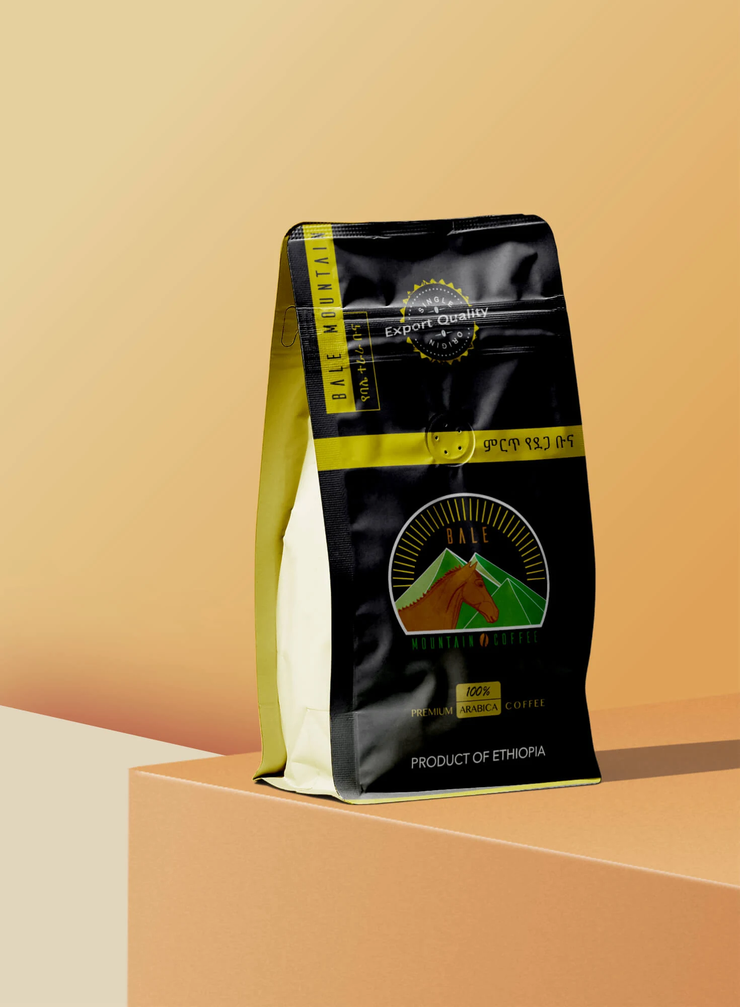
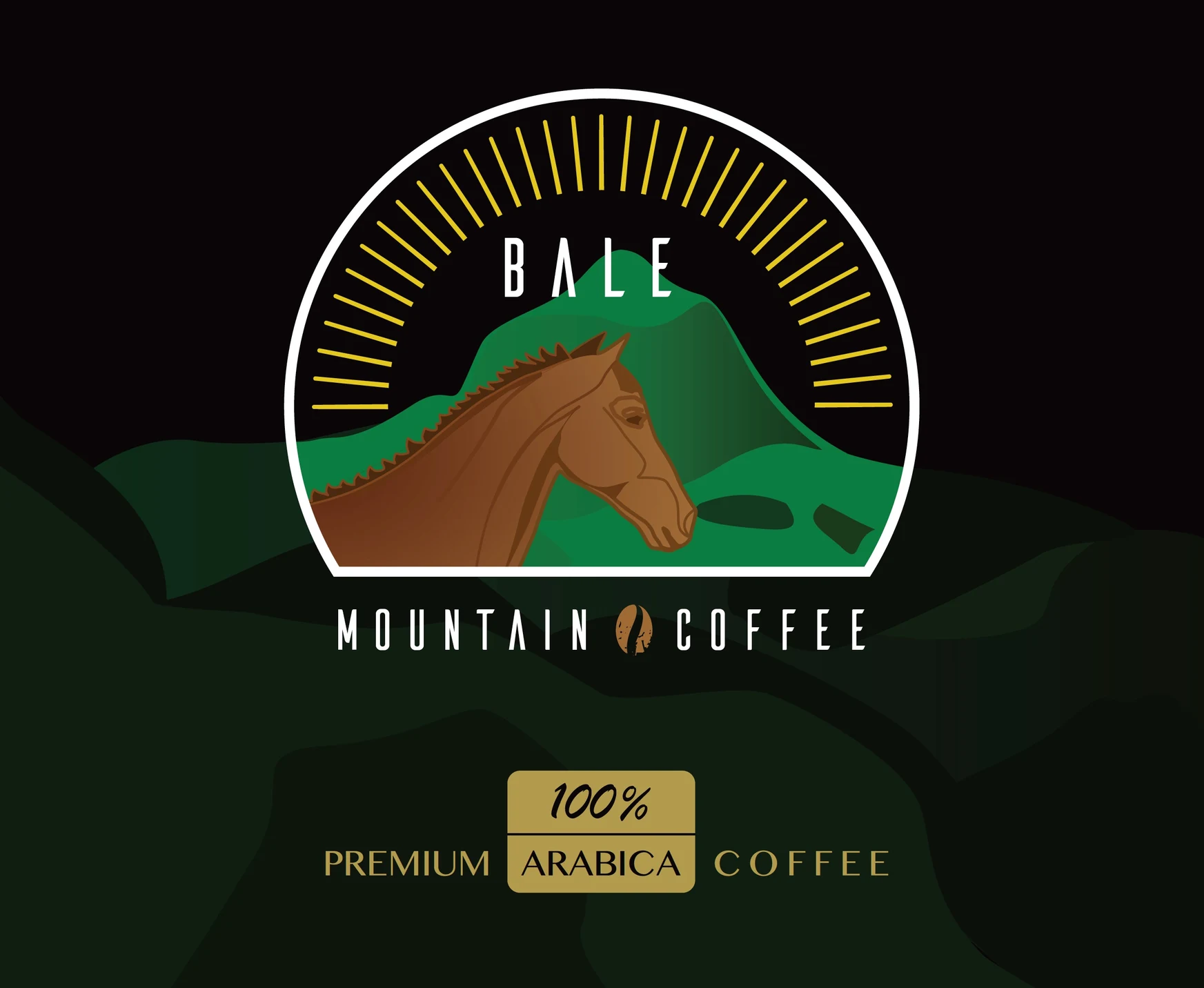
Bale Mountain Coffee needed an identity that made its Ethiopian origin part of the introduction. We developed the logo and packaging artwork together, giving the coffee a recognisable presentation from the mark to the information around the pack.
Explore the experienceBrand identity · Logo design · Packaging artwork / 2019
The brand needed to stand apart while telling customers where its coffee came from. Packaging also needed room for practical information, so the origin story and the product details had to work together.
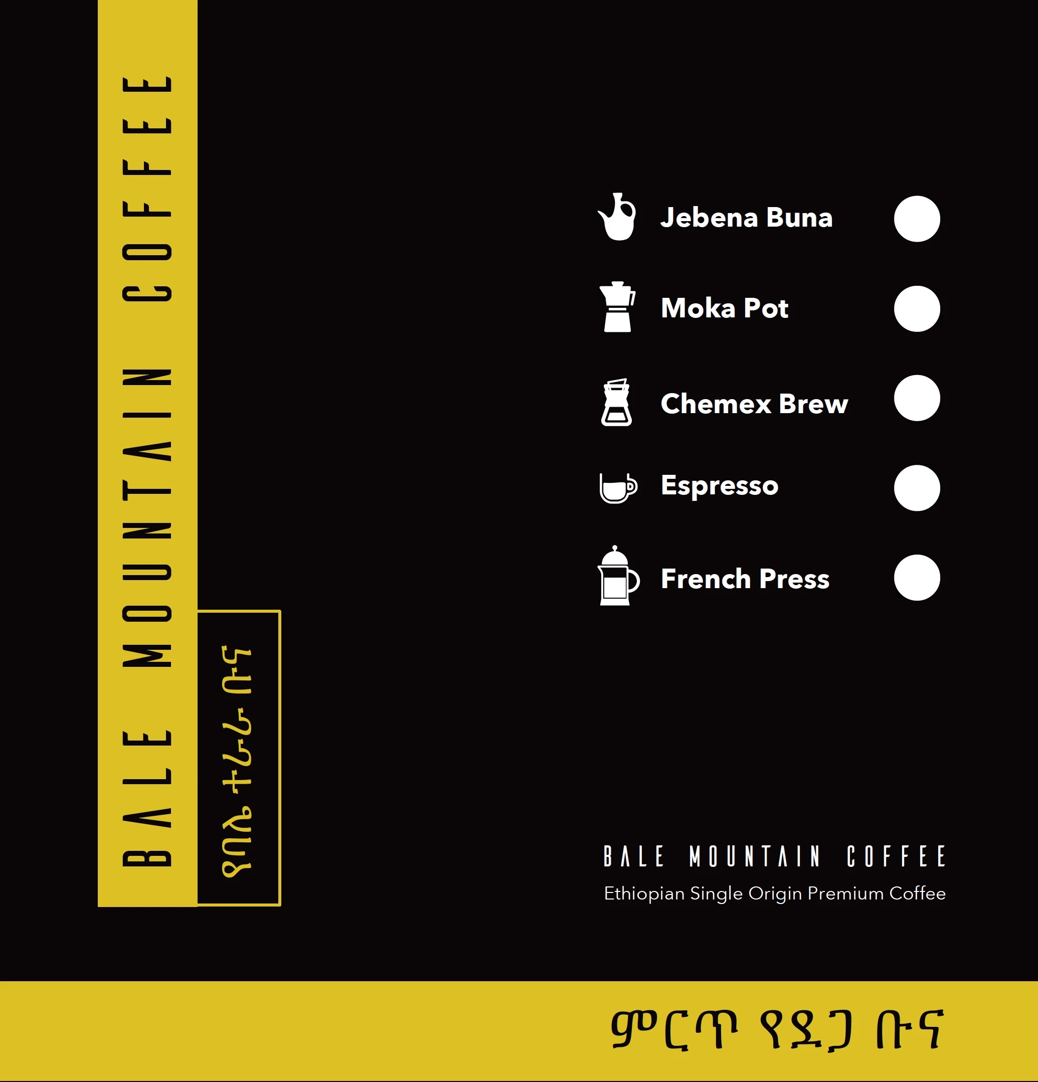
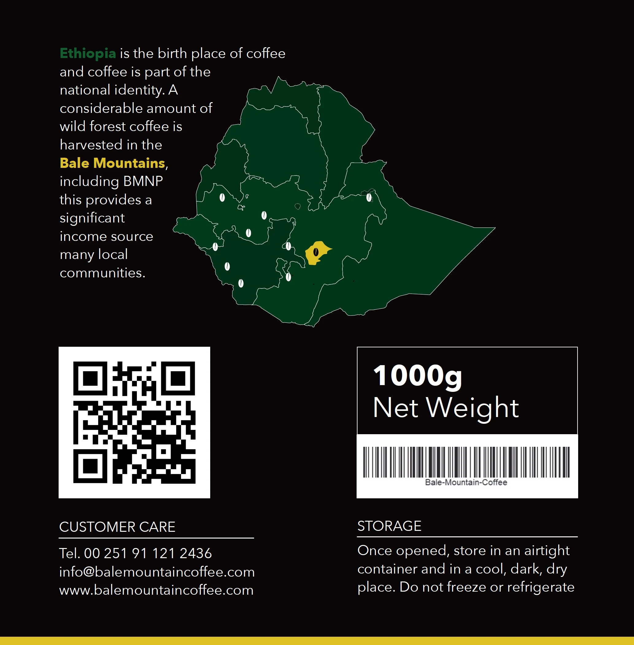
We brought mountain scenery, a horse motif and a green-and-gold palette into the identity. That direction continued across front, side and reverse packaging artwork, with brewing illustrations and origin information built into the layouts.
Bale Mountain Coffee received a coordinated identity and packaging artwork, with origin information and brewing illustrations included in the pack layouts. The design gives the brand a distinctive introduction while making room for the details a customer needs to choose and use the coffee.
The mountain and horse motif, typography and palette give the brand a distinctive visual story.
Front, side and reverse artwork share the same identity while serving different information needs.
Each application has a different role while remaining recognisably part of the brand.
Landscape and character sit at the centre of the identity.
The mark and palette lead the front-of-pack composition.
Brewing illustrations and origin information complete the artwork.
Original identity and packaging designs; the bag presentation is a mockup.
Illustrated brewing methods give the side panel a useful role within the same visual identity.
The reverse artwork pairs an Ethiopian map with product and storage information, continuing the pack’s black-and-gold treatment.
A recognisable logo and colour direction.
Front, side and reverse artwork within one visual system.
Brewing illustrations and origin details integrated into the design.

Bale Mountain Coffee needed an identity that made its Ethiopian origin part of the introduction. We developed the logo and packaging artwork together, giving the coffee a recognisable presentation from the mark to the information around the pack.
Brand identity · Logo design · Packaging artwork / 2019
The brand needed to stand apart while telling customers where its coffee came from. Packaging also needed room for practical information, so the origin story and the product details had to work together.
We brought mountain scenery, a horse motif and a green-and-gold palette into the identity. That direction continued across front, side and reverse packaging artwork, with brewing illustrations and origin information built into the layouts.
Bale Mountain Coffee received a coordinated identity and packaging artwork, with origin information and brewing illustrations included in the pack layouts. The design gives the brand a distinctive introduction while making room for the details a customer needs to choose and use the coffee.