
Most business owners think responsive web design simply means a website works on mobile devices. In reality, responsive design is a sophisticated engineering discipline that affects everything from SEO rankings to conversion rates. Expert responsive web design services transform how customers interact with your brand across every screen size, creating seamless experiences that drive measurable business growth through strategic layout systems, semantic code, and performance optimization.
Table of Contents
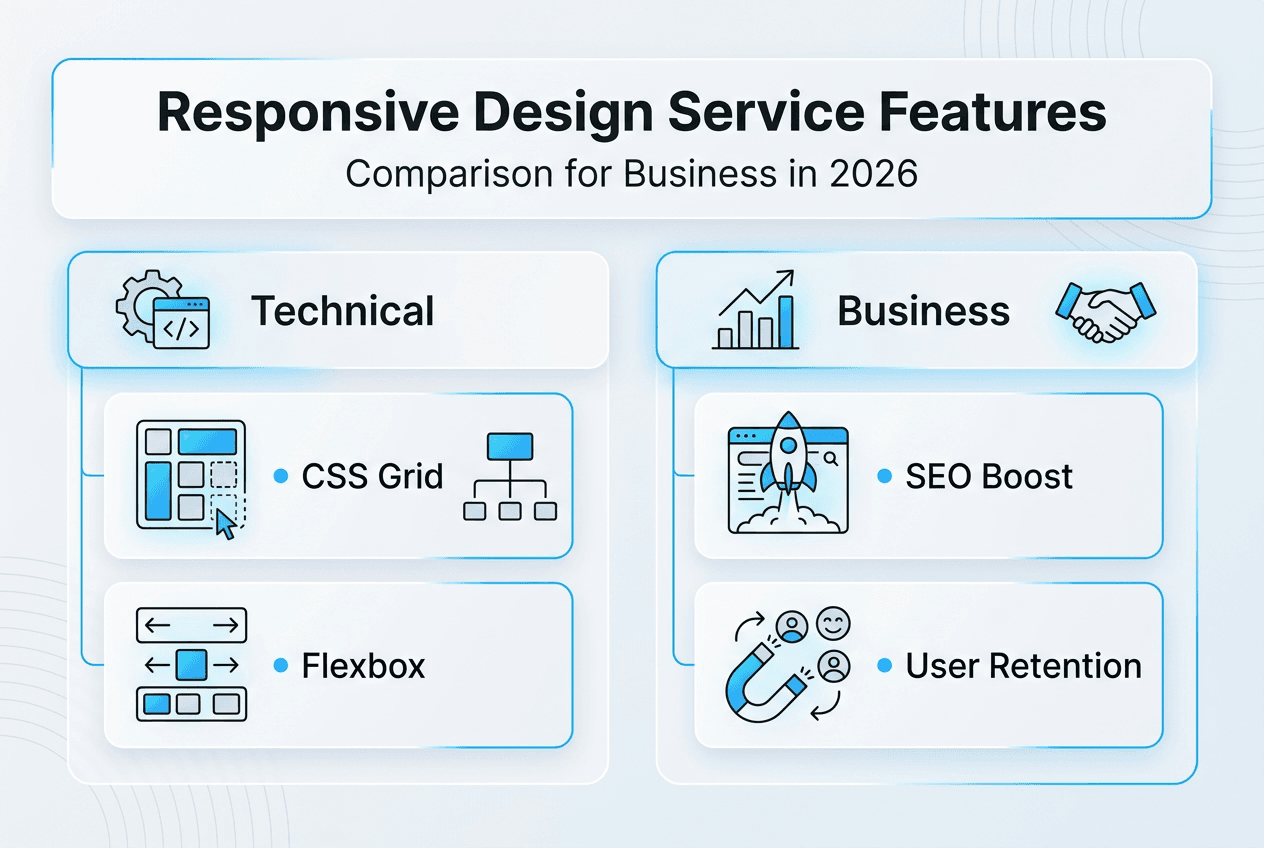
- Understanding The Foundation: Grid Systems And Layout Principles
- Advanced Responsive Design Techniques That Impact Business Success
- Responsive Design’s Role In SEO And User Experience Optimization
- Choosing The Right Responsive Web Design Service For Your Business Needs
- How Cloudfusion Can Elevate Your Responsive Web Design
Key takeaways
| Point | Details |
|---|---|
| SEO impact | Responsive design directly improves search rankings by adapting content to all devices and meeting Google’s mobile-first requirements. |
| Grid foundation | CSS Grid and Flexbox create scalable, maintainable layouts that reduce development time and improve cross-device consistency. |
| Performance matters | Semantic HTML and proper sizing boost accessibility while reducing page weight and Time to Interactive metrics. |
| Mobile-first indexing | Google now ranks sites based on mobile performance, making responsive design essential for visibility in 2026. |
| Framework pitfalls | Heavy responsive frameworks can add 127 KB of unused code, slowing load times and hurting user experience. |
Understanding the foundation: grid systems and layout principles
Grid systems form the technical backbone of professional responsive web design, organizing content flow through structured columns and gutters that adapt intelligently across viewport sizes. Mastering grid systems enables designers and developers to create predictable, scalable layouts that maintain visual hierarchy whether viewed on a 320px smartphone or a 2560px desktop monitor.
CSS Grid and Flexbox are the primary technologies powering modern responsive layouts. CSS Grid excels at two-dimensional layouts where you need precise control over rows and columns simultaneously, while Flexbox handles one-dimensional arrangements within those grid cells. Breaking layouts into flexible grid structures improves usability dramatically while speeding up development cycles since designers work within established constraints rather than creating custom solutions for every page.

The most effective responsive grid systems avoid device-specific breakpoints tied to popular phone or tablet dimensions. Instead, create breakpoints where your actual layout needs adjustment based on content reflow. A 768px breakpoint makes sense only if your navigation genuinely breaks at that width, not because iPads exist at that size.
Pro Tip: Use semantic source order within your grid structures to improve both accessibility and SEO. Screen readers and search engine crawlers parse HTML in document order, so placing your most important content first in the markup (even if CSS visually repositions it) ensures critical information reaches all users and search algorithms effectively.
Grid systems also reduce handcrafted CSS by providing reusable spacing units and alignment rules. This consistency translates to faster page rendering since browsers can cache and reuse grid calculations across multiple page elements rather than computing unique positions for every component.
Advanced responsive design techniques that impact business success
Beyond basic mobile-friendliness, advanced responsive techniques directly influence your bottom line through improved SEO rankings, accessibility compliance, and performance metrics that affect conversion rates. Semantic HTML markup significantly boosts accessibility by providing proper document structure that assistive technologies can navigate efficiently. Sites using semantic HTML see faster keyboard navigation task completion, reducing abandonment rates for users with disabilities while simultaneously lowering JavaScript processing costs.
Avoid hardcoded pixel values for font sizes throughout your responsive design. Fixed pixel typography breaks browser zoom functionality, violating WCAG accessibility guidelines and frustrating users who need larger text. Relative units like rem or em scale proportionally with user preferences, ensuring your content remains readable across all configurations without requiring visitors to fight with your CSS.
Many businesses unknowingly hurt their site performance by overrelying on large responsive frameworks. While frameworks like Bootstrap or Foundation offer convenient components, they often include massive amounts of unused code that slows initial page loads. Skipping foundational elements in favor of generic responsive frameworks can add 127 KB of unused code, increasing Time to Interactive by 1.8 seconds on 3G connections.
“Skipping foundational elements in favor of ‘responsive’ frameworks adds 127 KB, increasing TTI by 1.8 seconds on 3G.”
Effective responsive design balances adaptability with lightweight code execution. Start with browser-native capabilities like CSS Grid, Flexbox, and modern responsive images before reaching for JavaScript solutions. Native CSS features render faster, consume less memory, and work reliably even when JavaScript fails or loads slowly on congested mobile networks.
Consider implementing mobile-friendly design patterns that prioritize core content delivery before progressive enhancement adds interactive features. This approach ensures your most important business messages reach users immediately while advanced functionality loads asynchronously in the background.
Responsive design’s role in SEO and user experience optimization
Google switched to mobile-first indexing as the default for all websites starting in 2019, meaning the search engine primarily evaluates your mobile experience when determining rankings. Mobile traffic accounts for over 60% of global web traffic, making mobile-friendliness a critical ranking signal that directly impacts your business visibility in 2026 search results.
Well-implemented responsive design reduces bounce rates by eliminating frustrating horizontal scrolling, tiny tap targets, and illegible text that drive mobile users away. When visitors can easily navigate your content regardless of device, they spend more time engaging with your brand, sending positive behavioral signals that reinforce your search rankings. Increased dwell time correlates strongly with higher conversion rates since users who stay longer have more opportunities to understand your value proposition and take action.
| Metric | Responsive Sites | Non-Responsive Sites |
|---|---|---|
| Bounce Rate | 32% average | 58% average |
| Dwell Time | 3.2 minutes | 1.4 minutes |
| Conversion Rate | 4.8% | 2.1% |
| Mobile Rankings | Top 3 positions | Below position 10 |
Optimizing your responsive design for both SEO and user experience requires systematic attention across multiple dimensions:
- Implement responsive images using srcset and sizes attributes to serve appropriately sized assets based on viewport dimensions and pixel density.
- Prioritize core content above the fold on mobile viewports, placing conversion elements where thumbs naturally reach without requiring awkward scrolling.
- Test touch target sizes to ensure all interactive elements meet the minimum 44x44 pixel recommendation for comfortable mobile tapping.
- Optimize mobile page speed by eliminating render-blocking resources and implementing critical CSS inlining for instant first paint.
- Monitor mobile responsiveness metrics regularly using Google Search Console and Core Web Vitals reports.
- Create content hierarchies that make sense when linearized for narrow screens, avoiding layouts that depend on side-by-side comparisons.
Effective responsive services understand these interconnections between technical implementation and business outcomes. Sites that excel at responsive design don’t just adapt layouts; they create cohesive experiences that guide users toward conversion goals while satisfying search algorithms simultaneously. Following SEO-friendly website principles during responsive development ensures your technical foundation supports long-term organic growth.
Understanding responsive design challenges in 2026 helps businesses stay ahead of evolving mobile patterns and search algorithm updates that increasingly reward superior mobile experiences.
Choosing the right responsive web design service for your business needs
Selecting a responsive web design service requires evaluating technical capabilities against your specific business growth objectives. Different approaches offer varying benefits depending on your industry, target audience, and long-term digital strategy.
| Approach | Key Features | Best For |
|---|---|---|
| Custom Grid Systems | Tailored breakpoints, semantic HTML, minimal dependencies | Businesses prioritizing performance and scalability |
| Framework-Based | Rapid deployment, pre-built components, familiar patterns | Startups needing fast market entry |
| Hybrid Solutions | Selective framework use, custom optimization, balanced approach | Enterprises requiring both speed and customization |
When evaluating responsive web design services, prioritize these critical criteria:
- Scalability expertise: Services should demonstrate experience building sites that grow with your business without requiring complete redesigns.
- Performance optimization: Look for proven track records reducing Time to Interactive, Largest Contentful Paint, and Cumulative Layout Shift metrics.
- SEO knowledge: Ensure services understand mobile-first indexing implications and implement structured data appropriately.
- Accessibility compliance: Verify adherence to WCAG 2.1 AA standards minimum, with expertise in semantic HTML and ARIA attributes.
- Maintenance capabilities: Confirm ongoing support for browser updates, security patches, and performance monitoring.
Pro Tip: Choose services emphasizing minimal dependencies and browser-native layers to avoid accumulating accessibility debt. Heavy reliance on JavaScript frameworks for basic responsive functionality creates maintenance burdens and performance penalties that compound over time as your site grows.
Common pitfalls include over-relying on generic frameworks that ignore your specific user behavior patterns. A financial services site has dramatically different responsive needs than an e-commerce platform, yet many agencies apply identical frameworks regardless of industry context. Efficient responsive design eliminates dependencies, reduces bundle sizes, and improves maintainability for scalable business growth.
Understanding the differences between responsive and adaptive design helps clarify which approach aligns with your content strategy and technical infrastructure. Evaluating how services address mobile responsiveness problems reveals their troubleshooting capabilities and commitment to continuous improvement.
Align your web design investment with strategic objectives by asking potential services how they measure success beyond launch. Effective partners track conversion rates, mobile engagement metrics, and search rankings as ongoing indicators of responsive design effectiveness, adjusting strategies based on real user data rather than aesthetic preferences alone.
How Cloudfusion can elevate your responsive web design
Cloudfusion delivers bespoke custom web development solutions that embody the responsive design principles outlined throughout this guide. Our team combines deep expertise in grid systems, semantic HTML, and performance optimization to create websites that enhance both user experience and search rankings. We avoid bloated frameworks in favor of tailored approaches that match your specific business requirements and audience behaviors.
Our integrated mobile application development services ensure cohesive digital presence across native apps and responsive websites, creating unified brand experiences regardless of how customers access your content. This holistic approach prevents the disconnected experiences that frustrate users and undermine conversion goals.
Ready to transform your online presence with responsive design that drives measurable business results? Request a comprehensive web design and development quotation to explore how Cloudfusion’s tailored solutions can elevate your digital strategy in 2026.
Frequently asked questions
What is responsive web design service?
Responsive web design service creates websites that adapt smoothly across all device sizes using flexible grids, scalable images, and CSS media queries. It improves SEO rankings by meeting Google’s mobile-first indexing requirements, which prioritize mobile experience in search algorithms. Services typically involve implementing grid systems, semantic HTML structure, and performance optimization to ensure fast loading and intuitive navigation. Businesses see better user engagement, lower bounce rates, and increased conversions when responsive design aligns technical implementation with strategic growth objectives.
Why is a grid system important in responsive web design?
Grid systems provide predictable, scalable layout frameworks that organize content consistently across viewport sizes. They reduce handcrafted CSS and improve cross-device consistency by establishing reusable spacing units and alignment rules. This consistency speeds development while ensuring visual hierarchy remains intact whether users view content on smartphones or desktop monitors. Grid systems also improve browser rendering performance since layout calculations can be cached and reused across multiple page elements rather than computing unique positions for every component individually.
How does responsive design impact SEO and user experience?
Responsive design boosts rankings by satisfying mobile-first indexing requirements that Google uses to evaluate all websites in 2026. Over 60% of web traffic originates from mobile devices, making mobile-friendliness a critical ranking signal. It improves bounce rates, dwell time, and conversion rates by enhancing navigation comfort across all devices. Users spend more time engaging with content when layouts adapt intelligently to their screens, sending positive behavioral signals that further reinforce search visibility and business outcomes.
What should businesses look for in a responsive web design service?
Focus on proven expertise in implementing grid systems and semantic HTML that create maintainable, scalable architectures. Prioritize services demonstrating performance optimization capabilities through measurable improvements in Core Web Vitals metrics like Time to Interactive and Largest Contentful Paint. Look for accessibility compliance knowledge ensuring WCAG 2.1 AA standards minimum, plus ongoing maintenance capabilities for browser updates and security patches. Effective services measure success through conversion rates, mobile engagement metrics, and search rankings rather than aesthetic preferences alone, adjusting strategies based on real user behavior data.
How does semantic HTML improve responsive web design?
Semantic HTML provides proper document structure that assistive technologies navigate efficiently while reducing JavaScript processing requirements. It improves accessibility by creating logical content hierarchies that screen readers parse correctly, ensuring all users can access your information regardless of ability. Search engines also benefit from semantic markup since clear structure helps algorithms understand content relationships and relevance. This dual benefit makes semantic HTML essential for responsive designs that need to perform well in both human usability and search algorithm evaluations.
Recommended


